CENTRAL PARK · NYC
Nathalie Pozzi
A series of micro interventions to optimize natural light and improve the layout of a Central Park facing apartment.
In progress
Interior renovation
Location
Fifthe Avenue • New York City • NY
Year
2026
Use the form on the right to contact us.
You can edit the text in this area, and change where the contact form on the right submits to, by entering edit mode using the modes on the bottom right.
SPACE AND DESIGN
Filtering by Category: PROJECTS
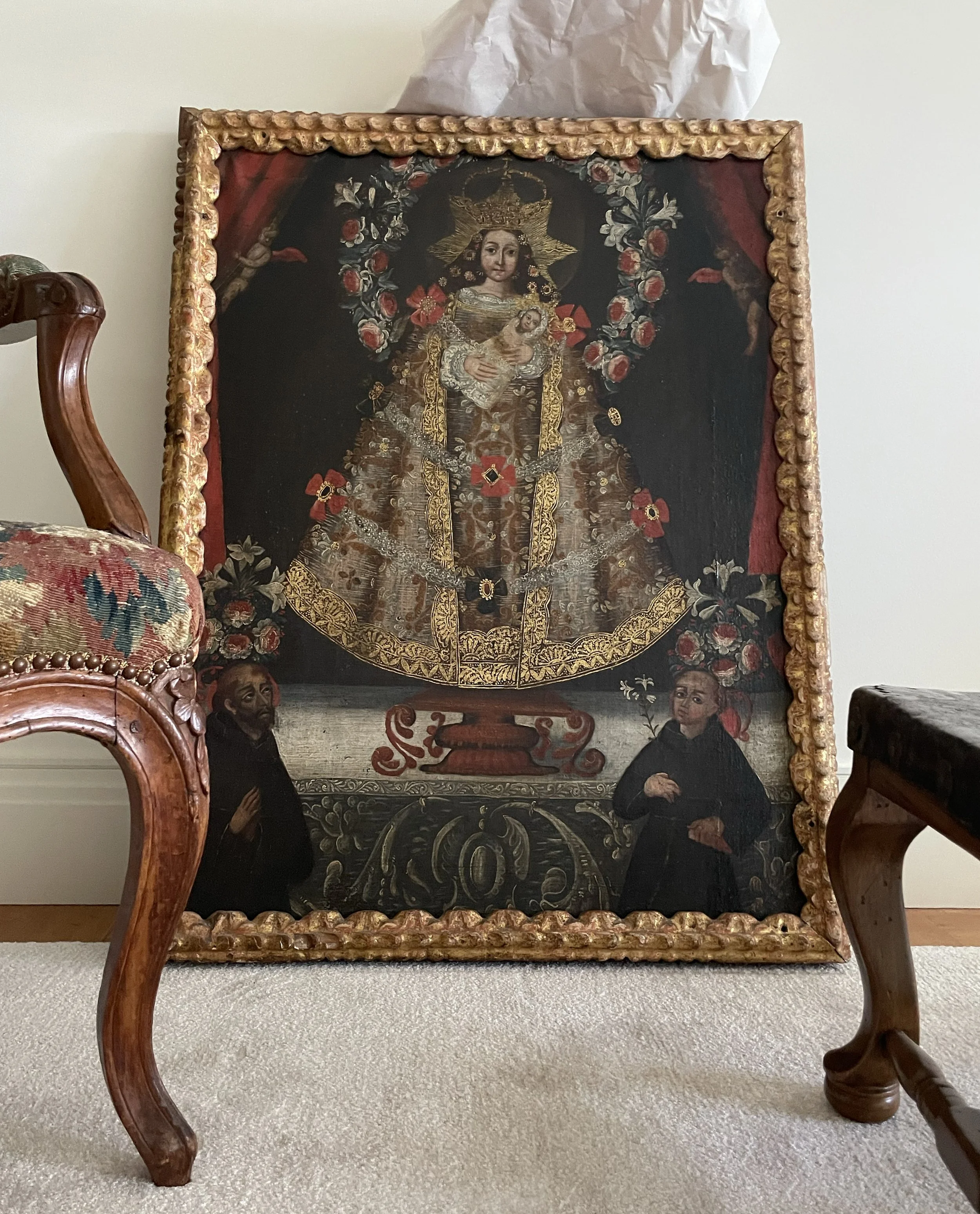
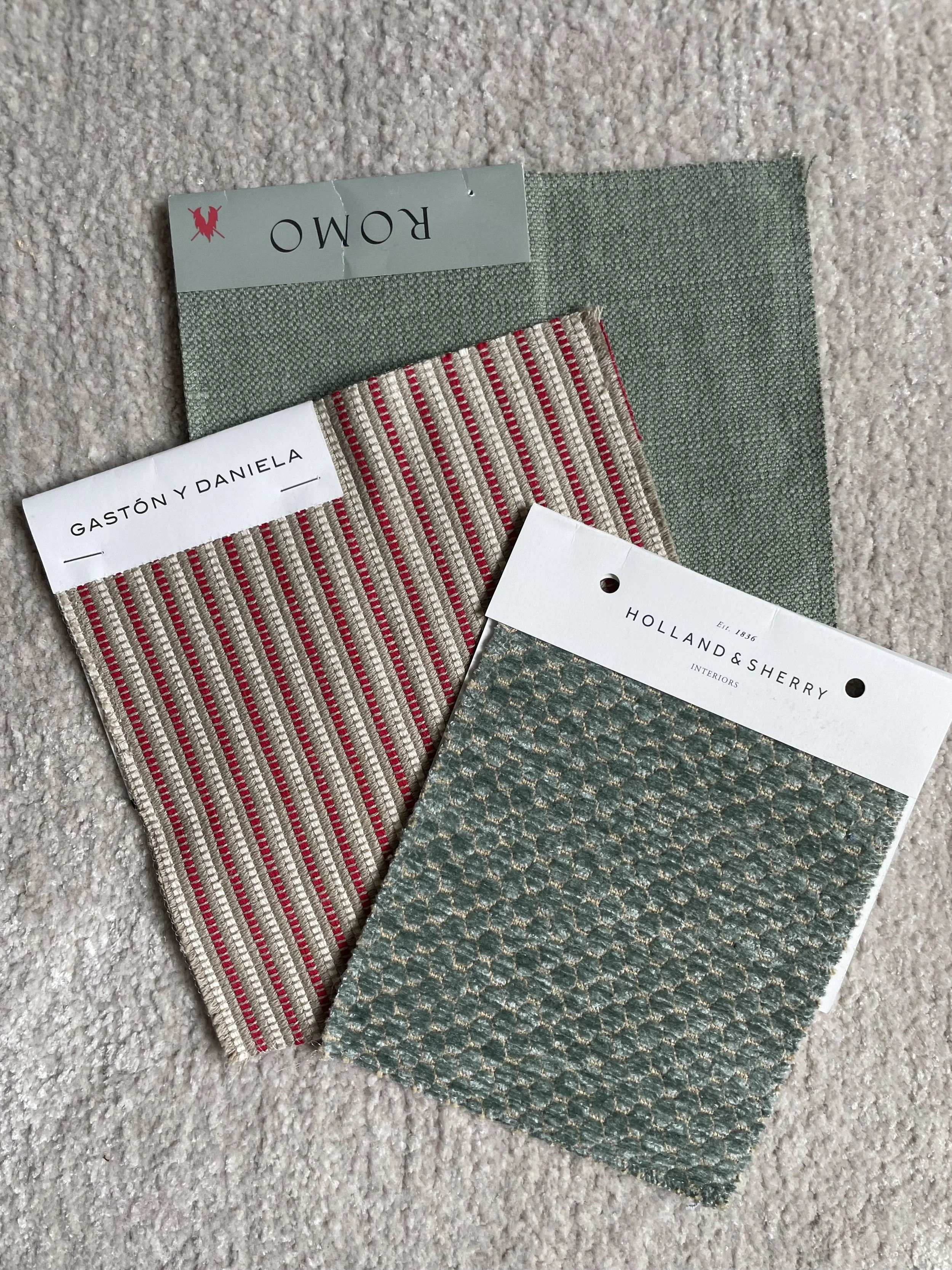
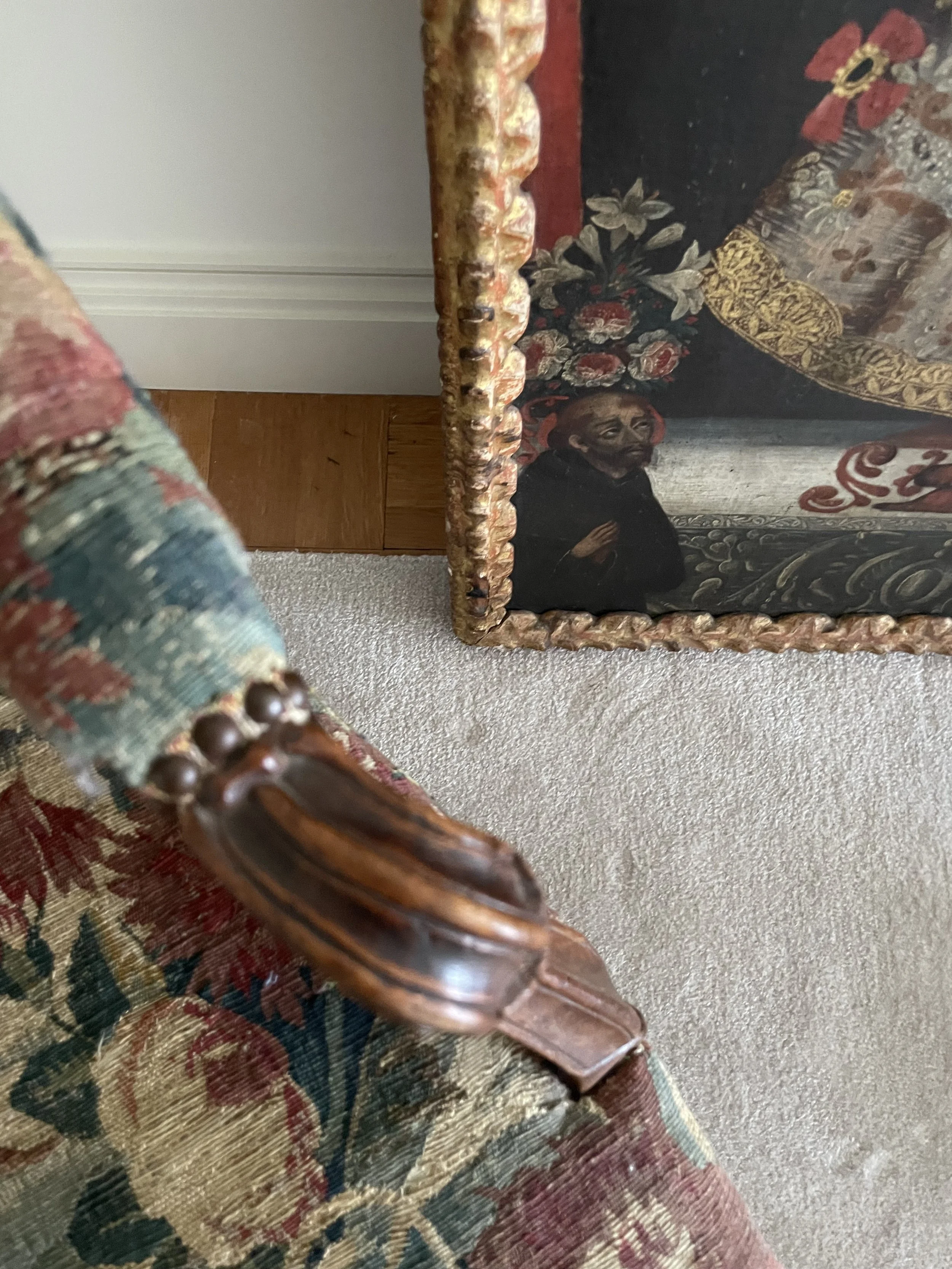
A series of micro interventions to optimize natural light and improve the layout of a Central Park facing apartment.
In progress
Interior renovation
Location
Fifthe Avenue • New York City • NY
Year
2026
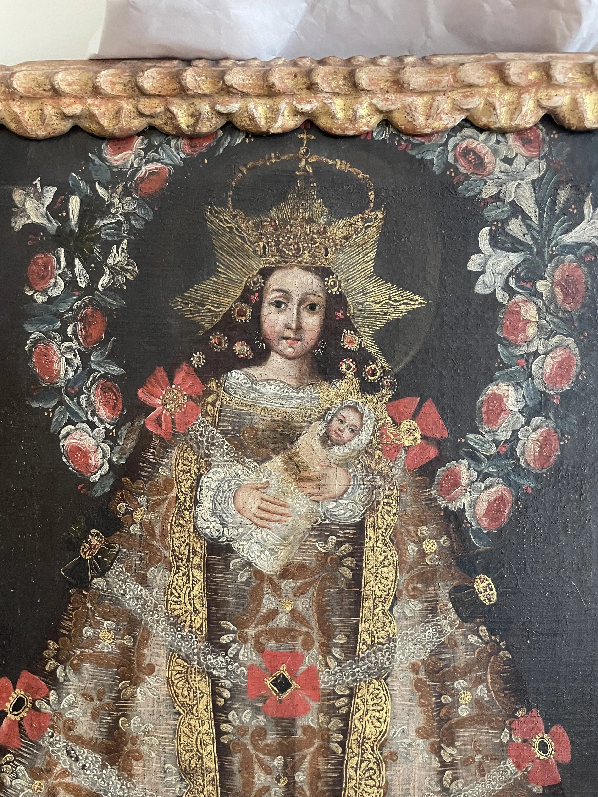
A series of micro interventions to optimize natural light and improve the layout of a North-West facing apartment.
The space occupies the main floor of the former Heppenheimer Mansion, a landmarked building in Jersey City. The elegant red brick, neo gothic building faces Van Vorst Park and was originally designed, circa 1884, for John Ward by architect Frederick Clarke Withers.
In progress

Interior renovation
Location
Jersey City • NJ
Year
2024
“Because one thing he was good at, possibly the only thing, was imagining things so clearly that he almost saw and heard them.”
― Michael Ende, The Neverending Story
A number of Withers's works are listed on the National Register of Historic Places (NRHP) and further honored as National Historic Landmarks.
Wikipedia

Courthouse, 425 Avenue of the Americas, New York
Source • Historic American Buildings Survey (HABS),

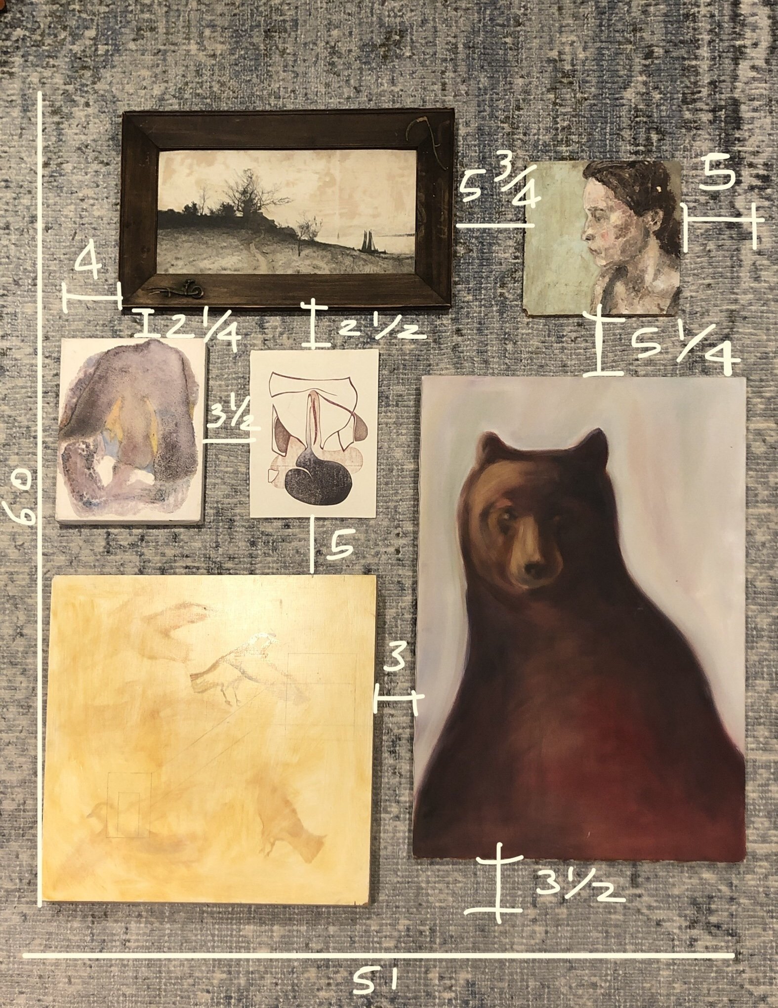
Interior renovation and custom furniture design [in progress]
©
Interior renovation and custom furniture design
Location
East Village• New York City
Year
2023
Carpentry
Takeshi Miyakawa
Status
In progress
For behind the wooden wainscots of all the old houses in Gloucester, there are little mouse staircases and secret trap-doors; and the mice run from house to house through those long narrow passages; they can run all over the town without going into the streets.
Beatrix Potter, The Tailor of Gloucester

Samples SHADE rug • Design Begum Cana Ozgur, 2018 • Handmade by Nanimarquina


One place suits one person, another place suits another person.
For my part, I prefer to live in the country, like Timmy Willie.
Beatrix Potter
(The Tale of Johnny Town-Mouse)

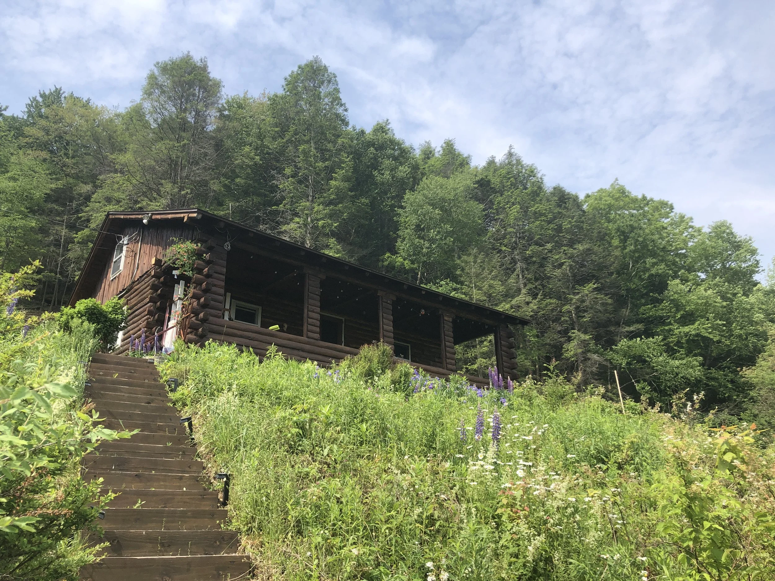
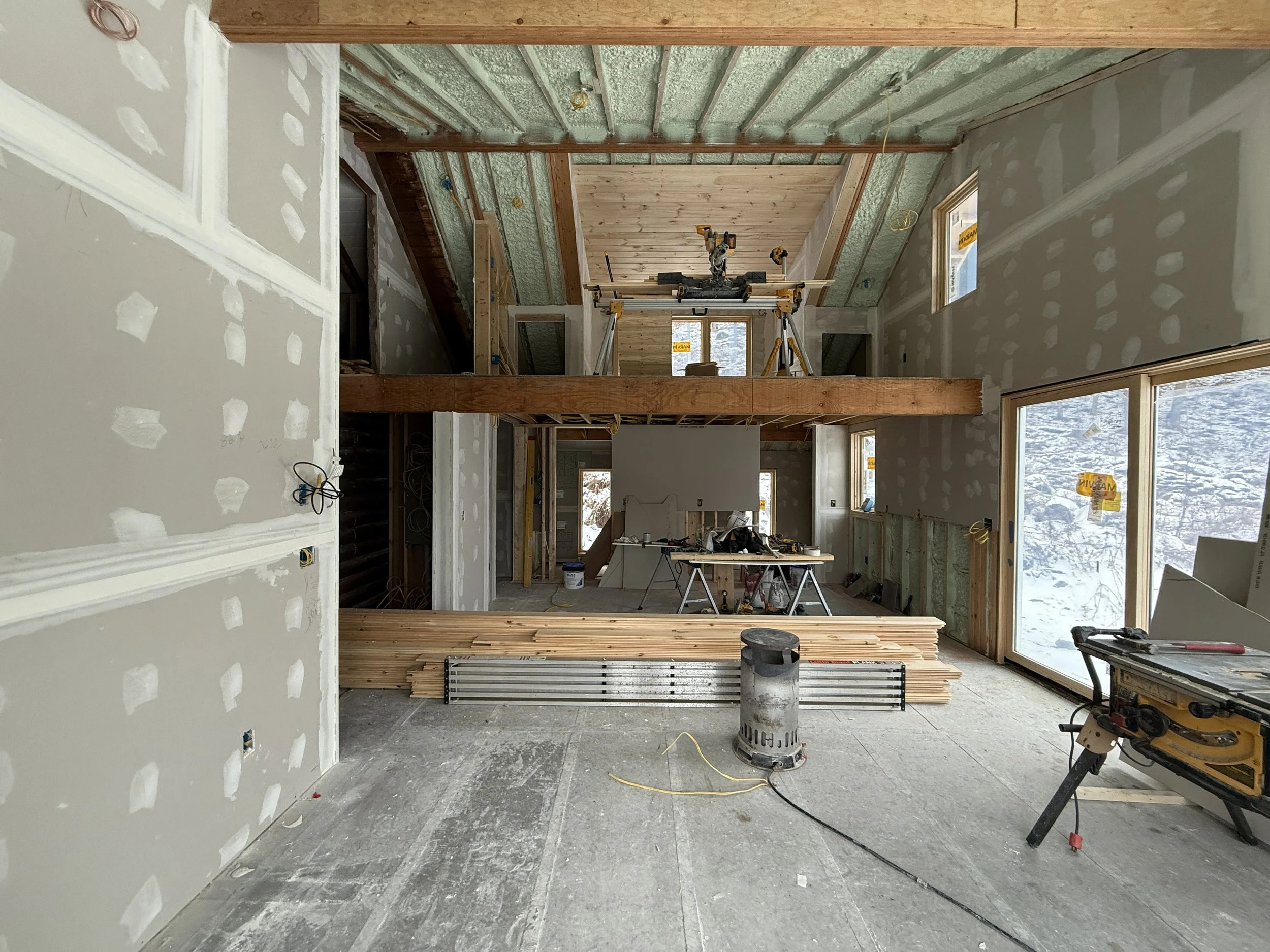
The project combines the renovation of a 1976 log cabin with the addition of a new volume oriented towards the sunset and the valley.
The challenges and opportunities of adapting the original log structure and embracing the north-west orientation became apparent early in the project. By extruding the shape of the existing cabin and setting the connection back from the front façade, it was possible to seamlessly merge old and new under one continuous roof, and optimise the materials, structure and thermal envelope of each of the two volumes.
The interiors are designed to bring natural light from the back of the structure to the front, and to suggest a sense of wonder as the scale of the spaces changes from room to room.
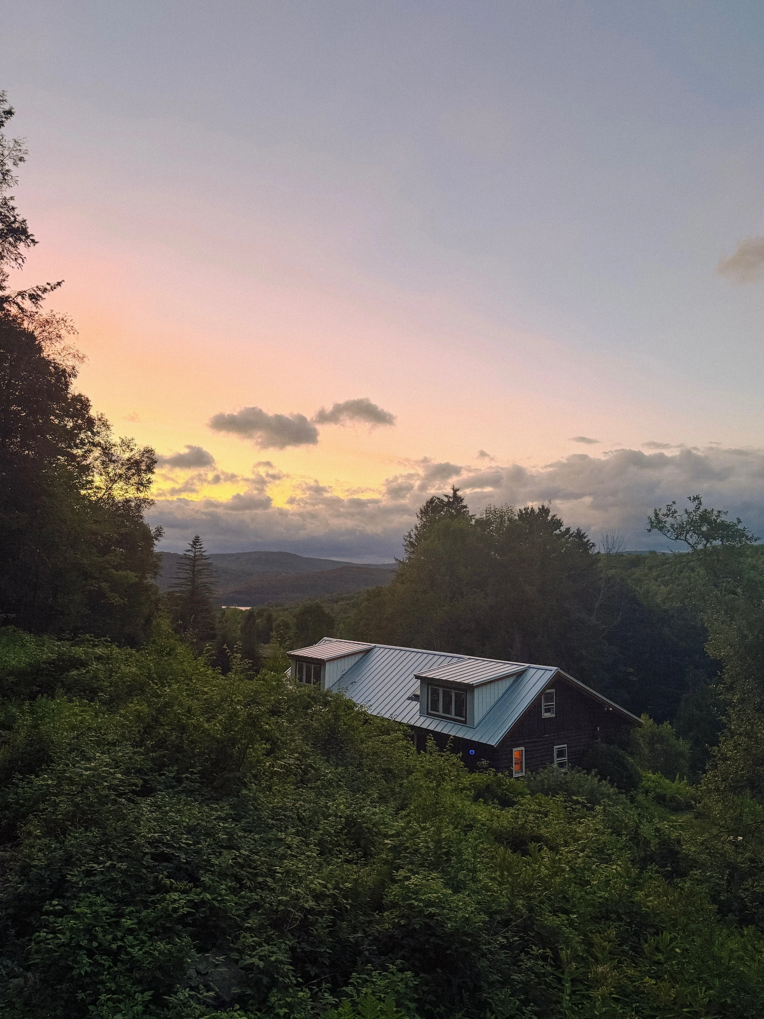
New addition and renovation of log-cabin
Architect
Studio STE
Location
Catskills • NY
Year
2022 • 2025
Photo © Renee Zalles




La Porte ! La porte, c'est tout un cosmos de l'Entr'ouvert.
On dirait toute sa vie si l'on faisait le récit de toutes les portes qu'on a fermées, qu'on a ouvertes, de toutes les portes qu'on voudrait rouvrir.
Gaston Bachelard, La poétique de l'espace. (1957)
For the door is an entire cosmos of the Half-open.
If one were to give an account of all the doors one has closed and opened, of all the doors one would like to re-open, one would have to tell the story of one's entire life.
Gaston Bachelard, The Poetics of Space. (1957)
Interior renovation of a 800 Sf apartment
Location
Elizabeth Street • SoHo • New York City
Year
2021
Photo
Cris Moor
Located on the 5th floor of a 1920s building on Elizabeth Street in SoHo, this project began with the goal of combining two small apartments into a single, more spacious unit.
As design possibilities were explored, the desire to preserve two original, large, slender windows prompted the decision to pursue a thoughtful, light-touch renovation rather than a full-scale remodel.
From there, the project unfolded as a study in spatial relationships, playing with windows, doors, and thresholds to form a dynamic and interconnected interior.

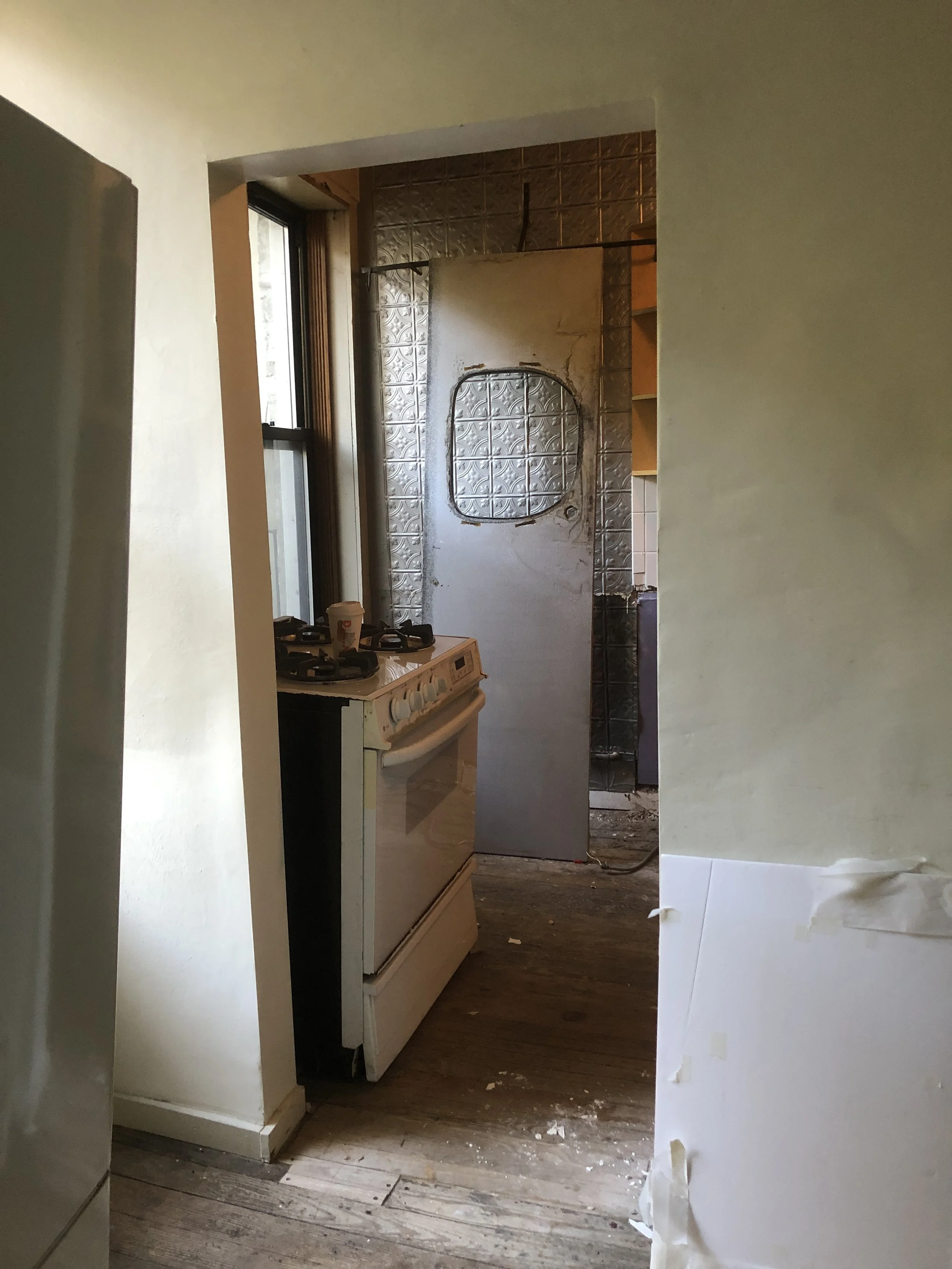


The renovation preserves and values existing details throughout the space.
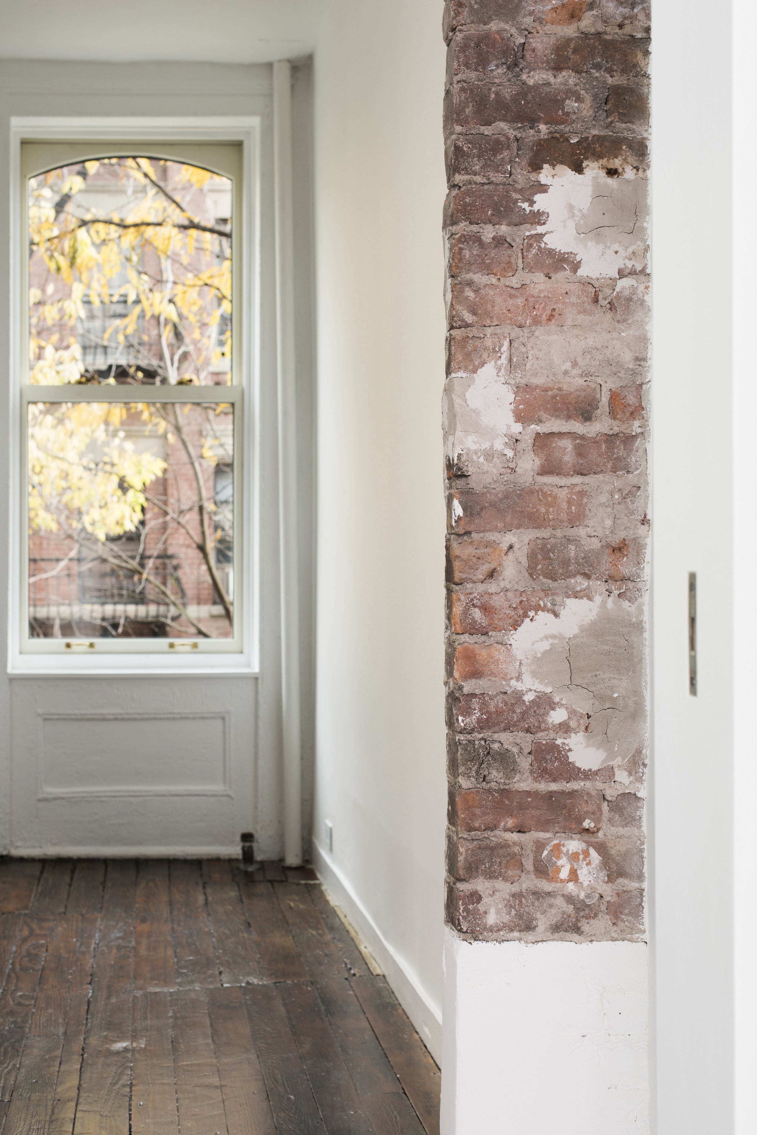
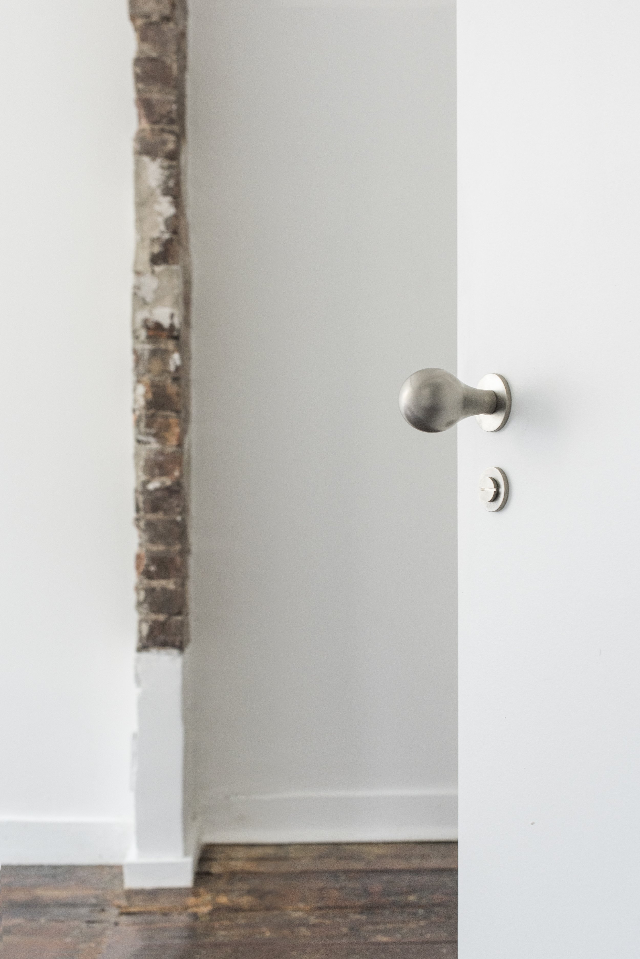
The original floors have been treated with a protective satin finish. Baseboards, window frames, doors and their handles - all have been preserved, including multiple layers of paint and imperfections.
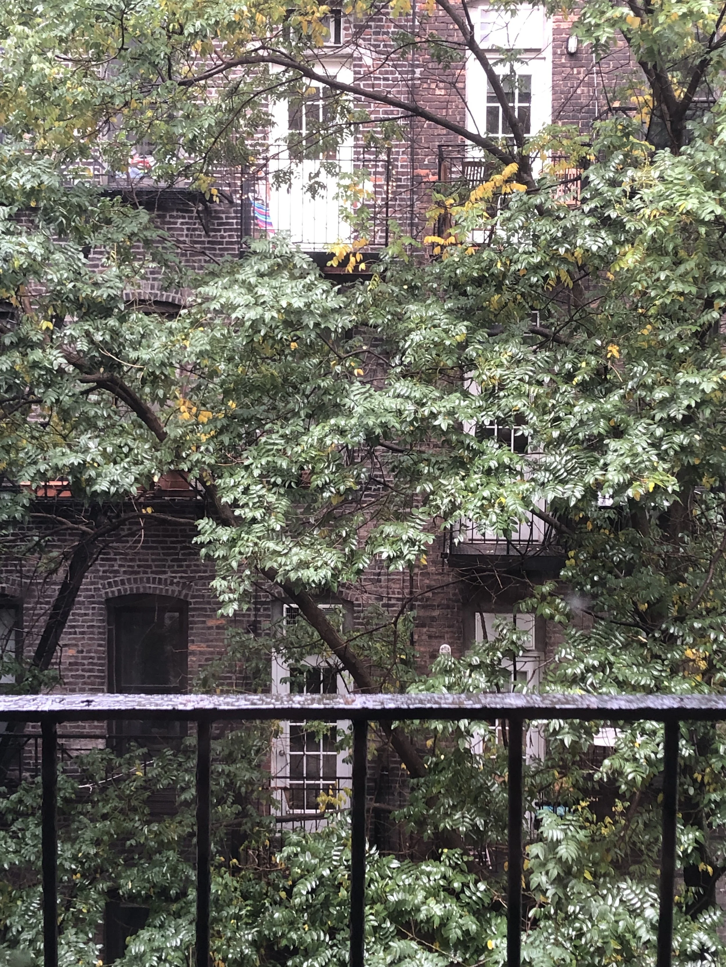
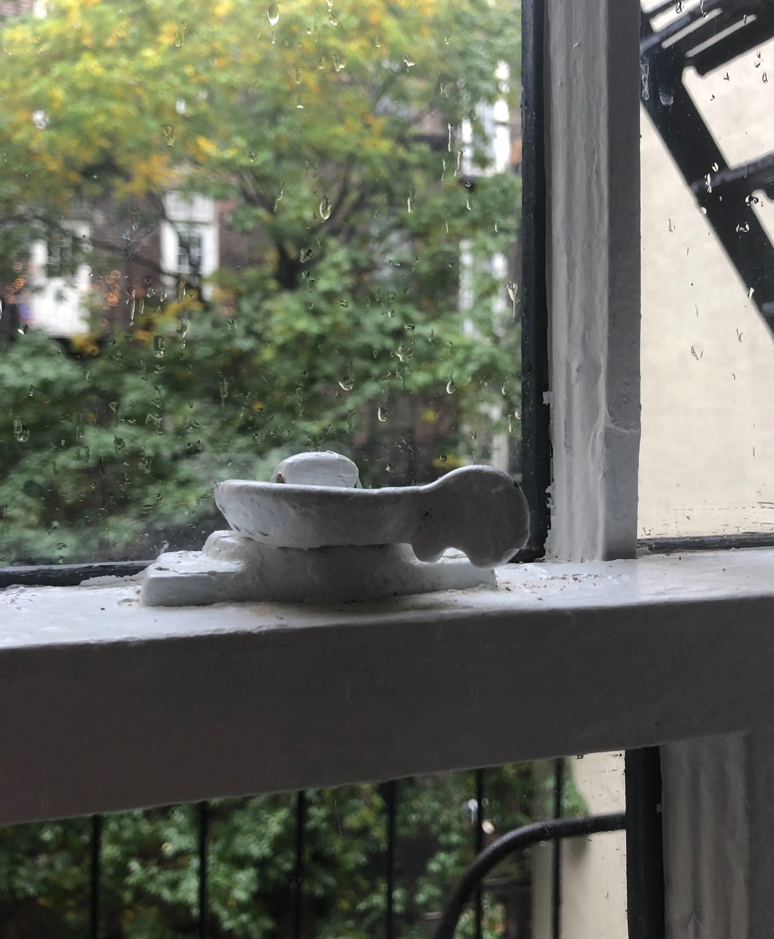

Every room, with the exception of the washrooms, has at least two doors. The resulting layout allows for unexpected views and opens up the space to new light and new possibilities for movement.
Rooms
Entry • Kitchen
Living Room
Dining Room
3 Bedrooms
Bathroom
Powder room
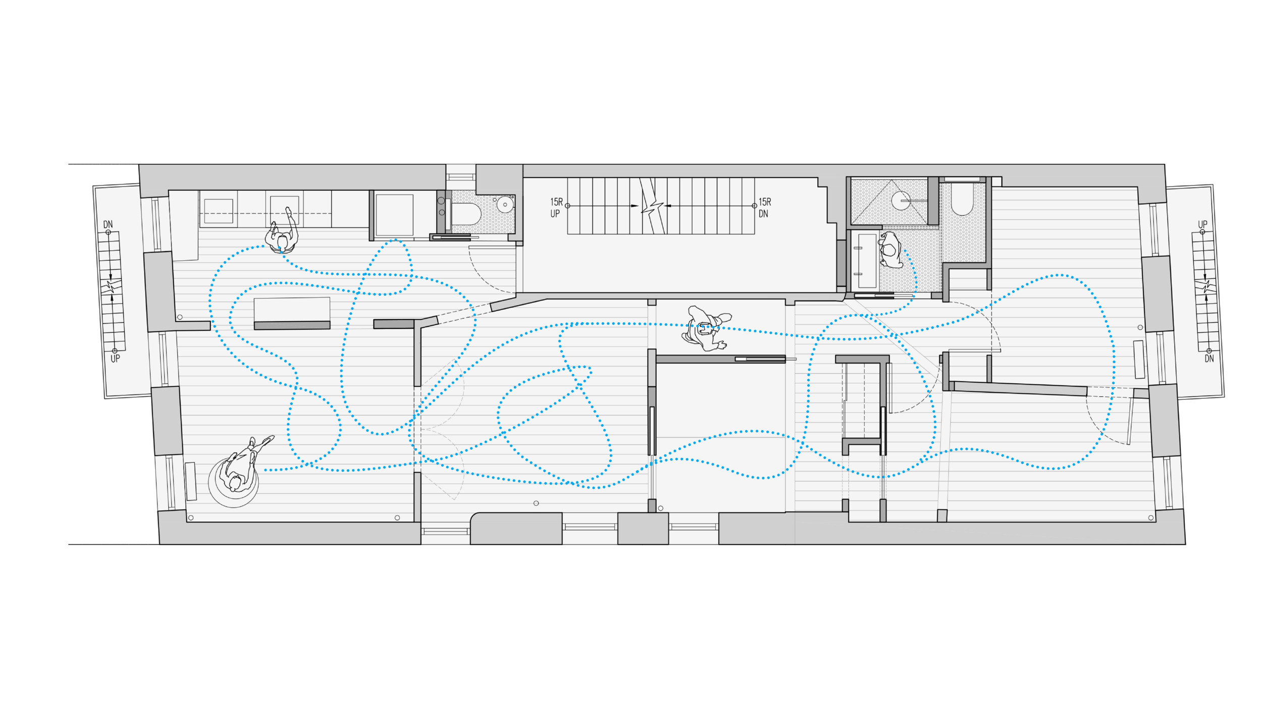


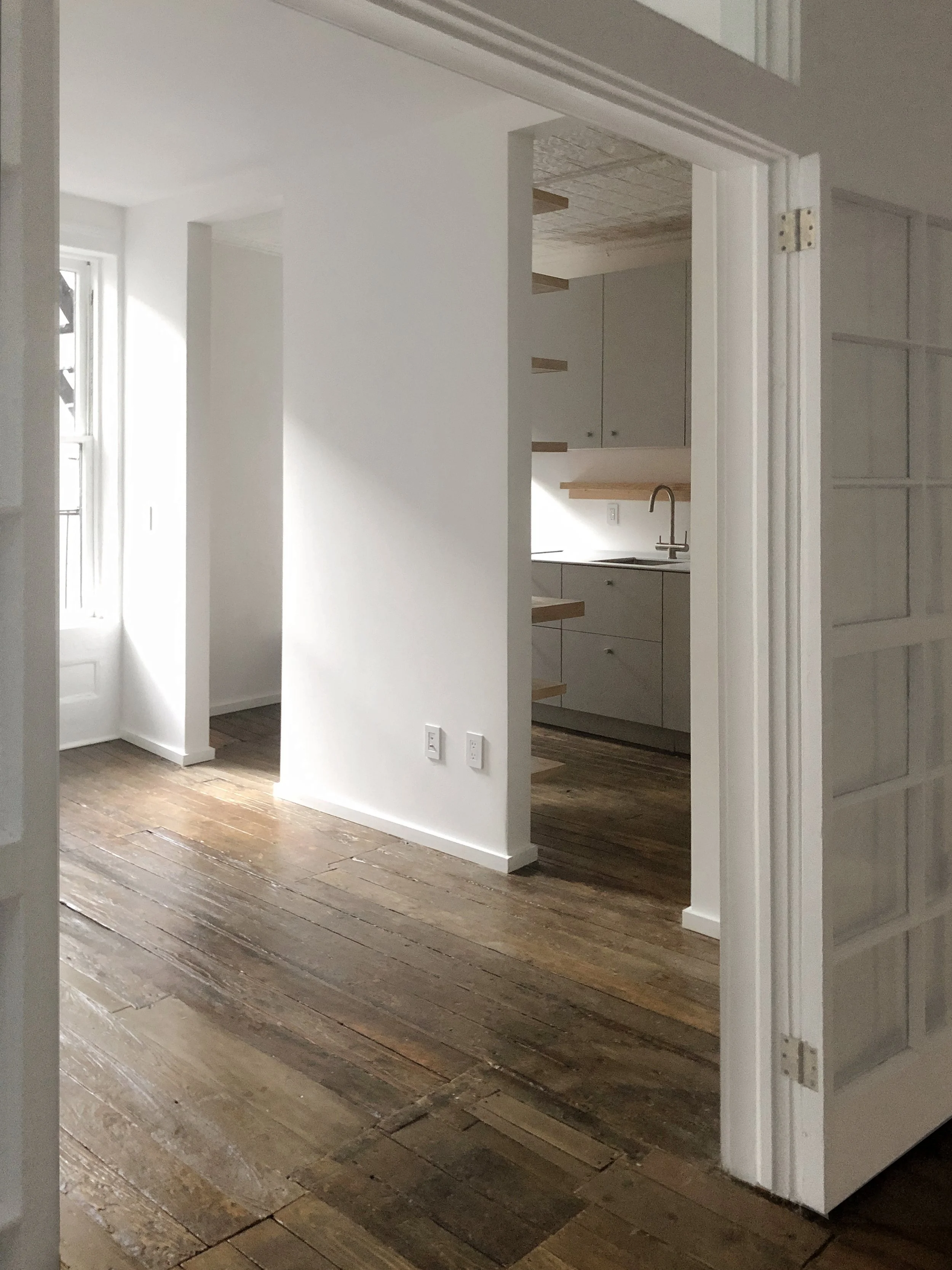
The renovation connects and opens views across rooms, multiplying sources of natural light and cross-ventilation. The new distribution allows for multiple connections between spaces, bringing light throughout the apartment - from morning sunrise in the east to late afternoon sunset in the west.


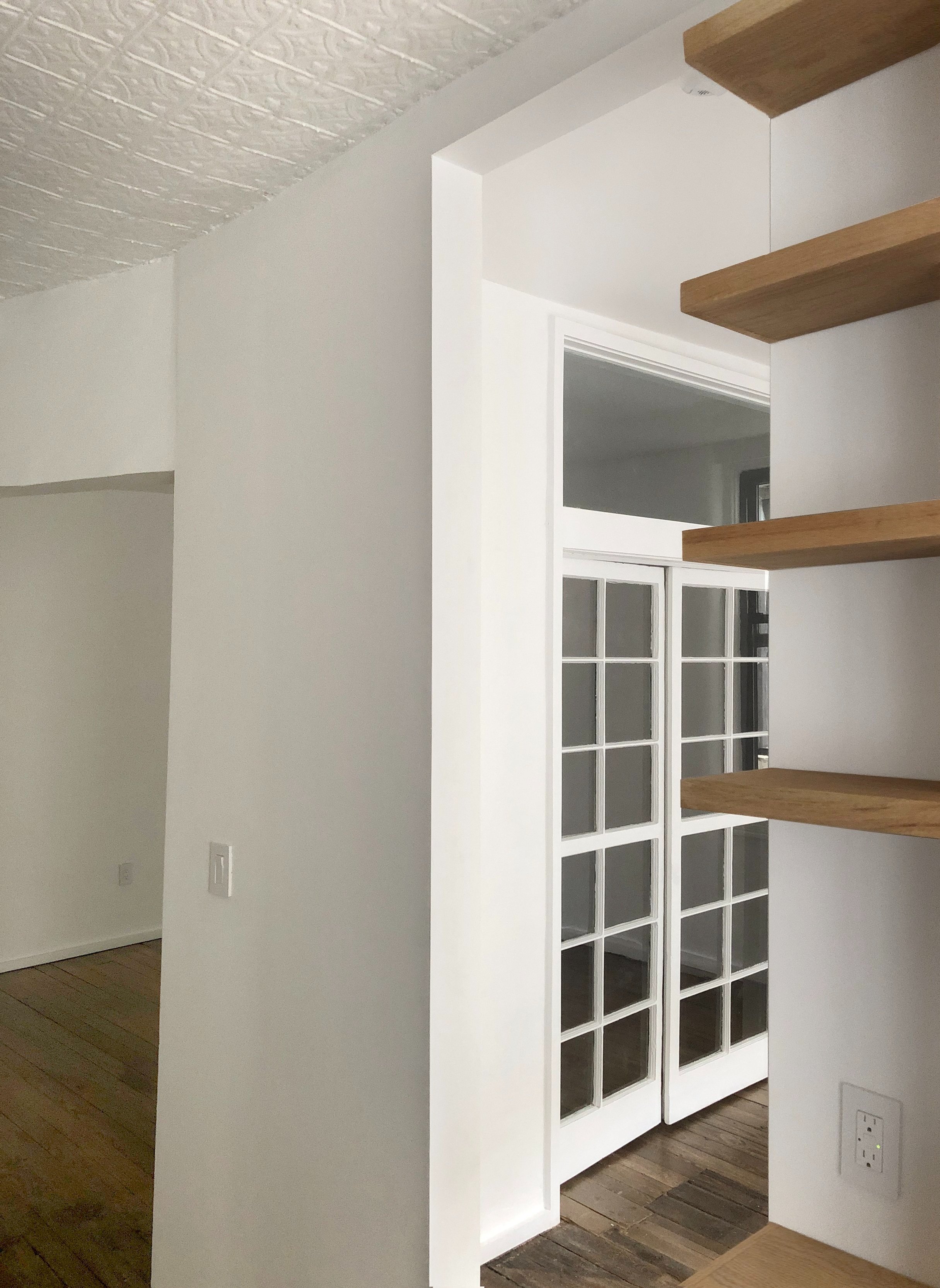

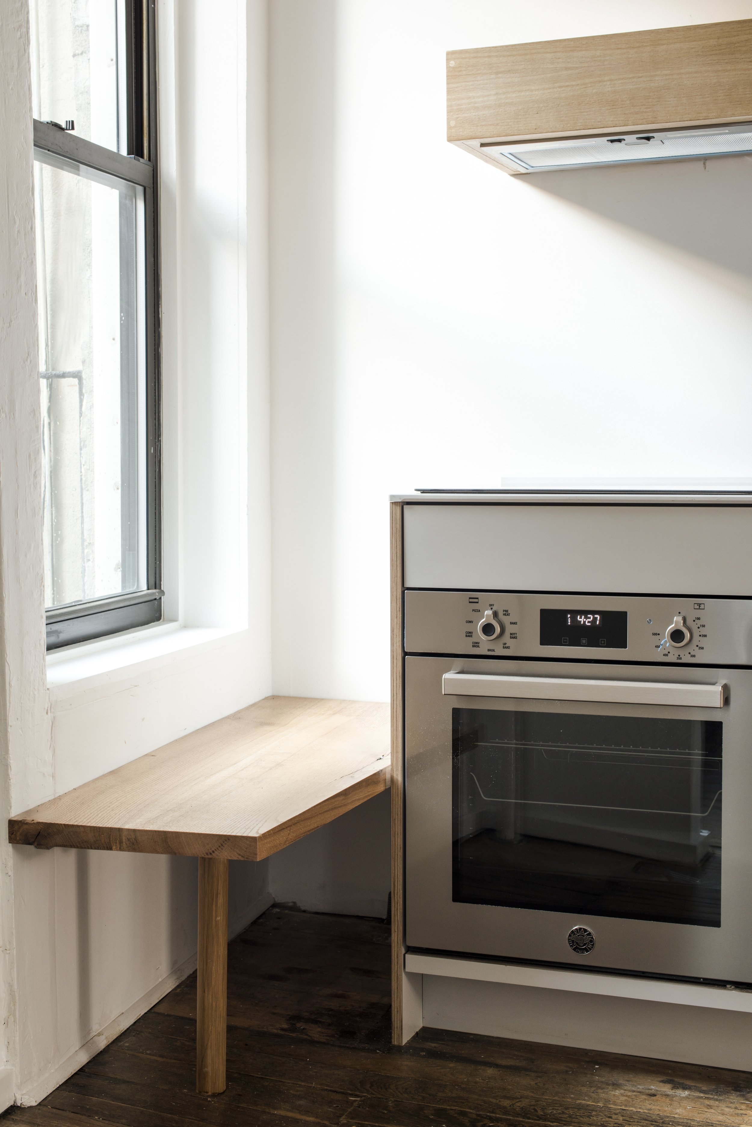

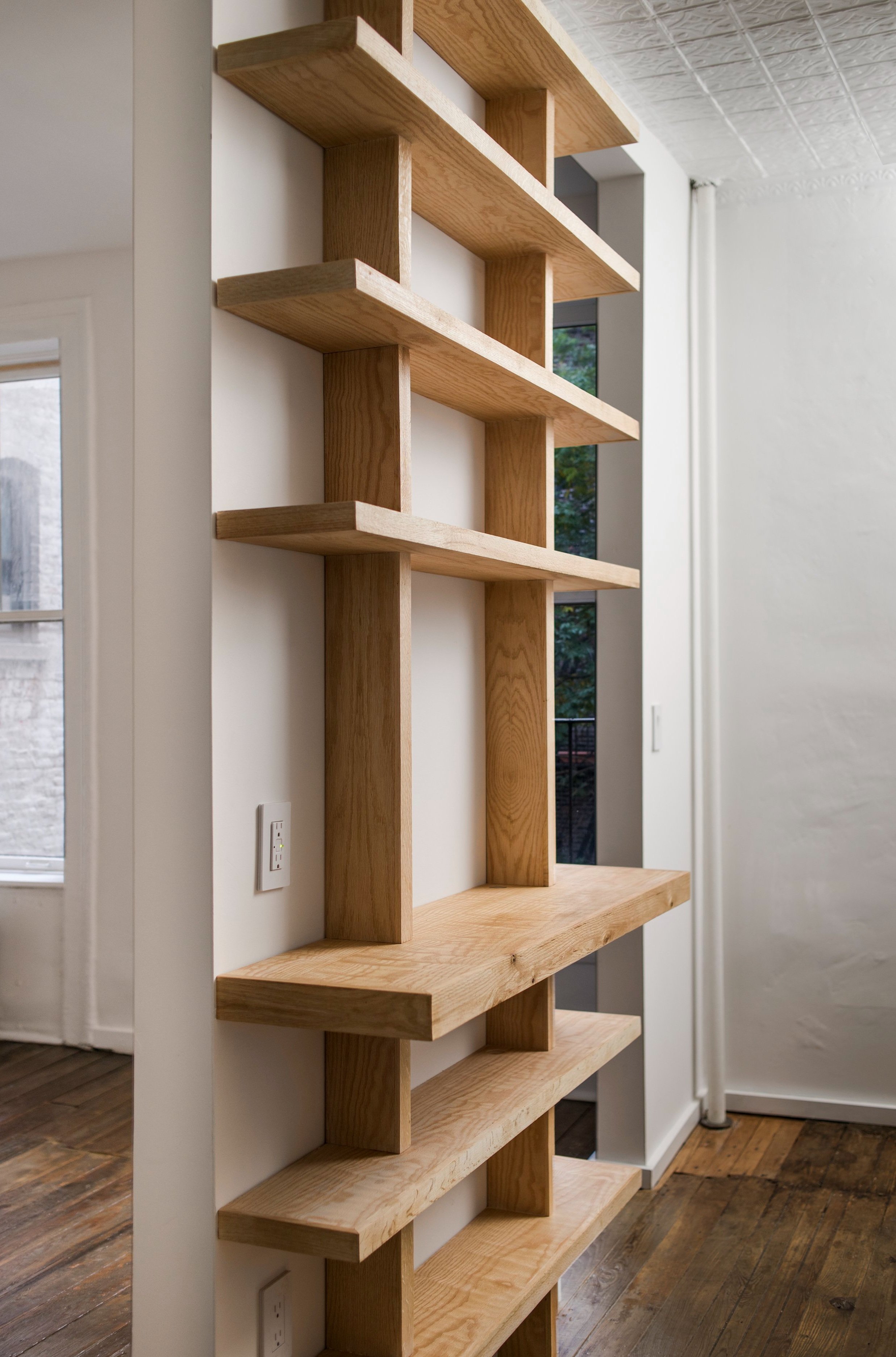
The primary alterations were made to the kitchen and bathrooms, where new components are introduced, thanks to a more open reconfiguration.
New cabinets and benches, in a matte light gray and oak finish, envelop the kitchen in a calm and serene atmosphere.
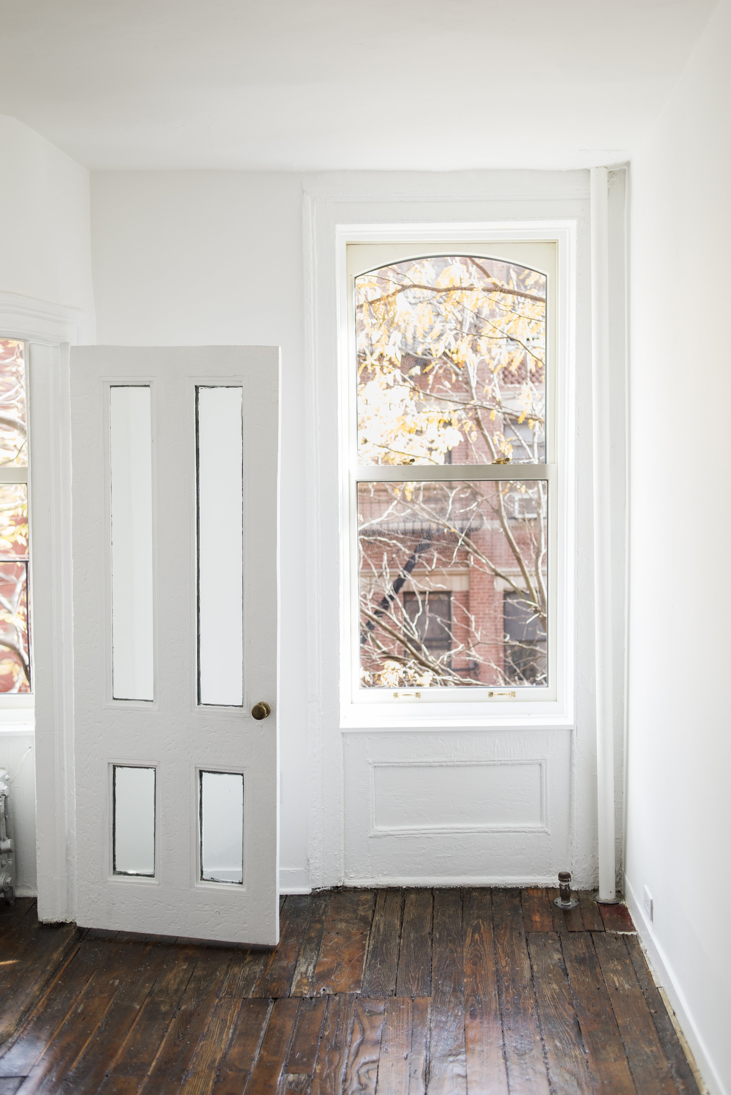


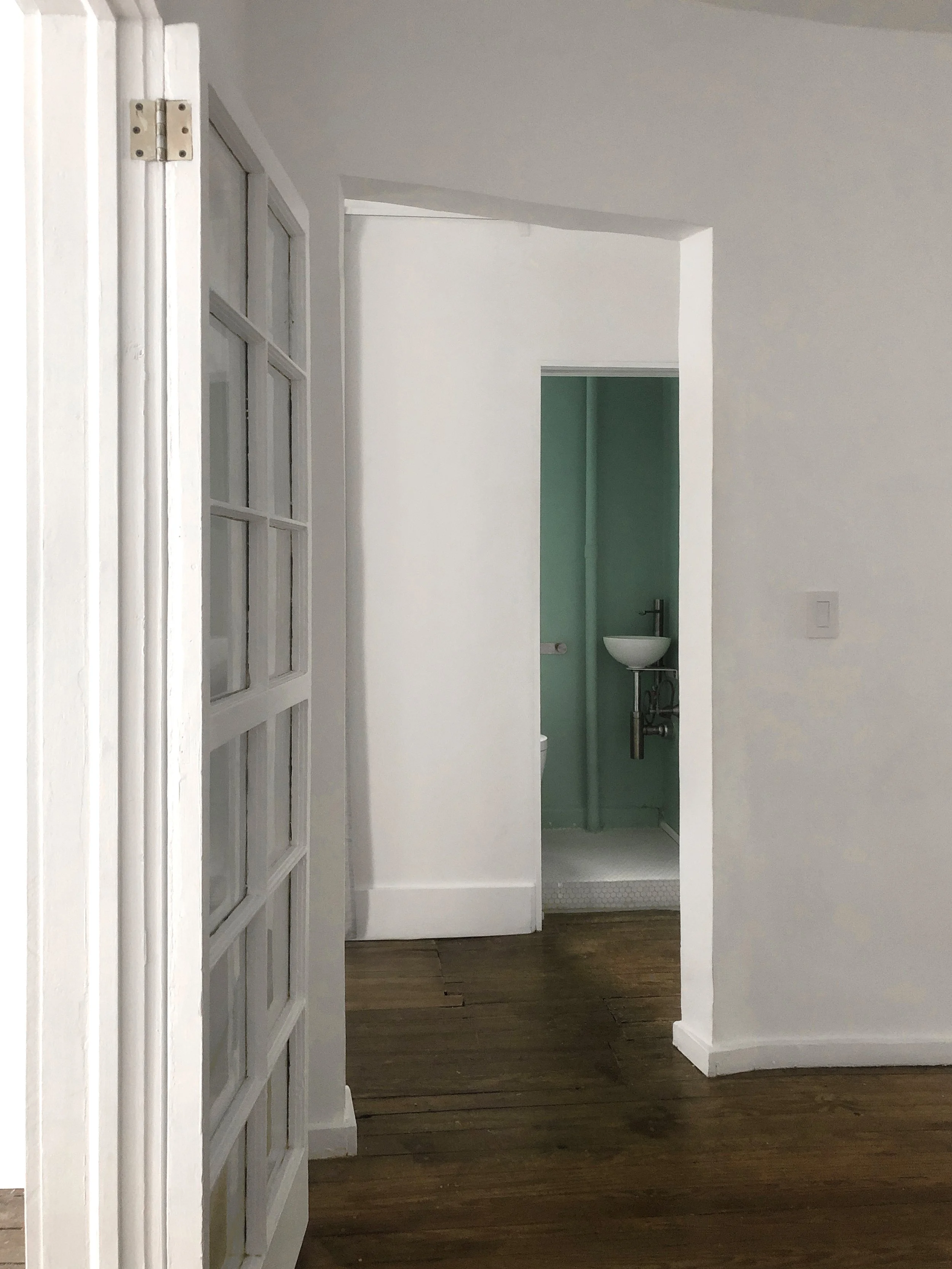
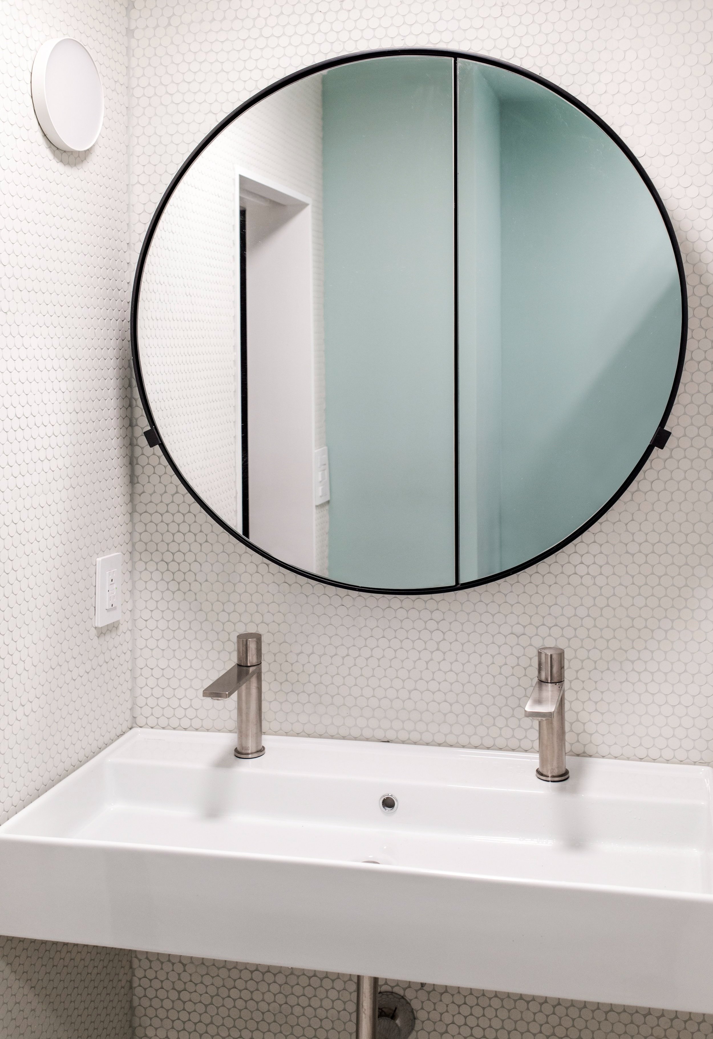
The new materials introduced into the space are understated and elemental, chosen to complement the apartment’s existing character.
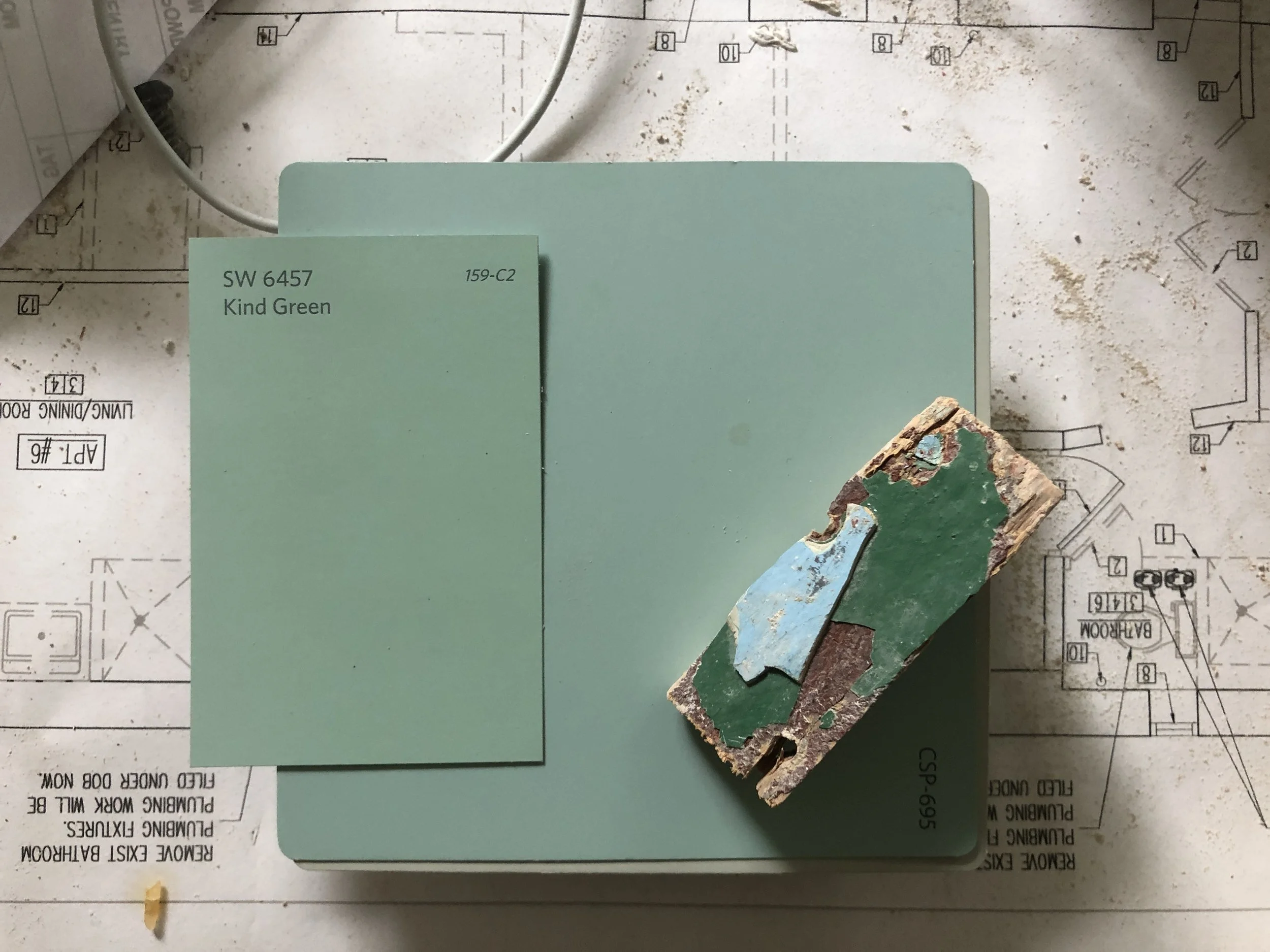
Round matte mosaic tiles add texture and depth, while the aqua-green paint—selected to echo the tones found in the original layers—creates a subtle connection between past and present.
These elements, along with a restrained material palette, bring a sense of cohesion and quiet refinement to the renovation.


Door:“Why it’s simply impassible”
Alice: “Why, don’t you mean impossible?”
Door: “No, I do mean impassible. (chuckles) Nothing’s impossible!”
Lewis Carroll, Alice's Adventures in Wonderland / Through the Looking-Glass

Can a sober and severe design evoke a sense of whimsical wonder and discovery? In a Lower East Side apartment, a table, a carpet and a room-sized wooden box are designed with a kind of architectural magical realism: the childlike feeling that one has when finding - hidden in plain sight - a space that unfolds into a private and personal world.
This interior renovation took place on the second floor of a cast iron building, in a spacious loft filled with diffuse, indirect light. The original layout placed all the main living functions within the same open space, with the kitchen, dining, and living areas set at the extremities, leaving its center empty and unused.
It is unusual to break up a majestic, light-filled space. Yet the owners, a young couple who had lived there for several years, were confident that separate spaces would better suit their needs. The idea was prescient: the pandemic hit shortly after, and the desire to live in an open loft completely lost its appeal. Partitions could provide options for privacy and the feeling of not being in the same space all of the time.
Project nominated for the 2023 ArchDaily Building of the Year Awards • Housing category

The proposed redesign fully embraced this challenge, breaking up the single finite room, and replacing it with smaller spaces that would not immediately reveal their boundaries. In subtle ways, the new partitions act like the “beloved hedge” which prevented philosopher poet Giacomo Leopardi from seeing the horizon, allowing him to imagine endless spaces instead. The sequence of spaces, and views from room to room, leave options for the mind to wander.
Interior renovation
Carpentry
Takeshi Miyakawa
Carpet consultant
Begum Cana Ozgur
Location
New York City
Year
2021

This solitary hill has always been dear to me
And this hedge, which prevents me from seeing most of
The endless horizon.
But when I sit and gaze, I imagine, in my thoughts
Endless spaces beyond the hedge,
An all encompassing silence and a deeply profound quiet,
To the point that my heart is almost overwhelmed.
The infinite, Giacomo Leopardi, 1798 – 1837
The exact position of new partitions was tested several times, using wide textiles normally employed for agricultural use. Like playing with an oversized dollhouse, these real-scale prototypes were tested at different times of the day and with different light conditions. In the final version, the revised interior layout pivots around a new, unobtrusive element: a room-sized wooden box, hiding in plain sight within the apartment.

© Rafael Gamo

From the exterior, the box is almost unnoticeable. Like an impossible object from a dream, the wooden box feels like a slice of interstitial space - at times infinitely compressed, and then suddenly expanding into a room which was not there before.
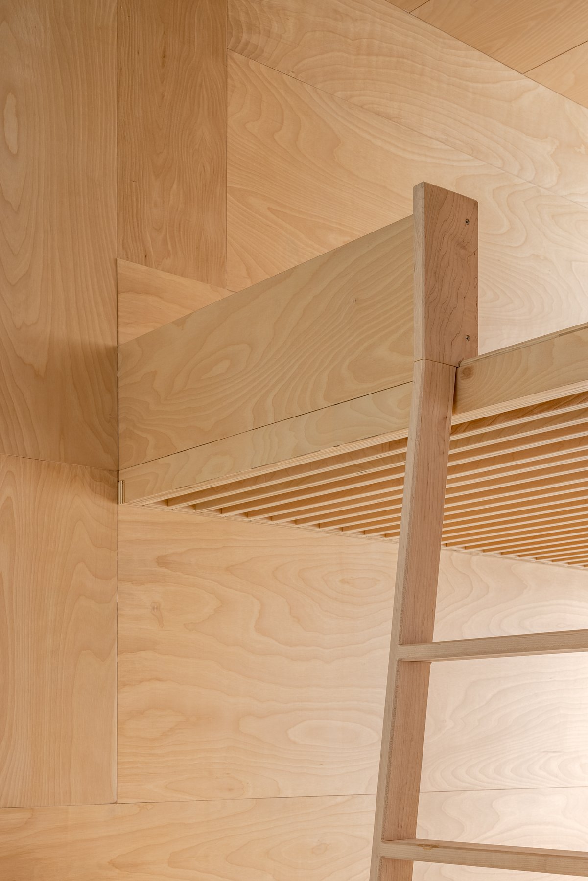
Entering into the box offers a world apart. As one steps into the box, the space shrinks to a cocoon, contrasting with the vastness of the large loft. The interior plays with a smaller height and a tighter width, shifting from a grand scale to an intimate and quiet one.
© Rafael Gamo

© Rafael Gamo

© Rafael Gamo
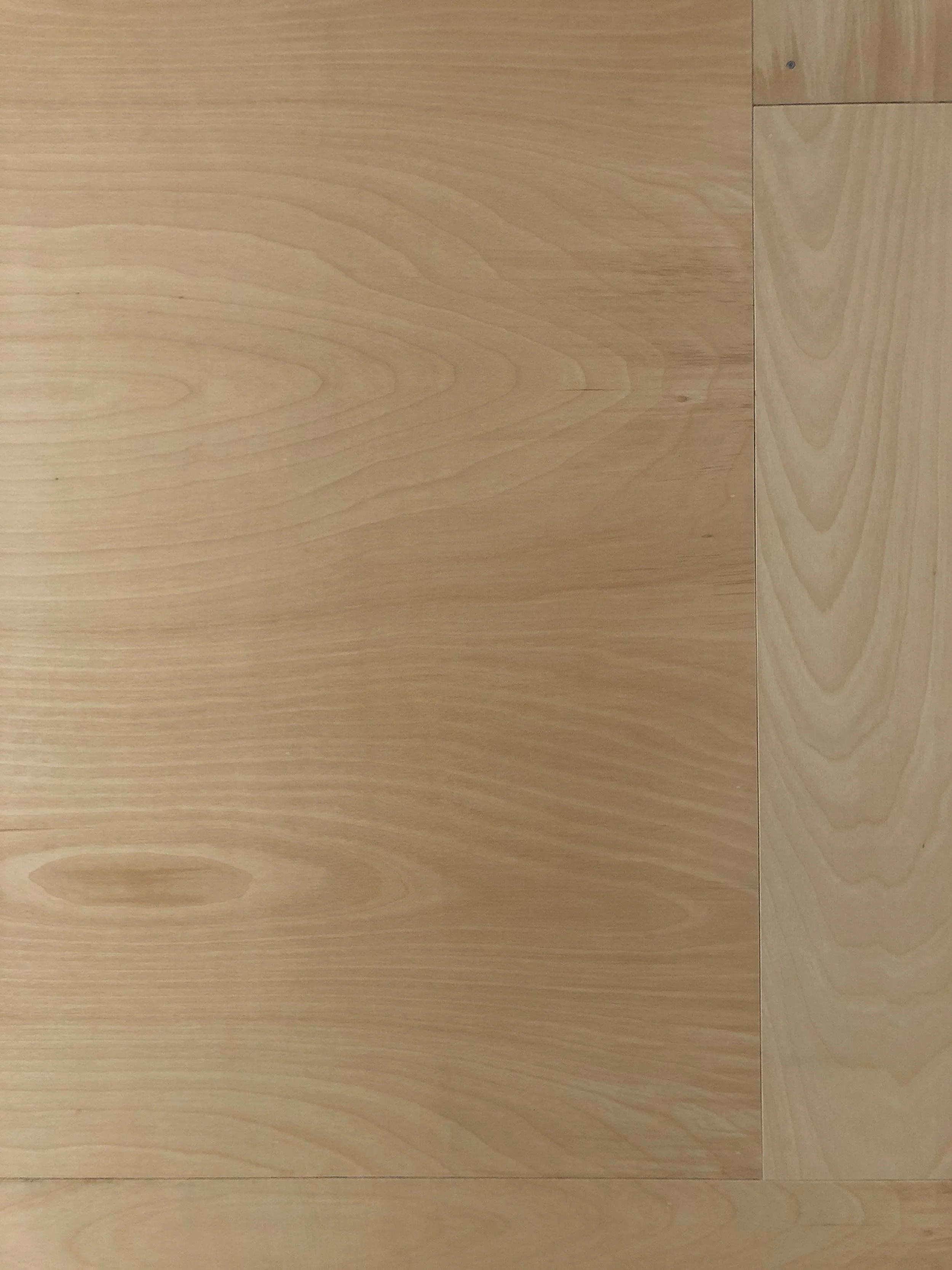
Its interior - which is wood cladded like a renaissance “studiolo” - is warm and rich. The box’s careful construction, by Japanese carpenter Takeshi Miyakawa, gives it a kind of meticulous preciousness. A translucent finish emphasizes the rich pattern of the plywood.
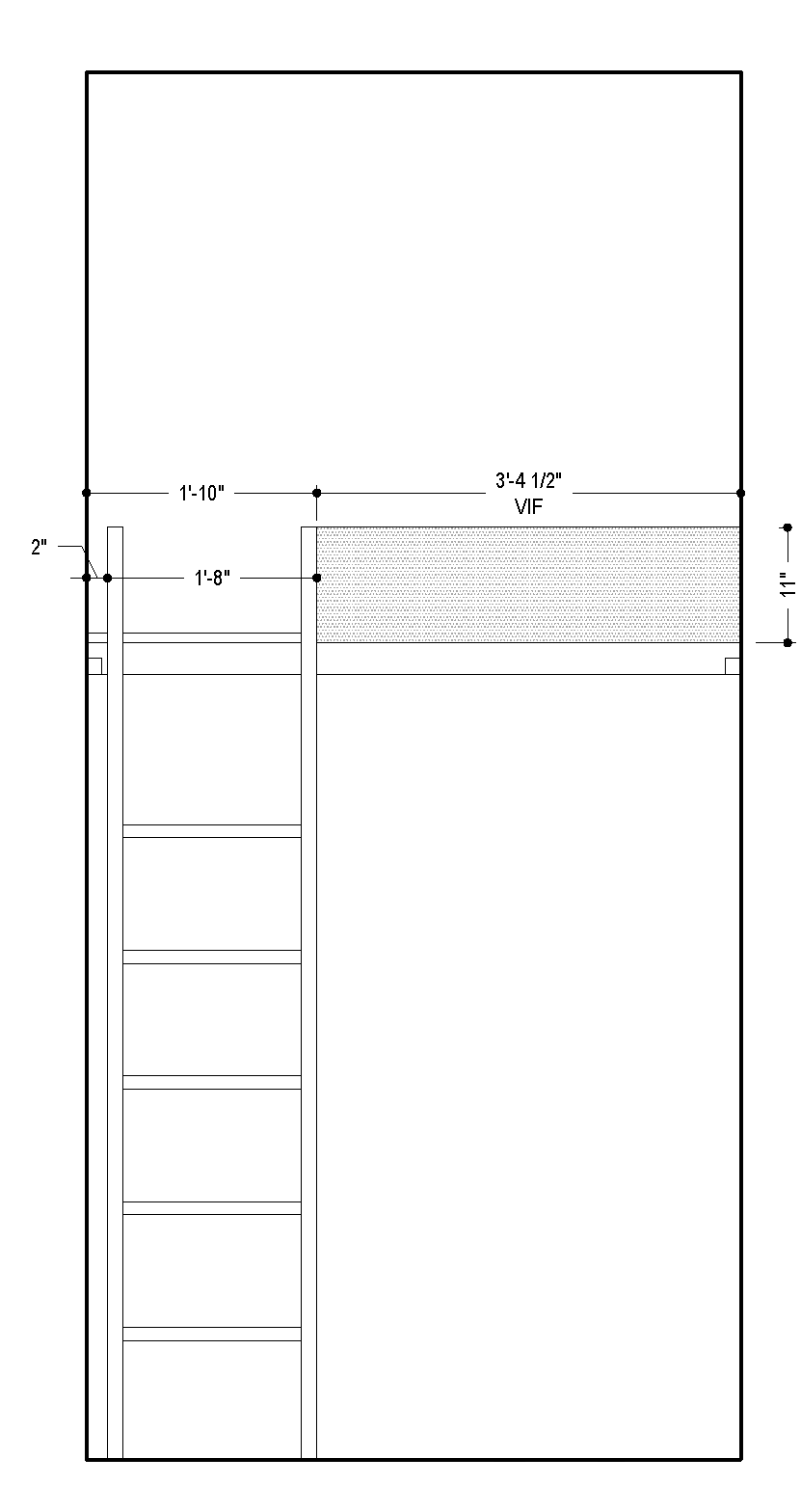
The composition of the panels is designed to visually structure the space, as well as minimize the use of material and avoid waste. The double height accommodates different options for use over time: a space for play, rest, work or study.
And as one leaves the box, the spaciousness of the loft, its tall columns and sudden expansiveness, comes back into view as a pleasant surprise.
ALICE
She drank from a bottle called DRINK ME
And she grew so tall,
She ate from a plate called TASTE ME
And down she shrank so small.
And so she changed, while other folks
Never tried nothin' at all.
― Shel Silverstein, Where the Sidewalk Ends
“Because one thing he was good at, possibly the only thing, was imagining things so clearly that he almost saw and heard them.”
― Michael Ende, The Neverending Story


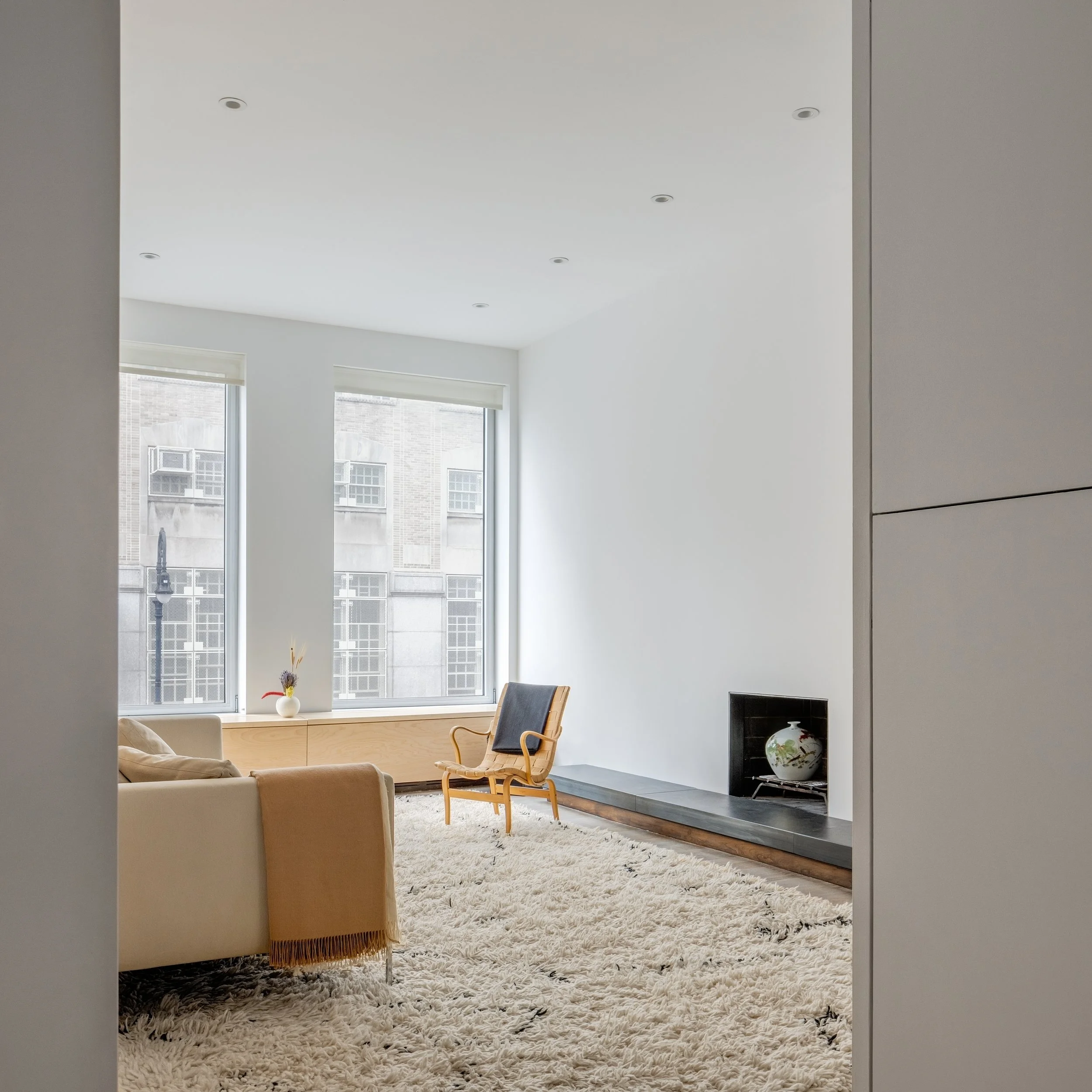
Without compromising the spaciousness of the original loft, the box adds complexity to the experience of the spaces and new possibilities to the life within. Wall-sized sliding doors enclose and define the box. When fully open, the doors contribute to uninterrupted circulation around the box. They allow soft-diffused light, coming from the North facing windows, to move from space to space. When the doors are closed, the box somehow vanishes from view.
© Rafael Gamo

© Rafael Gamo

© Rafael Gamo
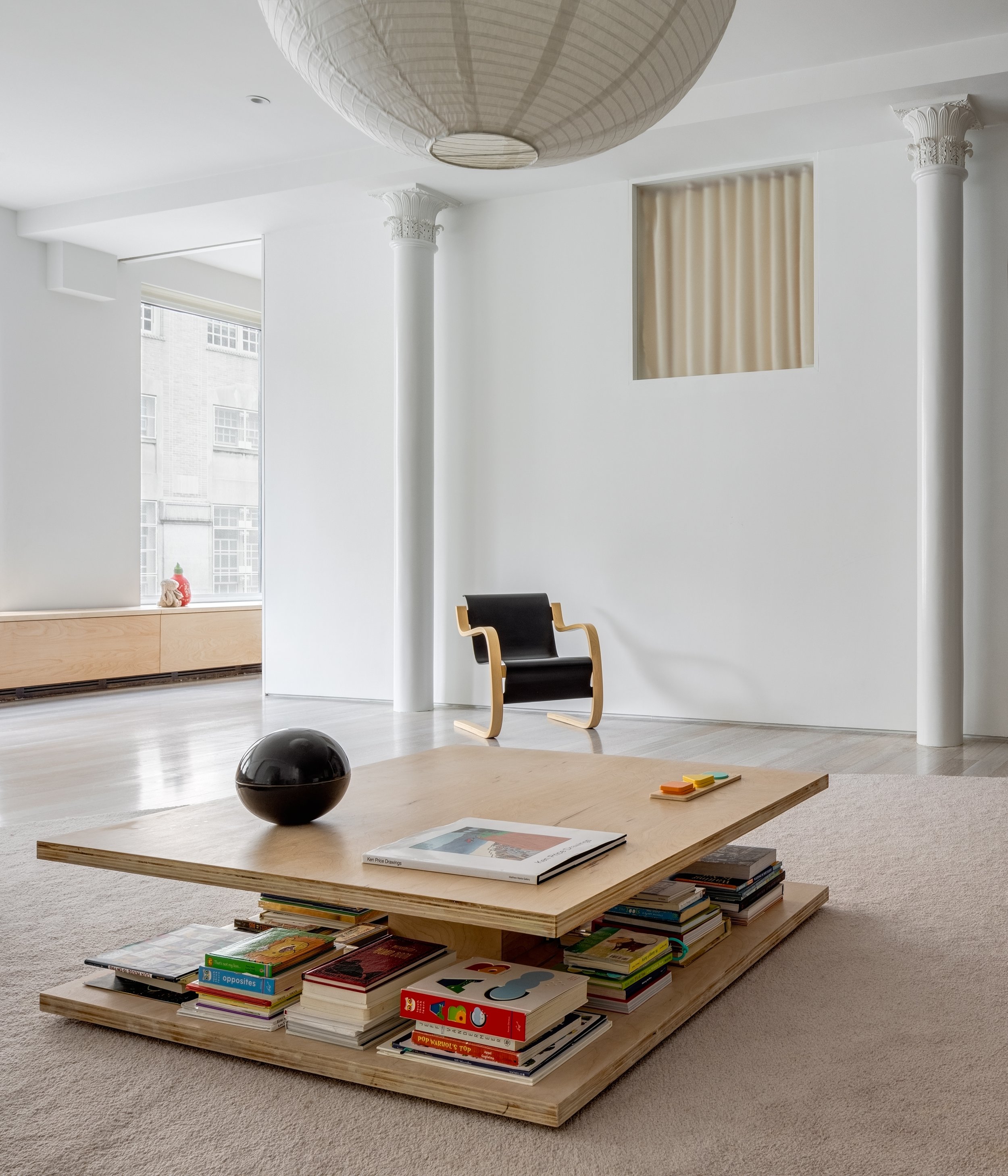
Deceptive scale is also at play with a sprawling custom carpet, hidden in plain sight in the living area. A note of softness and calm set right between the busy dining and kitchen areas, the carpet differentiates the central living space from the rest of the apartment.
© Rafael Gamo
© Rafael Gamo
Its color - a mix of pink, beige and blue - blends with the variegated tones of the wooden floor. The carpet is a 20” by 15” custom piece fabricated with the consultancy of designer Cana Begun. It is the largest object of the home - its irregular oval shape stretches to occupy as much space as possible - yet its subtle color and its unobtrusive shape render it oddly unnoticeable.

© Rafael Gamo

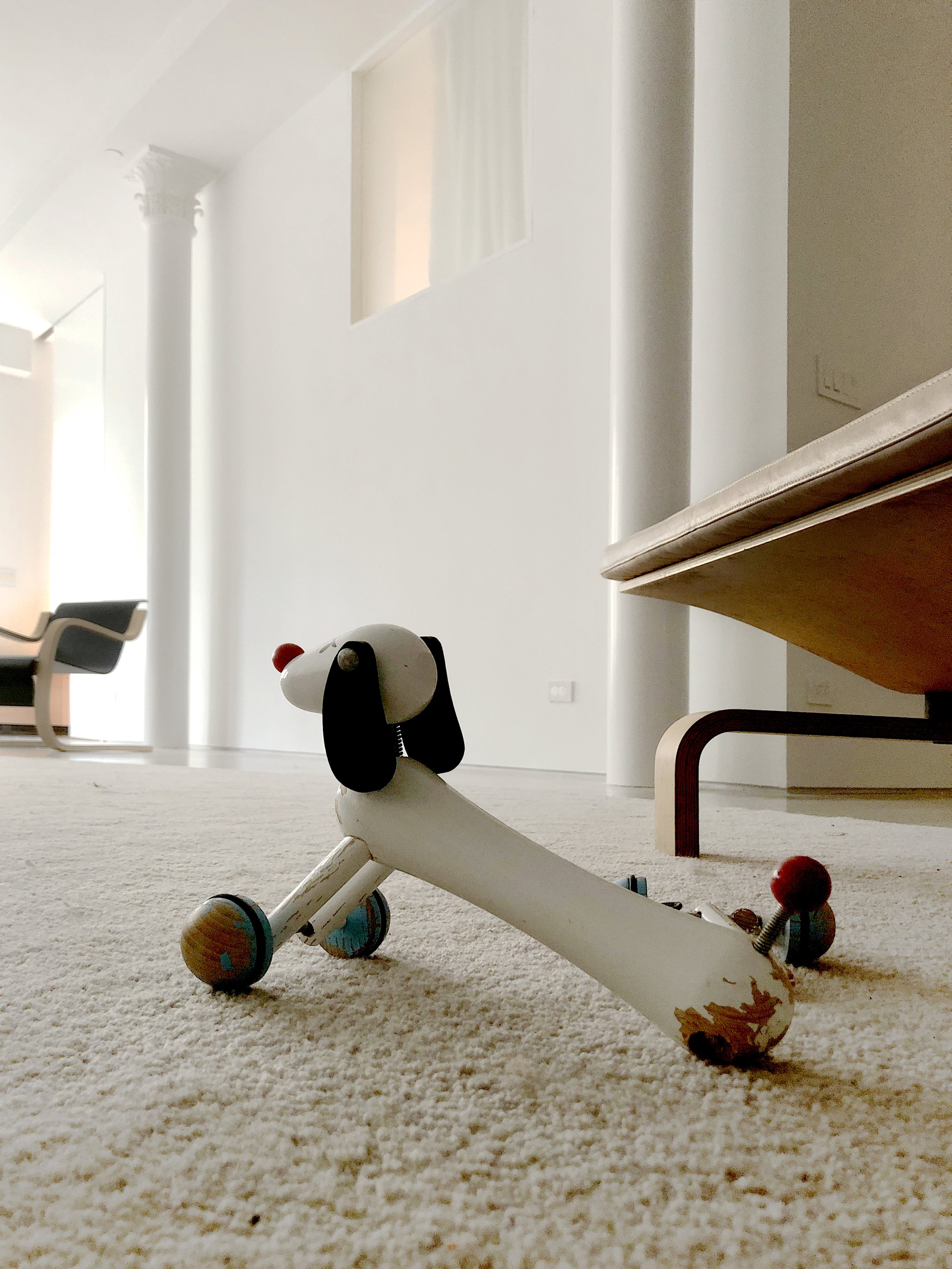
Stepping into the carpet suddenly leads into a different space. As the family has grown, with a toddler and a newborn baby, the carpet has become a shared space for relaxation and play. It is a soft and unexpected landscape, an area of stillness and warmth in the lively spaces of the loft.

© Rafael Gamo

© Rafael Gamo

© Rafael Gamo

© Rafael Gamo
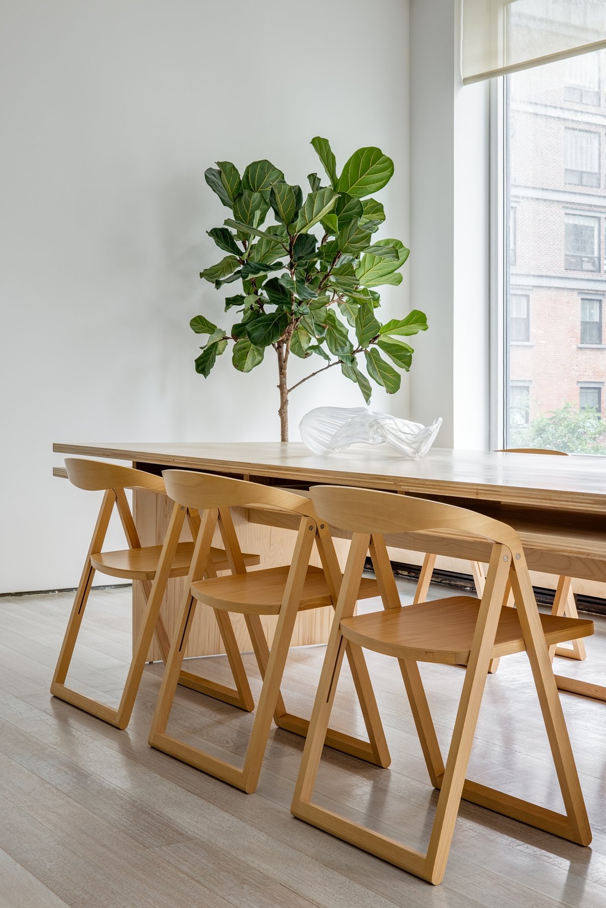
Lastly, among the objects at play is an unassuming table, slender and grand at the same time. The table accommodates eight to ten people and the 4’ depth comfortably allows a formal dining setting. It is constructed of 1 1/4” thick formaldehyde-free plywood. The 10’ length is monumental - yet well-proportioned to the scale of the space around it.
© Rafael Gamo
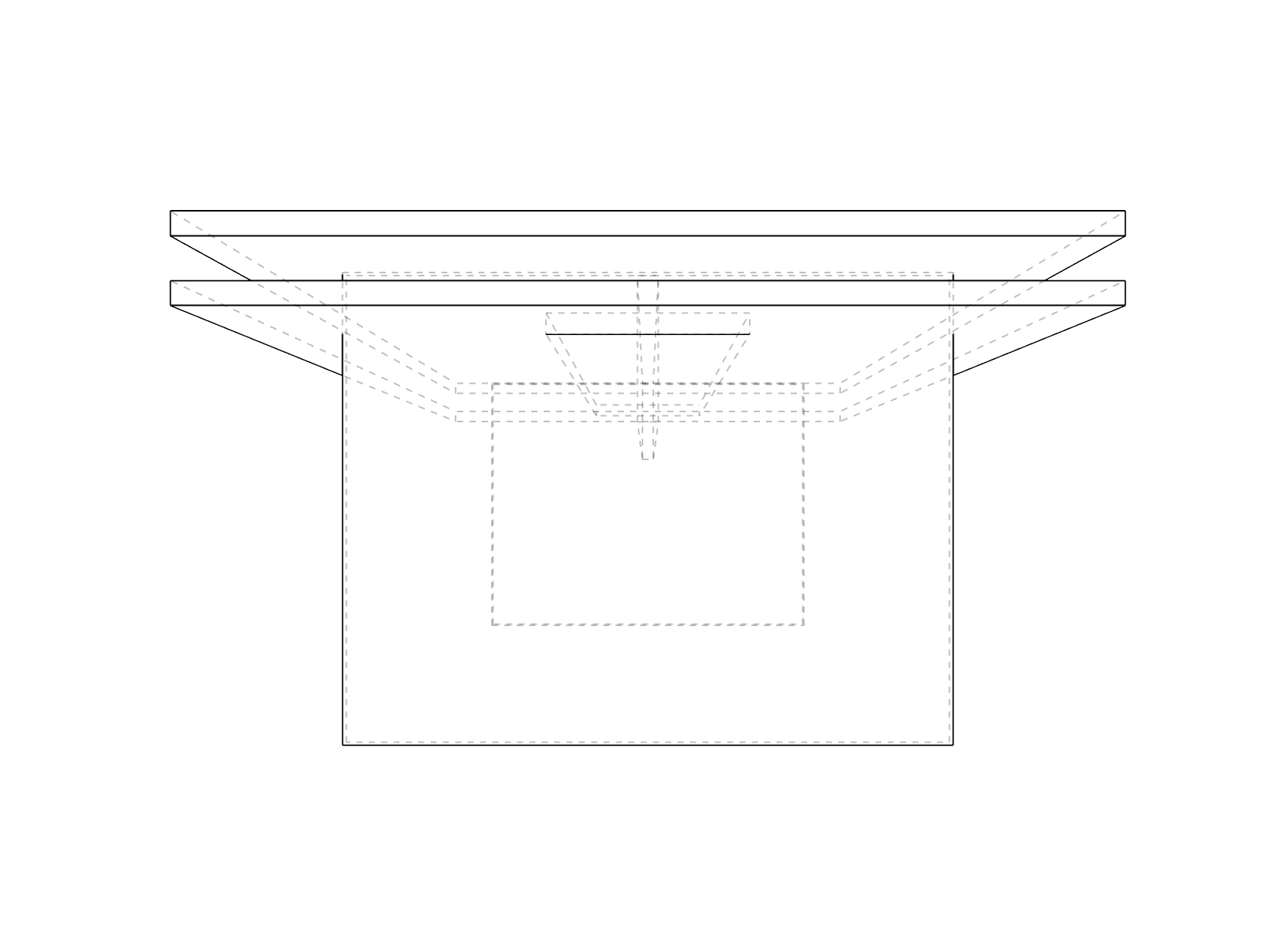
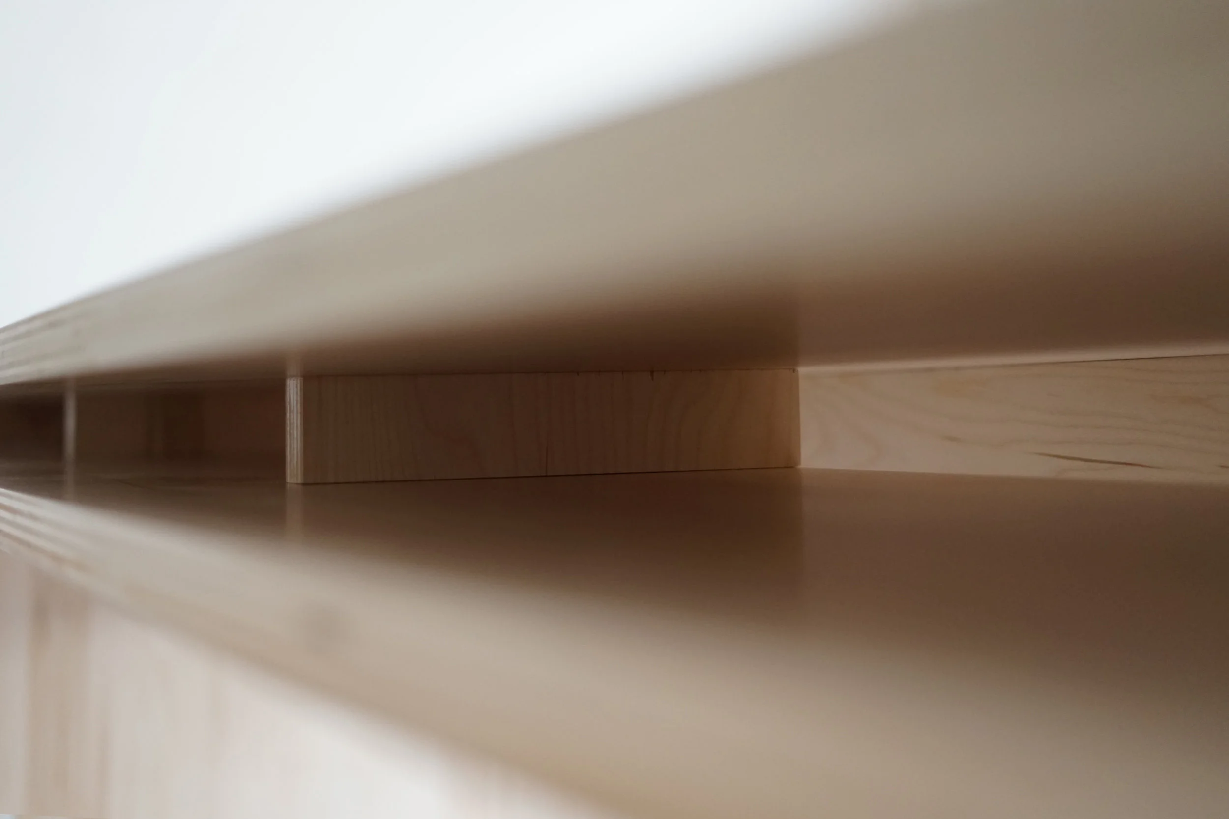
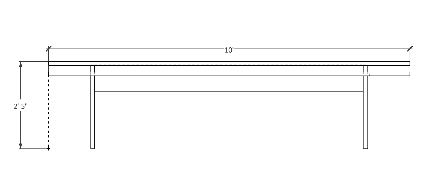
The most noticeable feature of the table is a double tabletop. Structurally, the layered tabletop acts as a beam to prevent flexion. Functionally, the lower tabletop allows for a rapid shift from work to dining - as computers, drawings, and paperwork are quickly stored away.
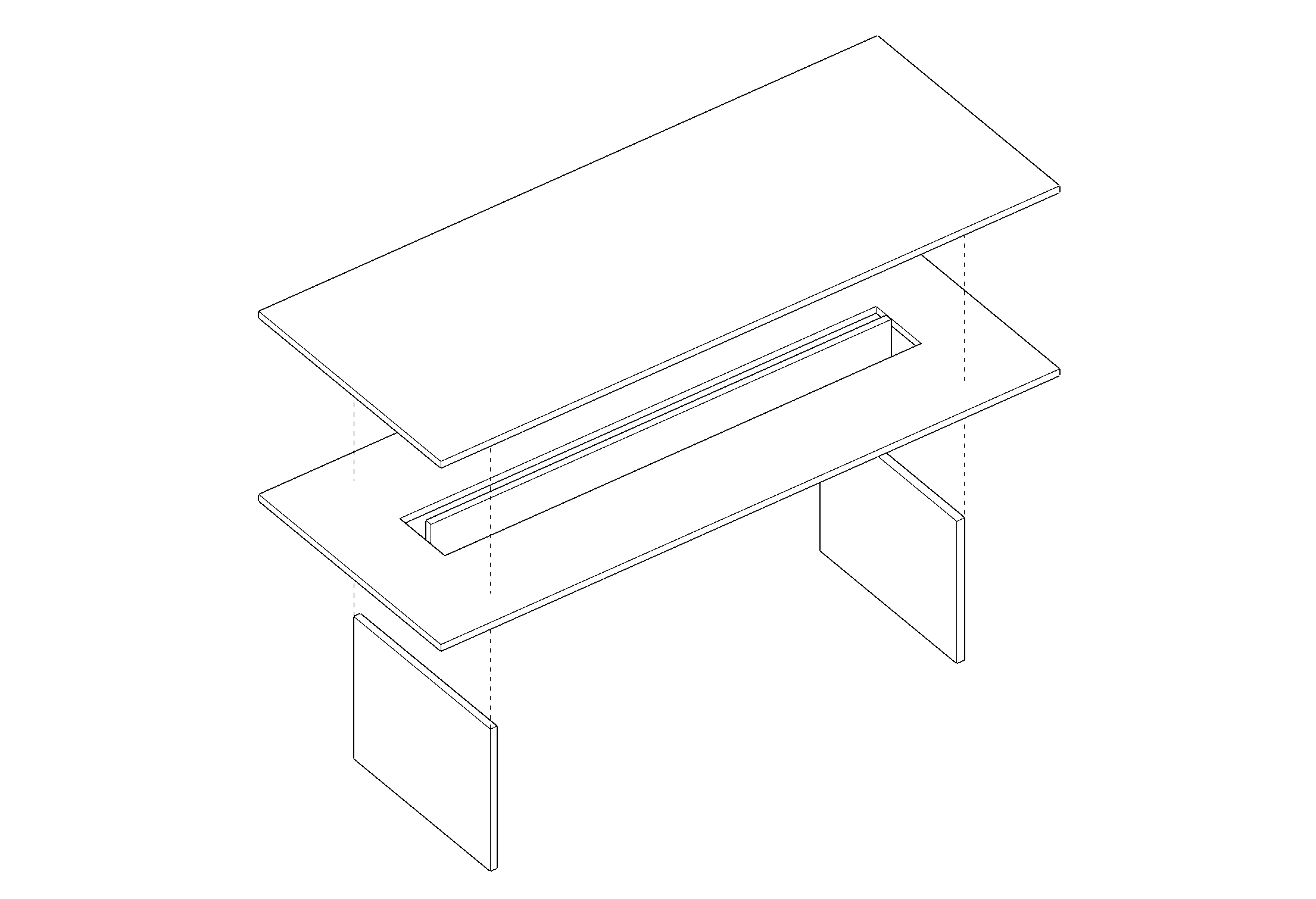
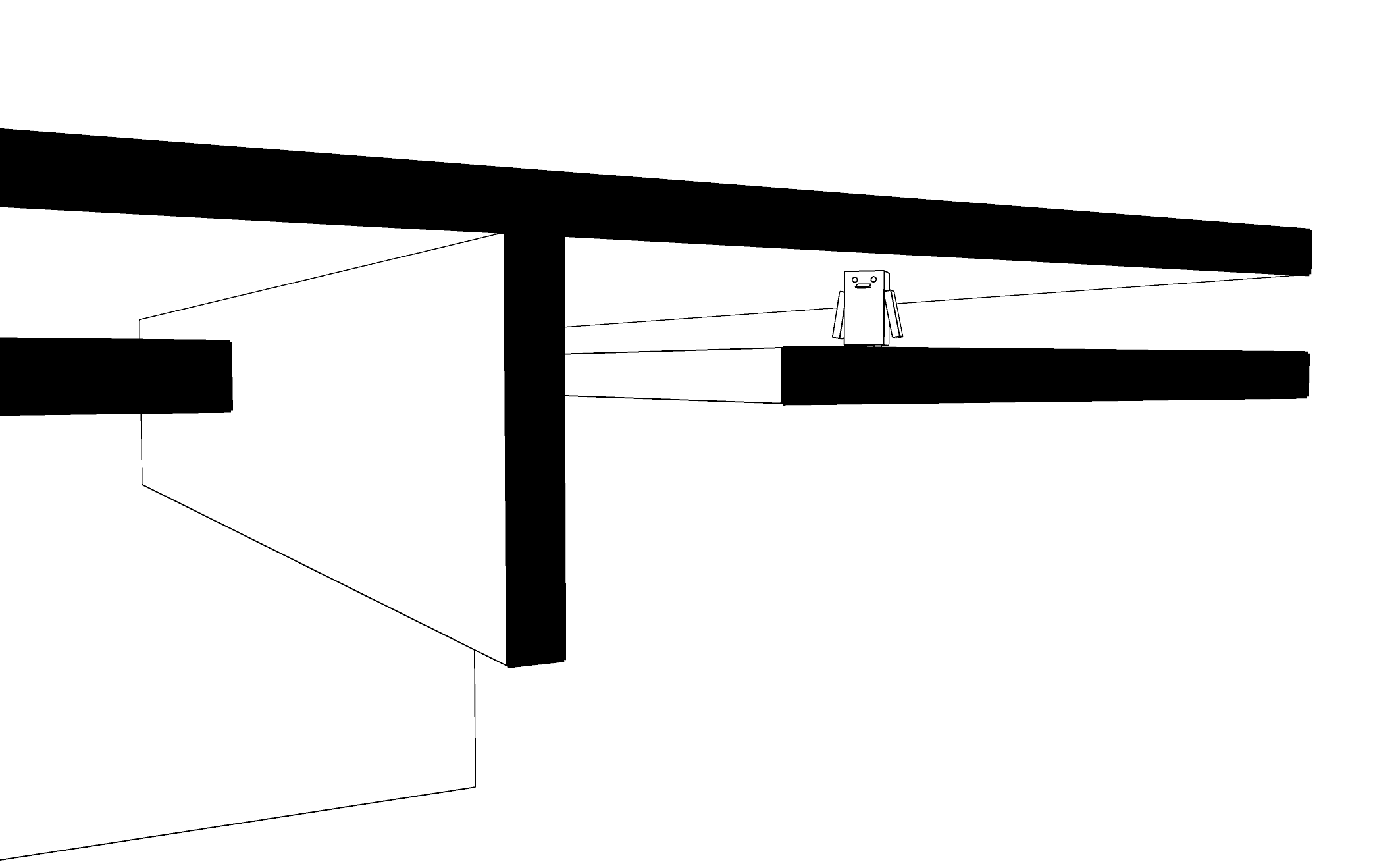
A more clandestine detail of the table is completely hidden from view.
A gap in the lower tabletop provides secret access to lower compartments, accessible only to those who choose to crawl underneath. While one of the reasons for the gap is to prevent the accumulation of dust, the gap also becomes something more.
It is a place where a child can cache toys and imagine a miniature universe, unseen inside the adult world. A secret place, hidden in plain sight, that brings a bit of wonder into the ordinary life that contains it.
I liked you better as a rabbit, Charlie.
- Bedknobs and Broomsticks.


© Rafael Gamo

© Rafael Gamo
Interior renovation
and new residential addition to an existing home
In progress
Location
Crete • Greece
Year
2020 • in progress
Collages
Carolina Andrade / Ciudad Análoga
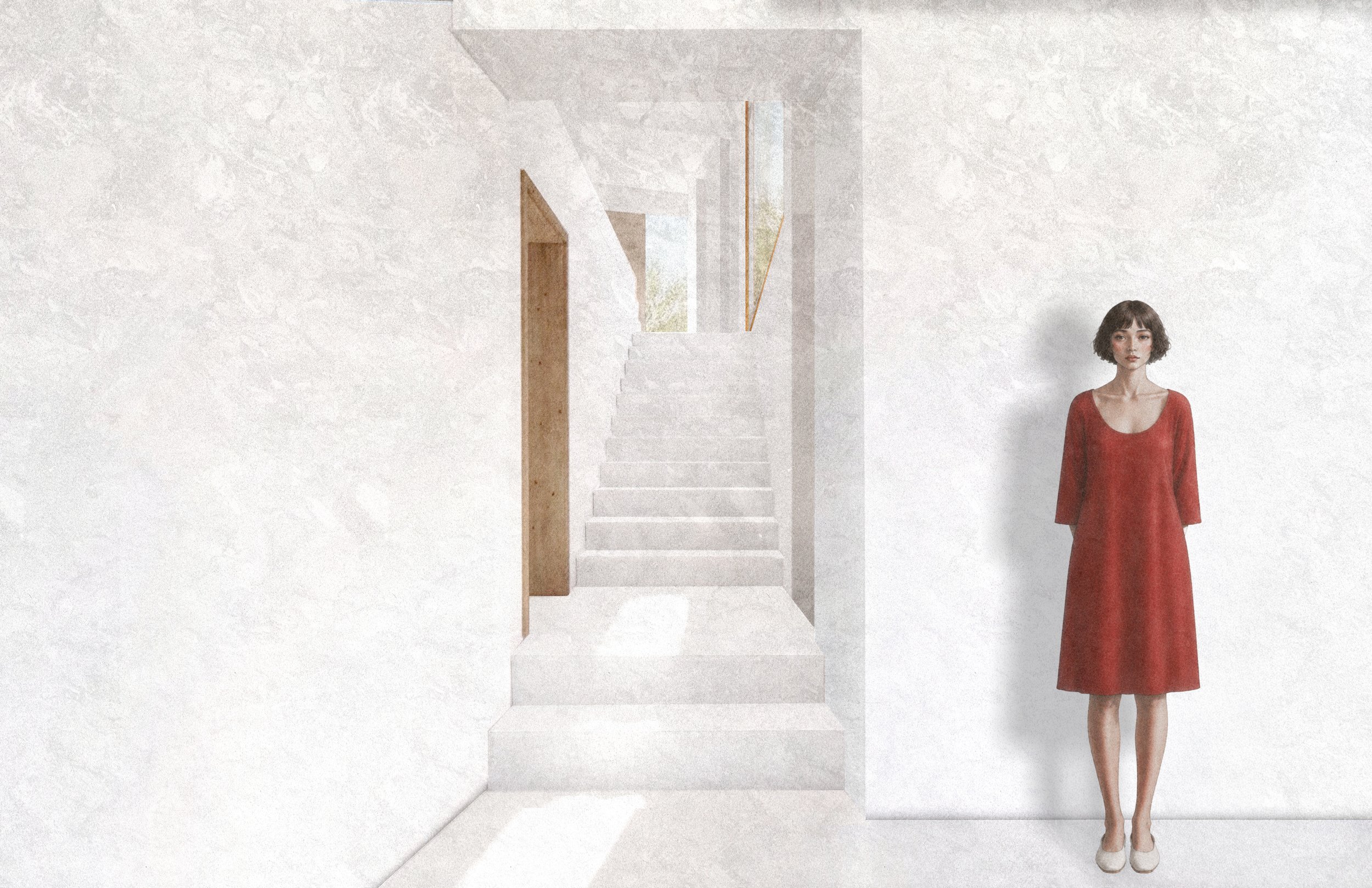
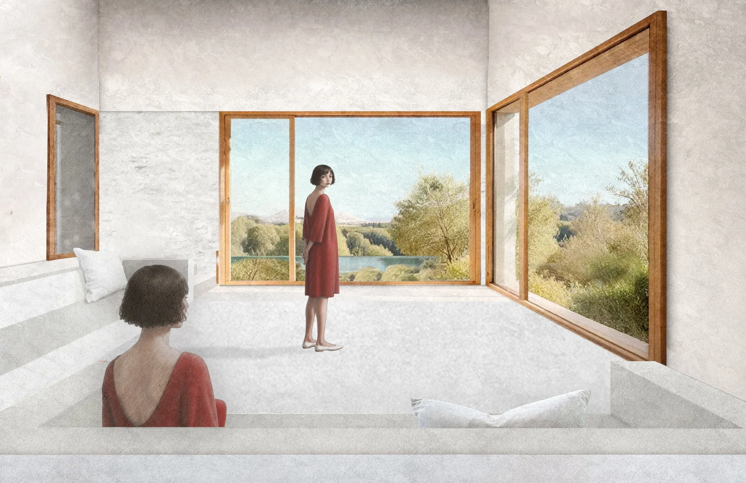
The project involves the renovation of an existing house and the addition of a new home on the same property. Together, the two structures unfold along the mountain slope through a series of interconnected levels, terraces, and courtyards.
Existing olive trees become anchors within the composition, while openings frame views across the Cretan landscape. Rather than sitting on the site, the architecture follows its topography, creating a sequence of indoor and outdoor spaces embedded in the terrain.
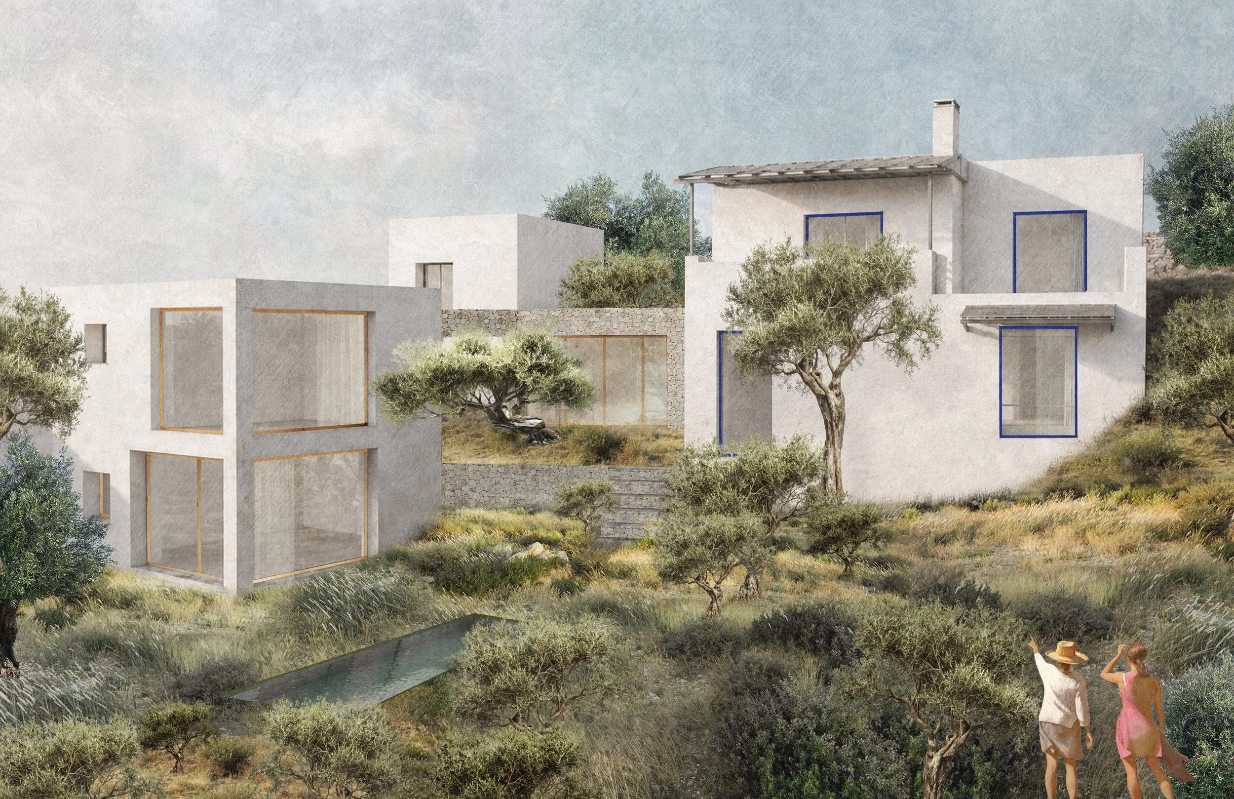

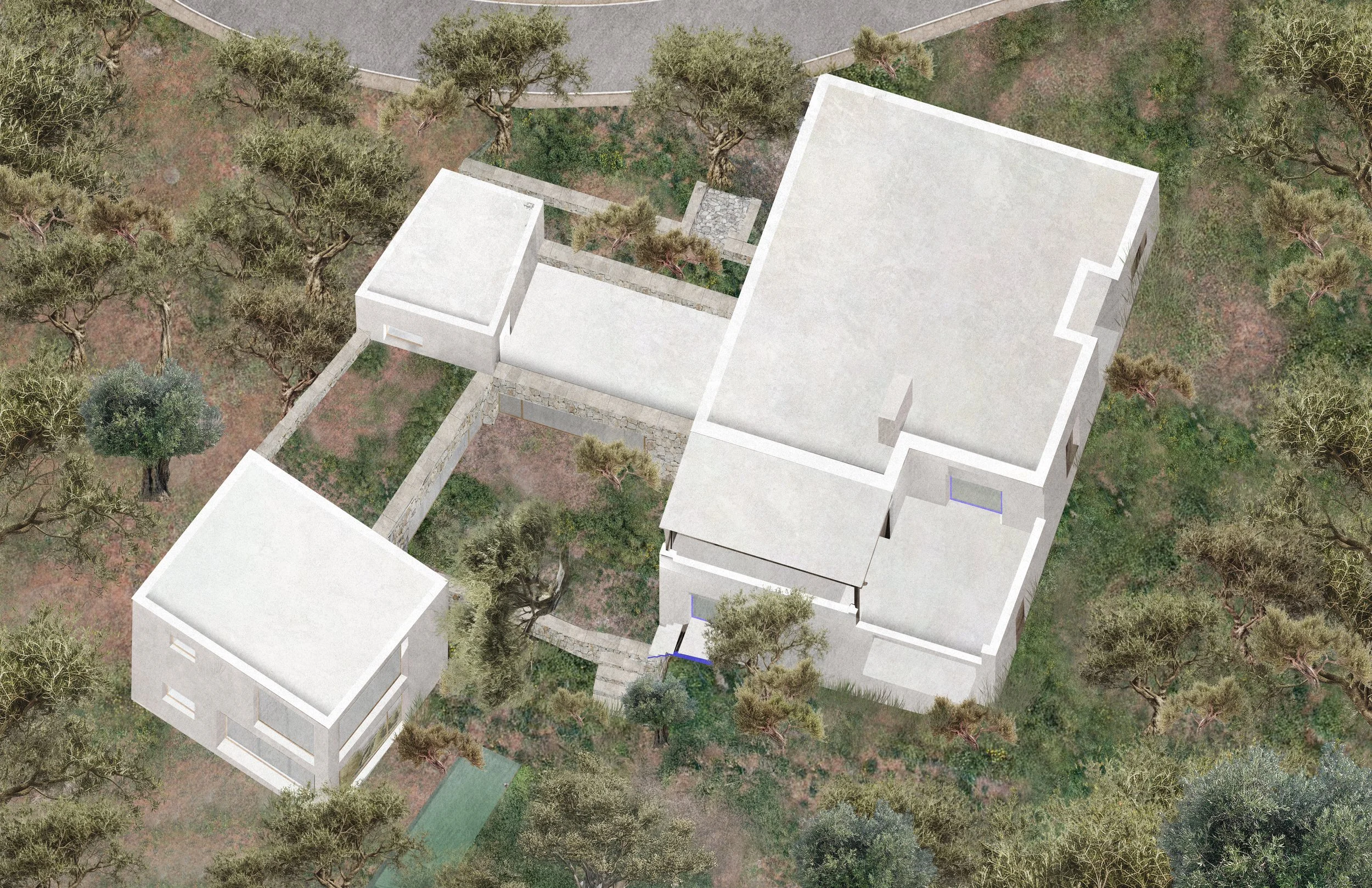

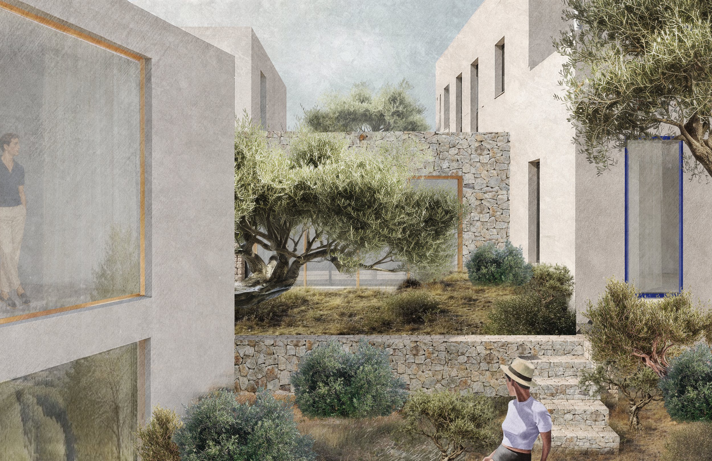

The structural frame is in concrete, while the walls are built in local stone — a combination that reflects both the seismic requirements of Greek building regulations and a deeper logic of place. On an island where the delivery of materials carries a significant logistical and environmental cost, using what the land already provides is both a practical and ethical choice.
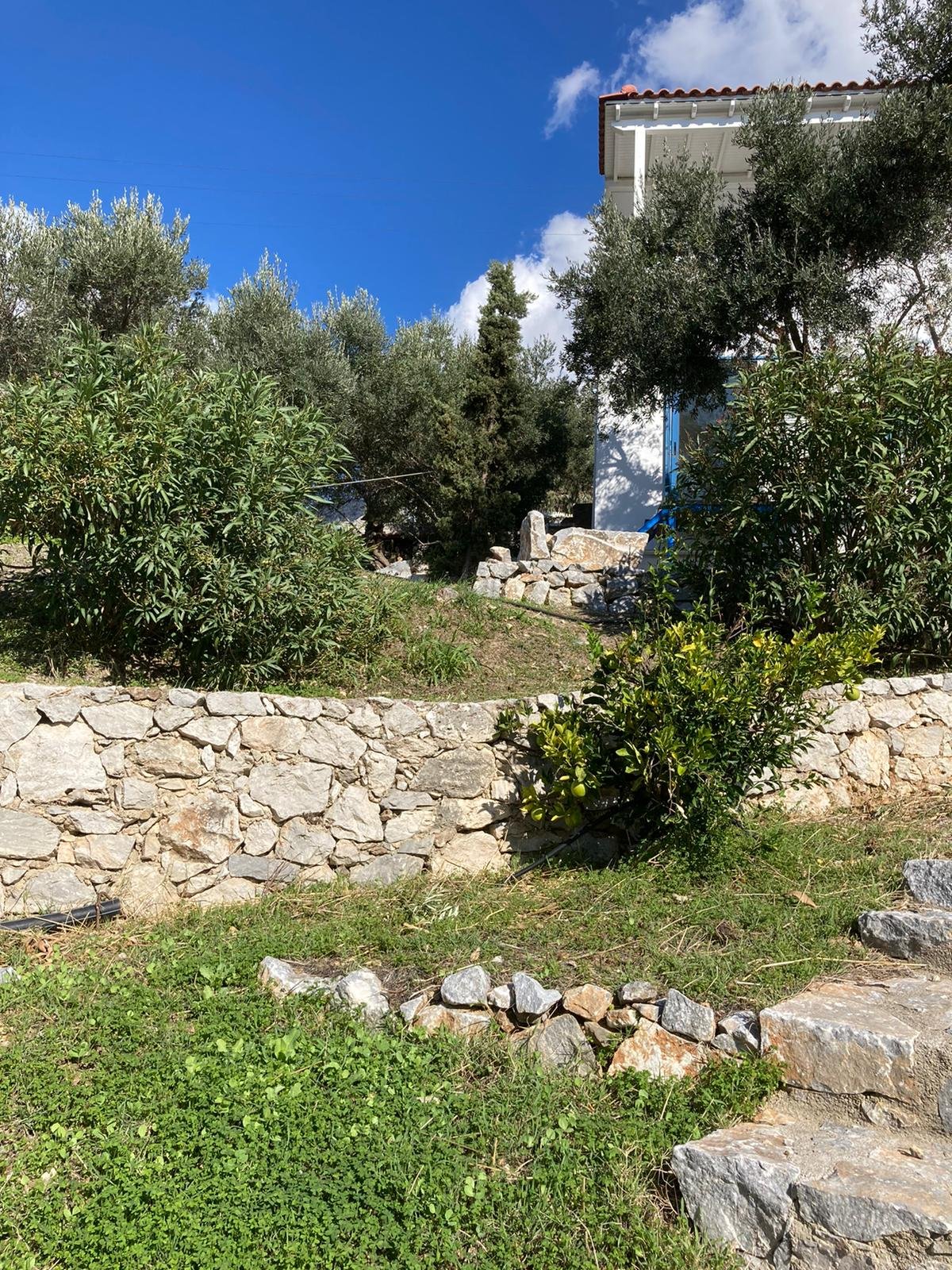
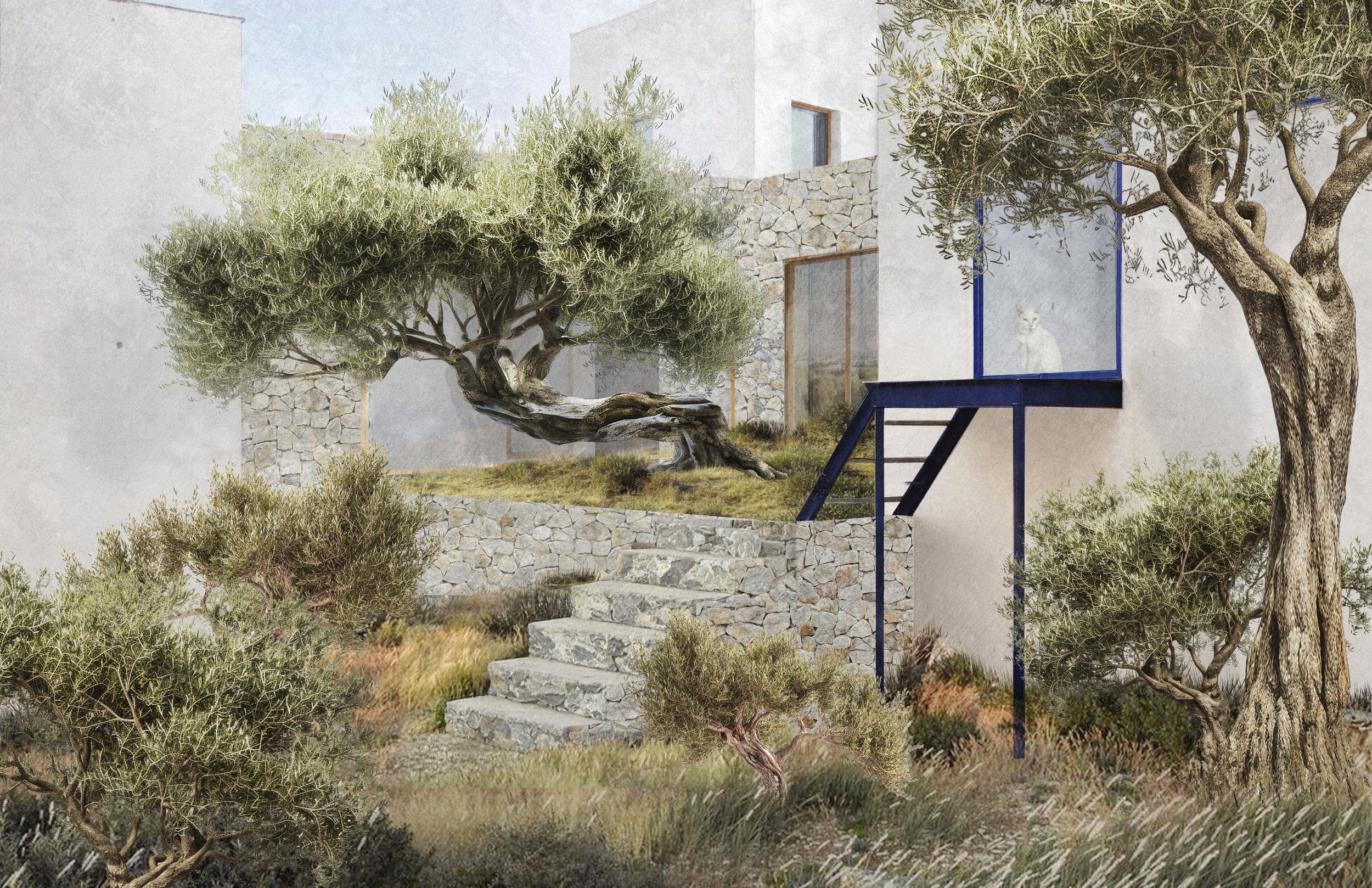
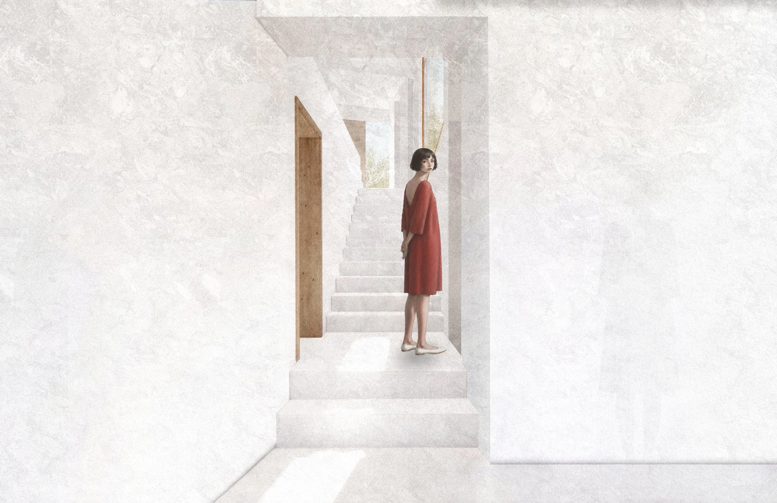
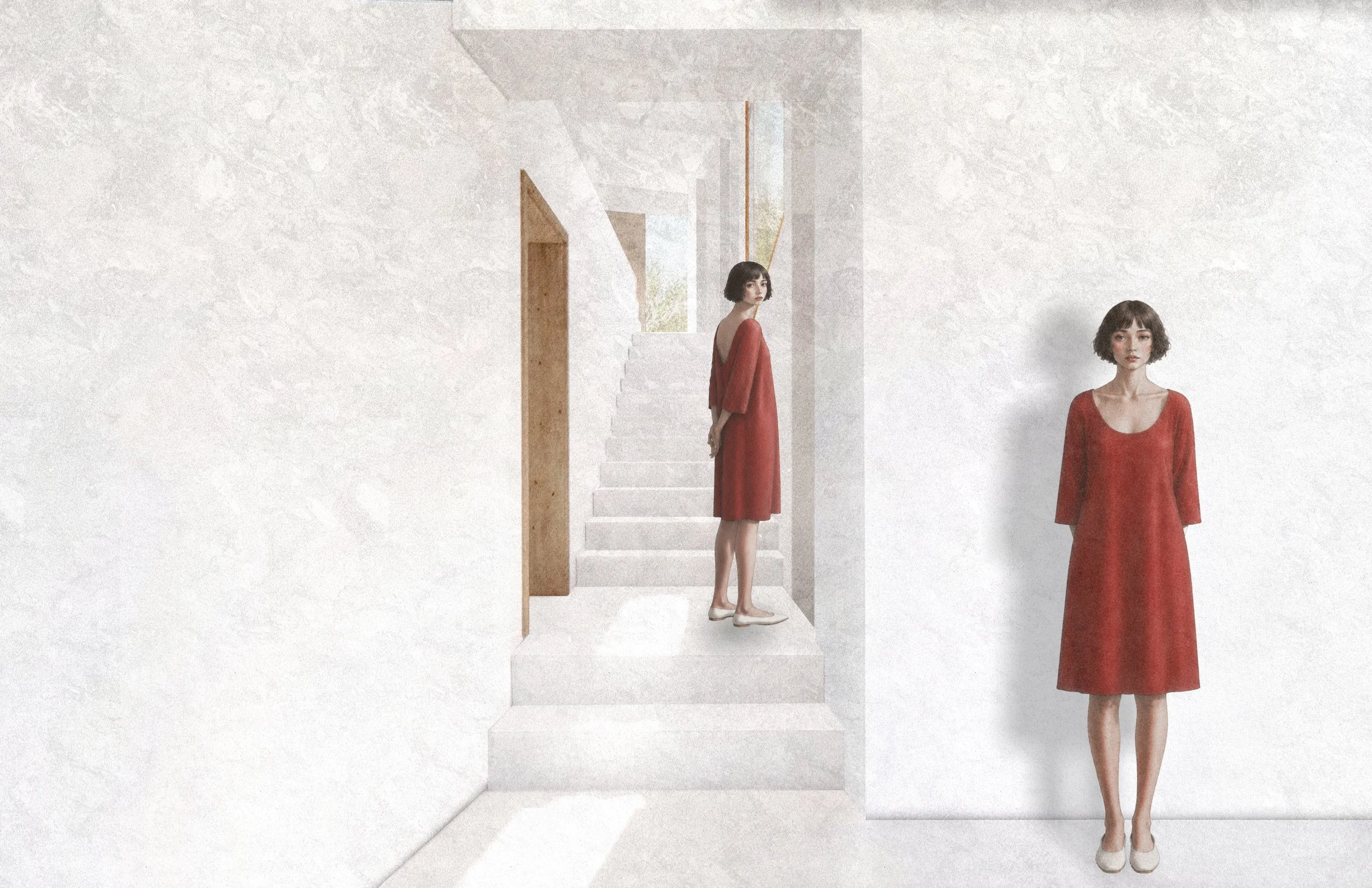
The openings are designed as a sequence of depths. From inside, the eye first settles on the olive trees, close, familiar. Then the valley opens up, wide and unhurried, falling away toward the coast.
The same view shifts throughout the day, and from room to room, as the framing changes and the distance reads differently each time.
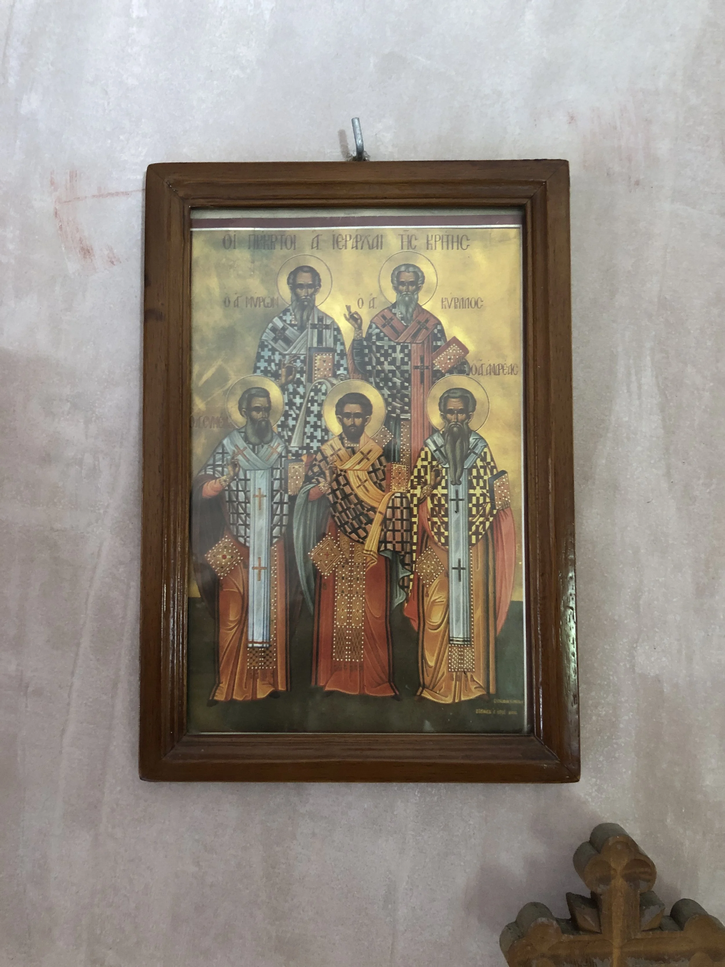
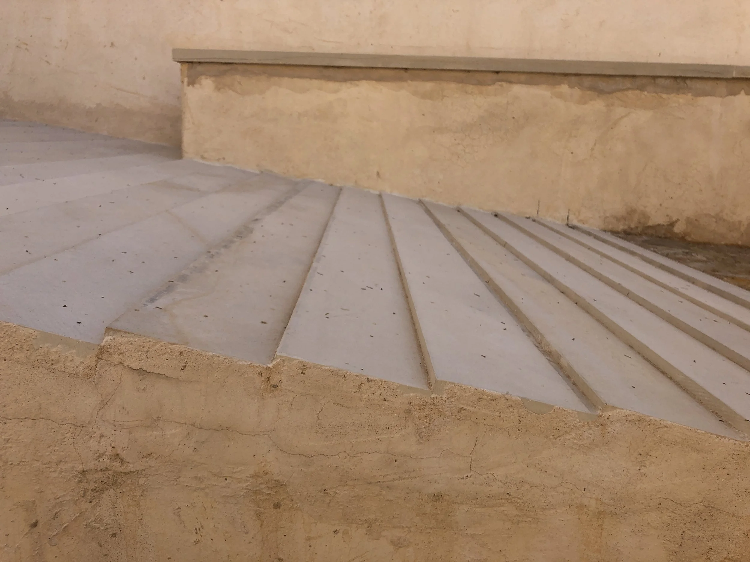
Reference • Convent • Crete
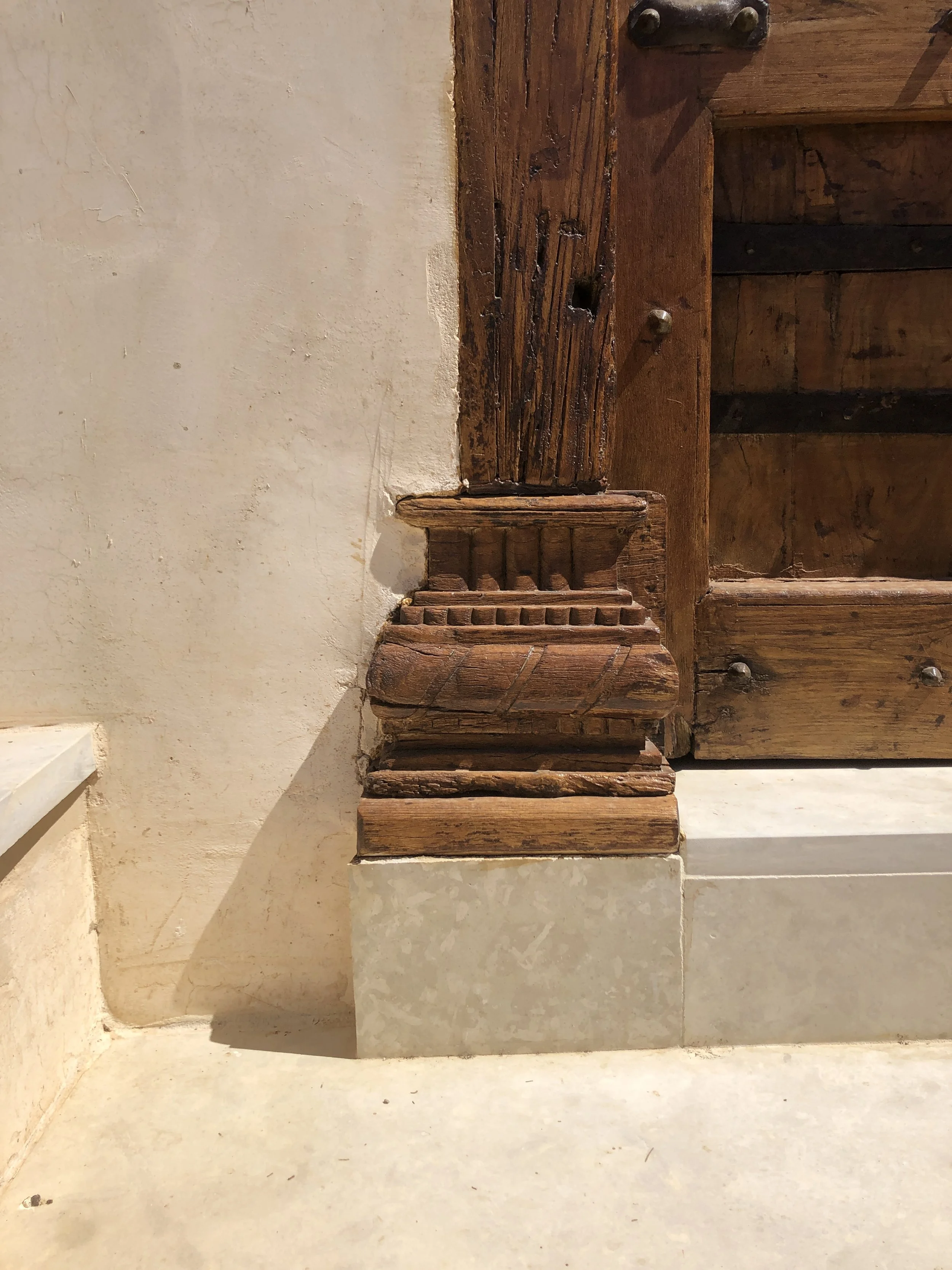
Reference • Convent • Crete
A thoughtful, prosocial company in Midtown Manhattan needed to reconfigure their offices in response to the global pandemic. The resulting design offered a flexible use of space, taking into consideration remote working and hoteling - the practice of occupying an office only a few days a week.
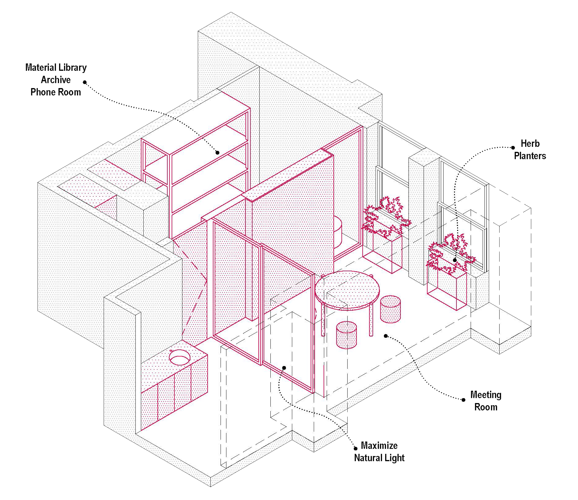
The proposal focuses on a few selected areas of intervention and is designed for modular, gradual implementation.
The offices are located on the top floors of the Fred F. French Building, a 1927 Art Deco skyscraper with Middle Eastern influences in Manhattan, registered in the U.S. National Register of Historic Places.

Interior renovation of a 13,000 Sf office space
Status
Proposal
Location
New York City
Year
2020
In collaboration with
Rai Pinto Studio

The design is meant to integrate seamlessly with existing spaces while also bringing order and organization to the elements that are already there.
The design works to:
• leverage a more balanced verticality to instill an airy experience
• utilize curved lines to draw a more peaceful flow through the space
• be sensitive to acoustic comfort for those working in the space
• bring warmth and color through surfaces and materials
• provide a nuanced visual language that can eventually be extended to other spaces


Proposal for an indoor herb garden with plants like mint or lemon verbena that can be enjoyed while working in the office and can also be brought home. Caring for the garden and bringing herbs home makes the workspace a place of nurturing health and growth while strengthening a connection with direct natural light in the urrban environment.
Natural Light
The design maximizes multiple connections between the larger space and the windows, allowing natural light to enter more workspaces. Focusing on sight lines to the windows brings structured order and rich complexity throughout the space.

Material Sustainability
The wood paneling, flooring, and other elements focus on material sustainability. They also consider the potential involvement of small local fabricators, with design solutions that consider the life cycle of the material within the larger perspective of a circular economy.

Lactation Room
Slender Verticality
Plywood paneling and vertical louvers will highlight verticality and facilitate noise attenuation.
The vertical paneling in some locations has a monochrome natural finish and in others a more vivid palette using colorful felt insertions.

PURE BOND ® PLYWOOD • COLUMBIA FOREST
Formaldehyde-free
Environmentally safe
Soy based
Made in North America

Soft Curves and Subtle Patterns
Gently curving lines and the introduction of natural materials (such as maple or oak plywood) lend the experience of the workspace a soft calmness.
The proposed color palette integrates with these warm material surfaces, resulting in subtle variations that unify the space.
Soft curves will engender a less rigid flow through the offices. They also encourage flexible inhabitation and usage: a desk becomes a place for social gathering or a collaborative workspace.
“Gray is the color... the most important of all... absent of opinion, nothing, neither/nor.”
Gerhard Richter

The apartment occupies the 5th floor of a 1929 Lower East Side building.
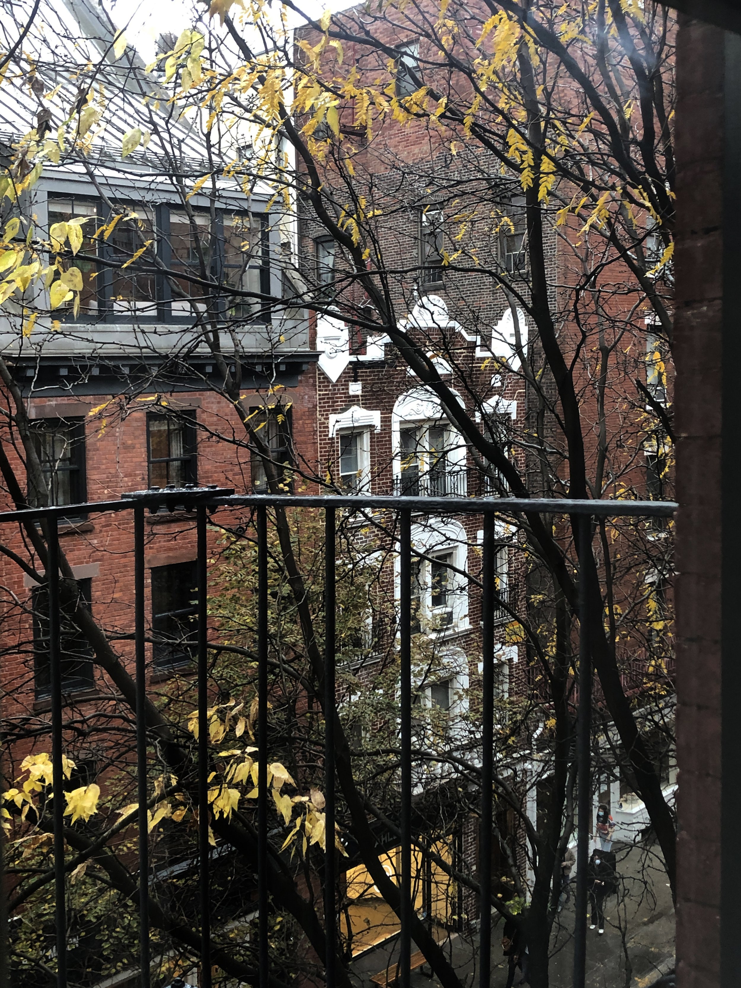
Oriented toward a private courtyard, views open onto trees and a flower garden. Like in many New York City neighborhoods, the residents of the building are radically diverse in culture and history.
Designed for a couple from the UK and Germany working in the arts and academia, the renovation aims to set a space of quietude within the buzzing city. The design retains the sensibility of the original apartment, combining existing elements with pointed interventions.
Interior renovation of a 800 Sf apartment
Location
New York City
Year
2019


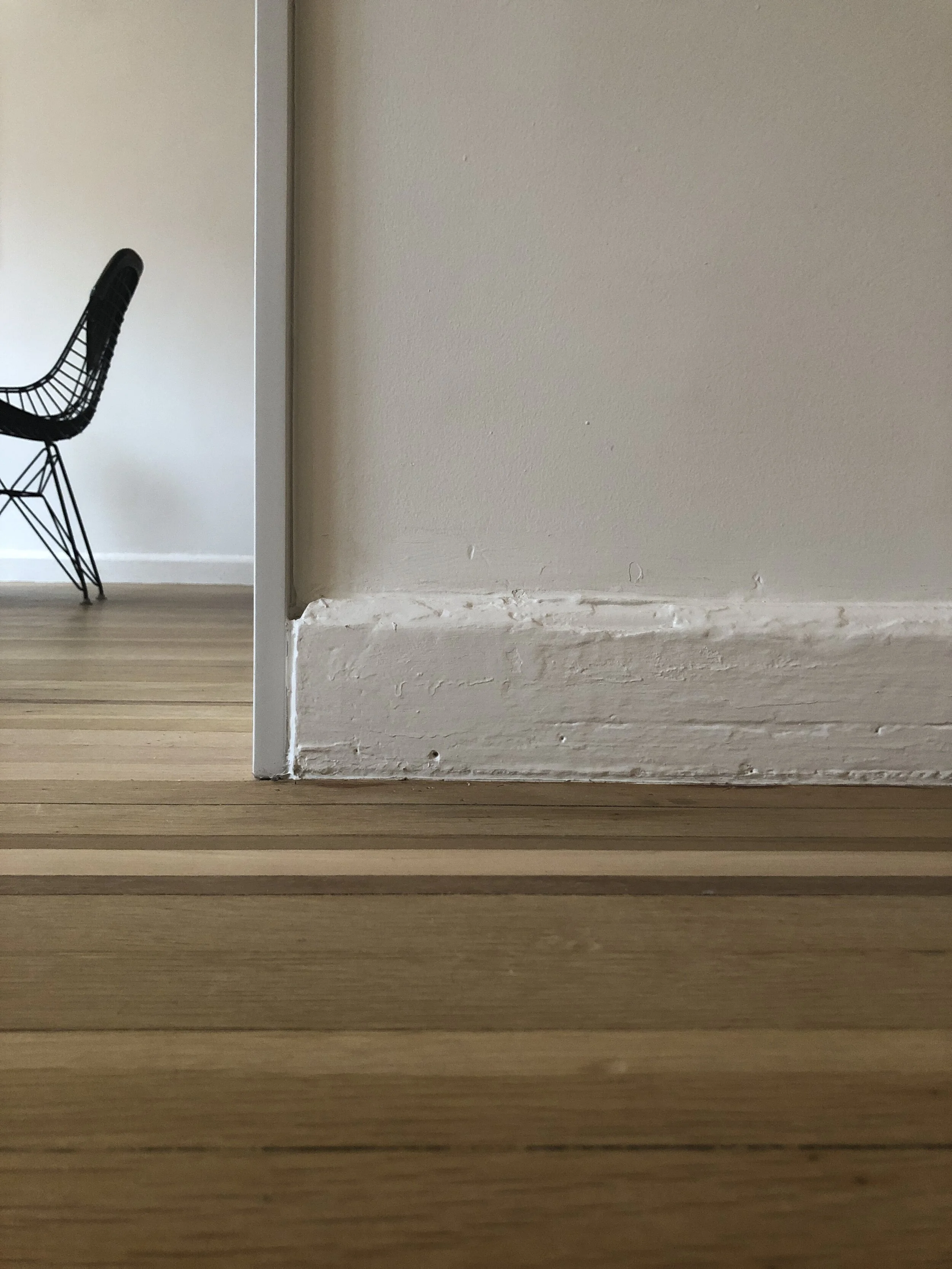
The renovation connects and opens views across rooms, multiplying sources of natural light and cross ventilation. In the original layout, a long dark corridor sharply divided rooms from each other. The new distribution allows multiple connections between spaces, bringing light across the apartment - from morning sunrise in the East sunrise to late afternoon sundown in the West.


The furniture itself serves as partitions, mediating between flexible spaces and allowing for transitions across formal and informal living.
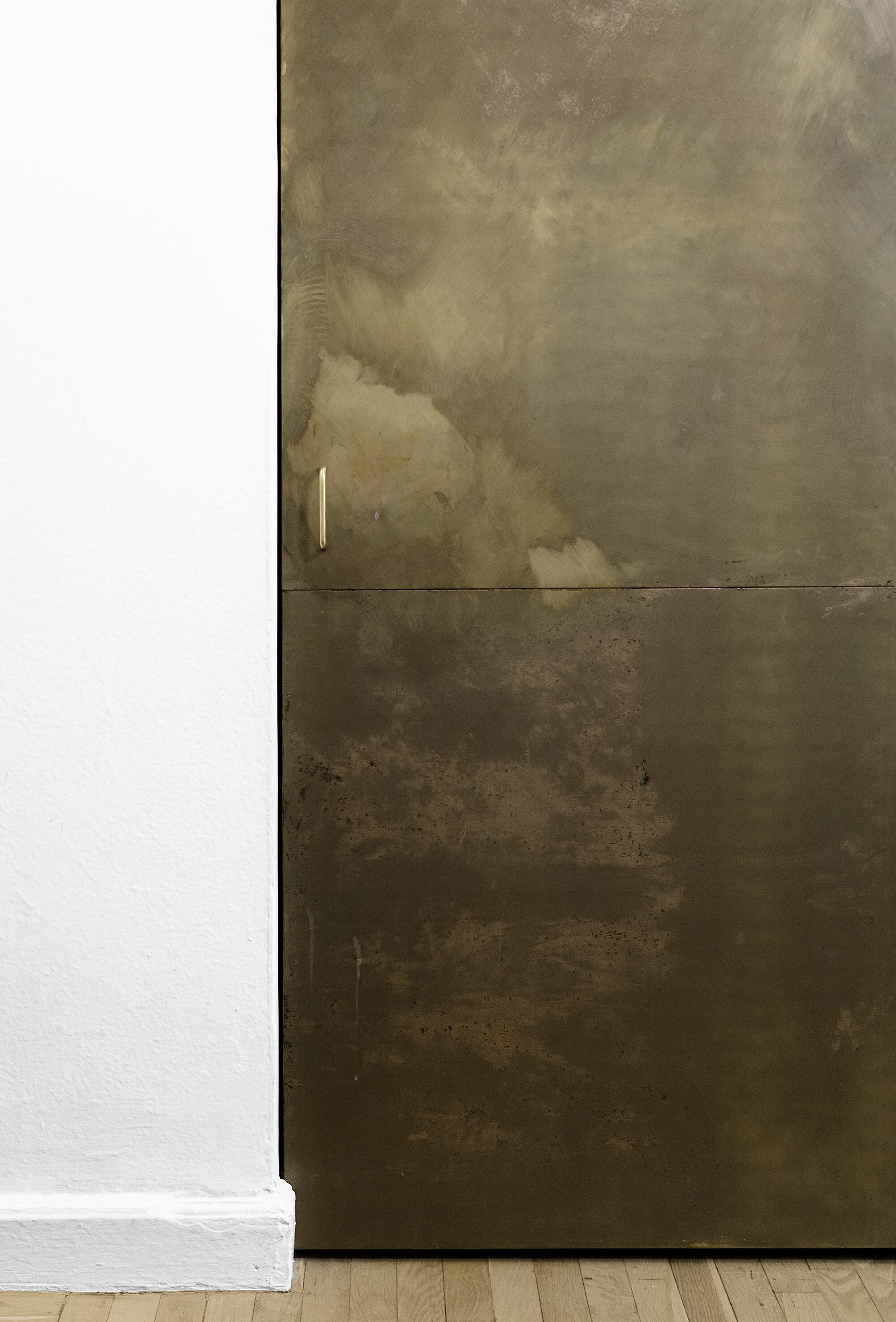
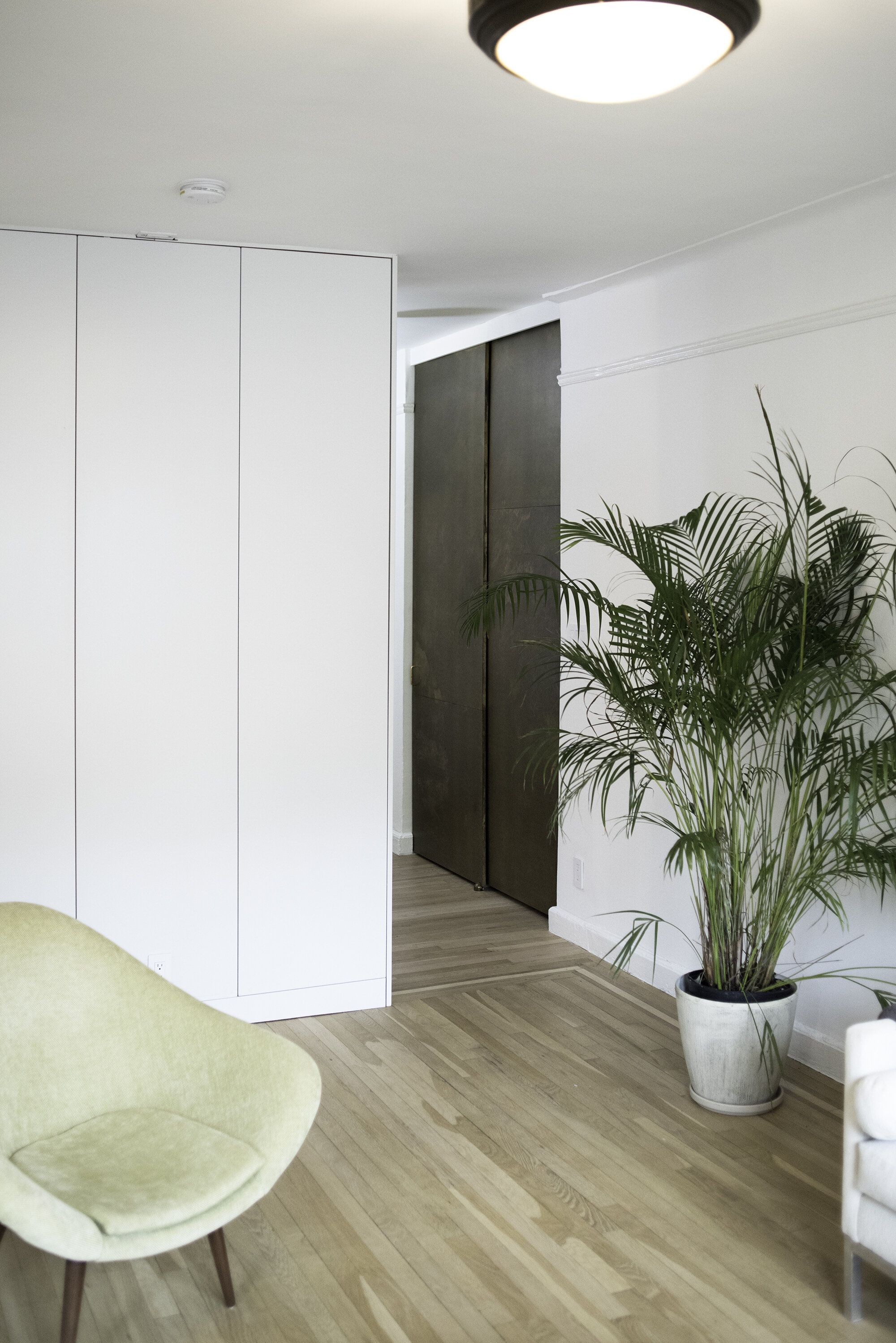


A large, utilitarian entry closet is framed by sliding doors in brass - a panel of unexpected material that brings warmth and depth to the experience of the space.

Rooms
Entry
Living Room
Office • Dining Room
Kitchen
Bedroom
Bathroom
The renovation maintains and values existing details throughout the space.
The original floors have been sanded and treated with a matte protective finish. Baseboards, windows frames, doors and their handles - have all been kept, including multiple layers of paint and imperfection.
Even the handmade shelves in the interior of the linen closets - worn yet remarkably functional and usable - were retained and reused as part of the design.


The brass and glass ceiling fixtures, original from the building’s inception, were cleaned and restored. They stand in measured counterpoint with more contemporary lamps.


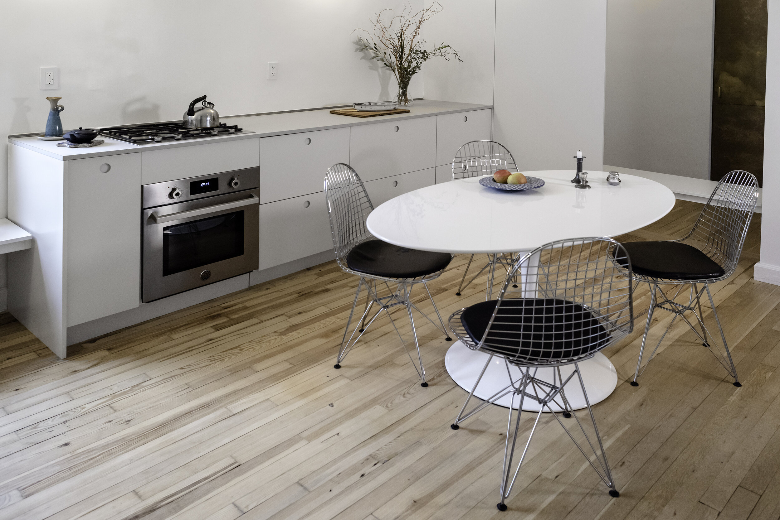
The primary alterations happened in the kitchen and bathroom, where new components work in concert with a more open reconfiguration. The cabinets, in matte light grey, embrace the kitchen in calm and serenity.


Materials introduced to the space are subdued and elemental - unglazed mosaics and white ceramic lamps.

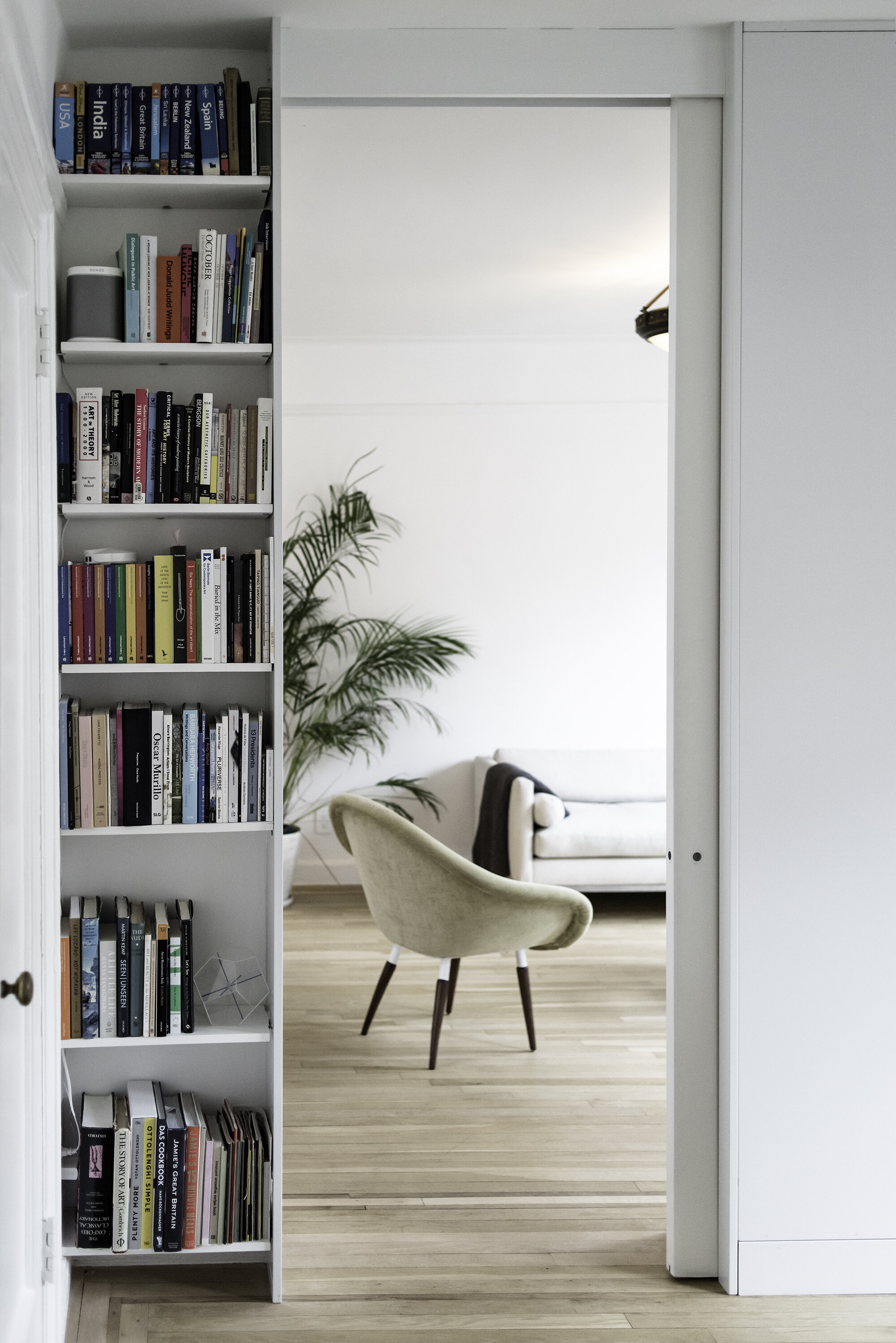


“If one were to give an account of all the doors one has closed and opened, of all the doors one would like to re-open, one would have to tell the story of one's entire life.”
Gaston Bachelard, The Poetics of Space


Renovation of an existing kitchen and design of a new central island with the objective of improving the space while limiting the demolition work, utilizing the existing structure, and designing to maximize reusability.
Interior design
Status
completed
Location
New York City · USA
Year
2019

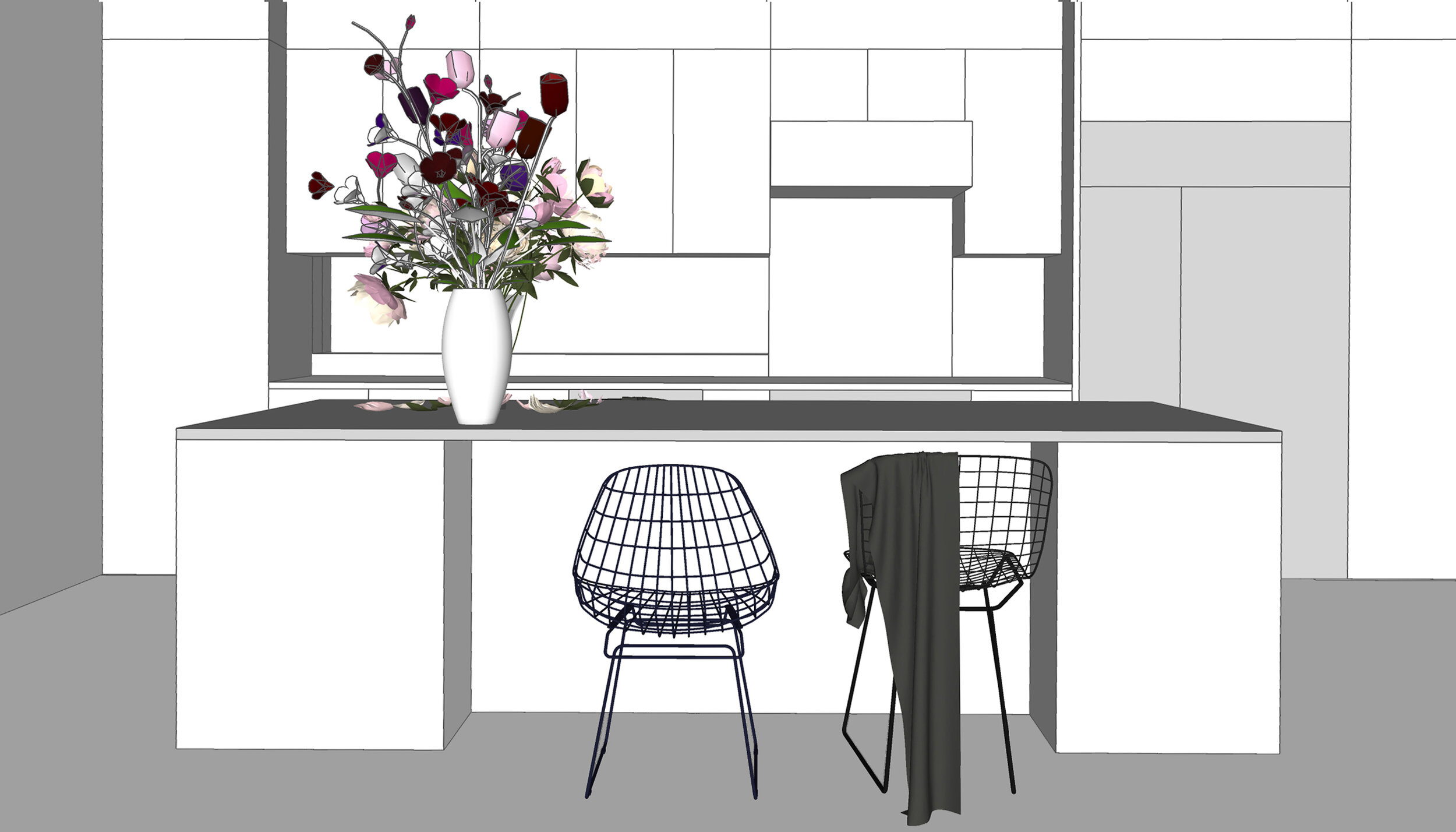



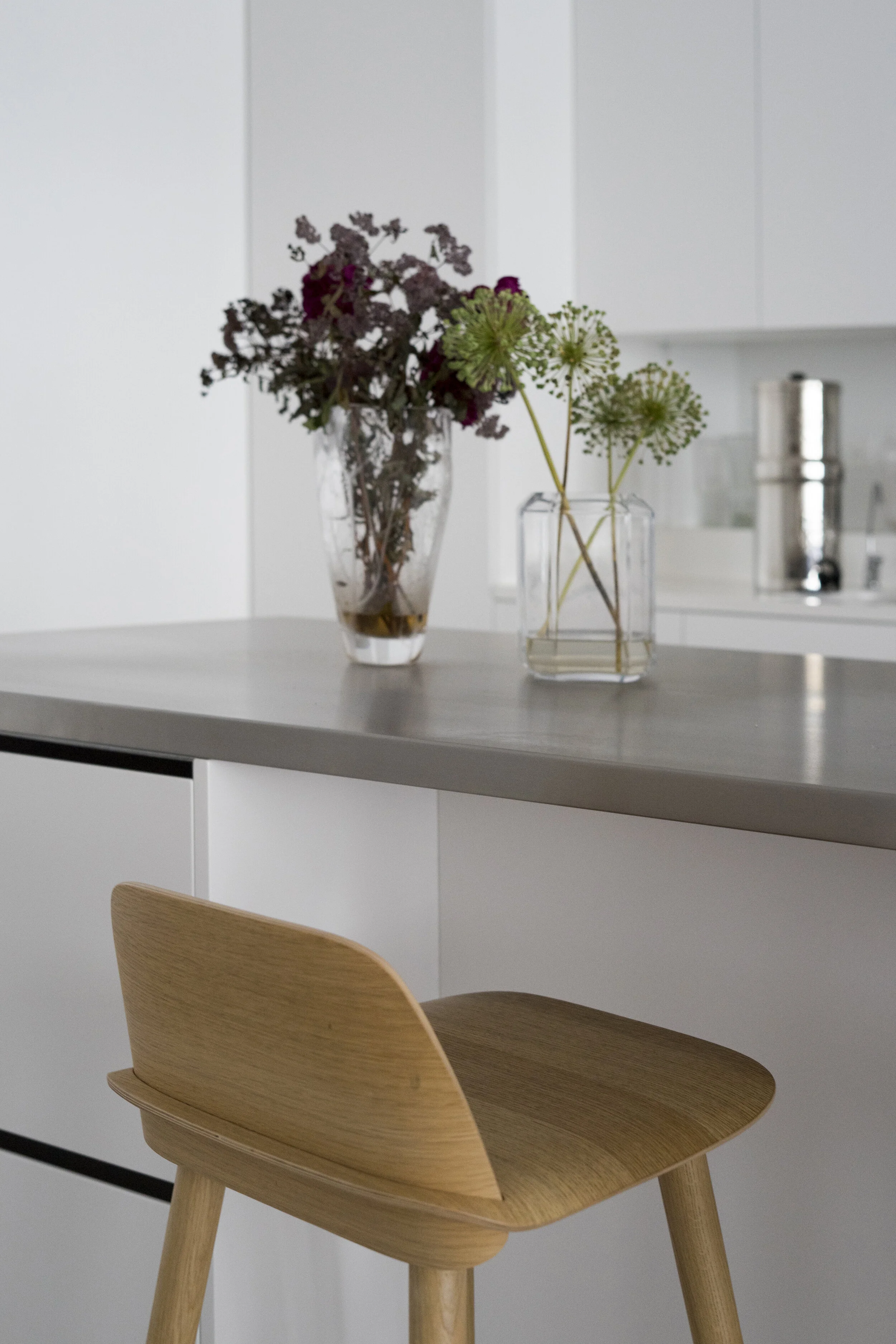
The central island serves as a large working area for prepping food.
The 10'6" long countertop is made of stainless steel. Each side of the island accommodates large drawers for the easy storage of pots and pans.
The layout of the island allows as well four people to sit and eat comfortably in an informal setting.
The renovation also included the kitchen cabinets.
The existing structure was maintained, and the cabinetry was upgraded by replacing the door panels and replacing the lighting above the sink and work area.




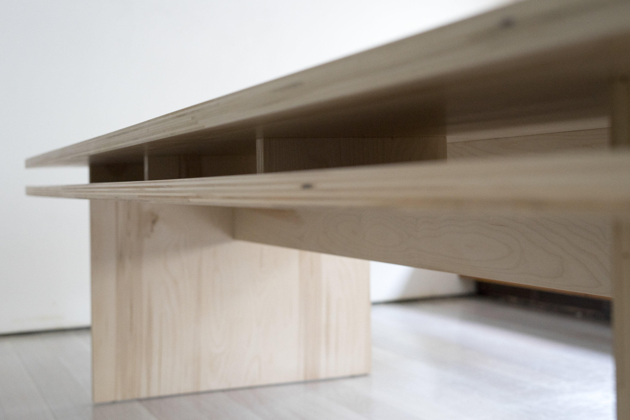
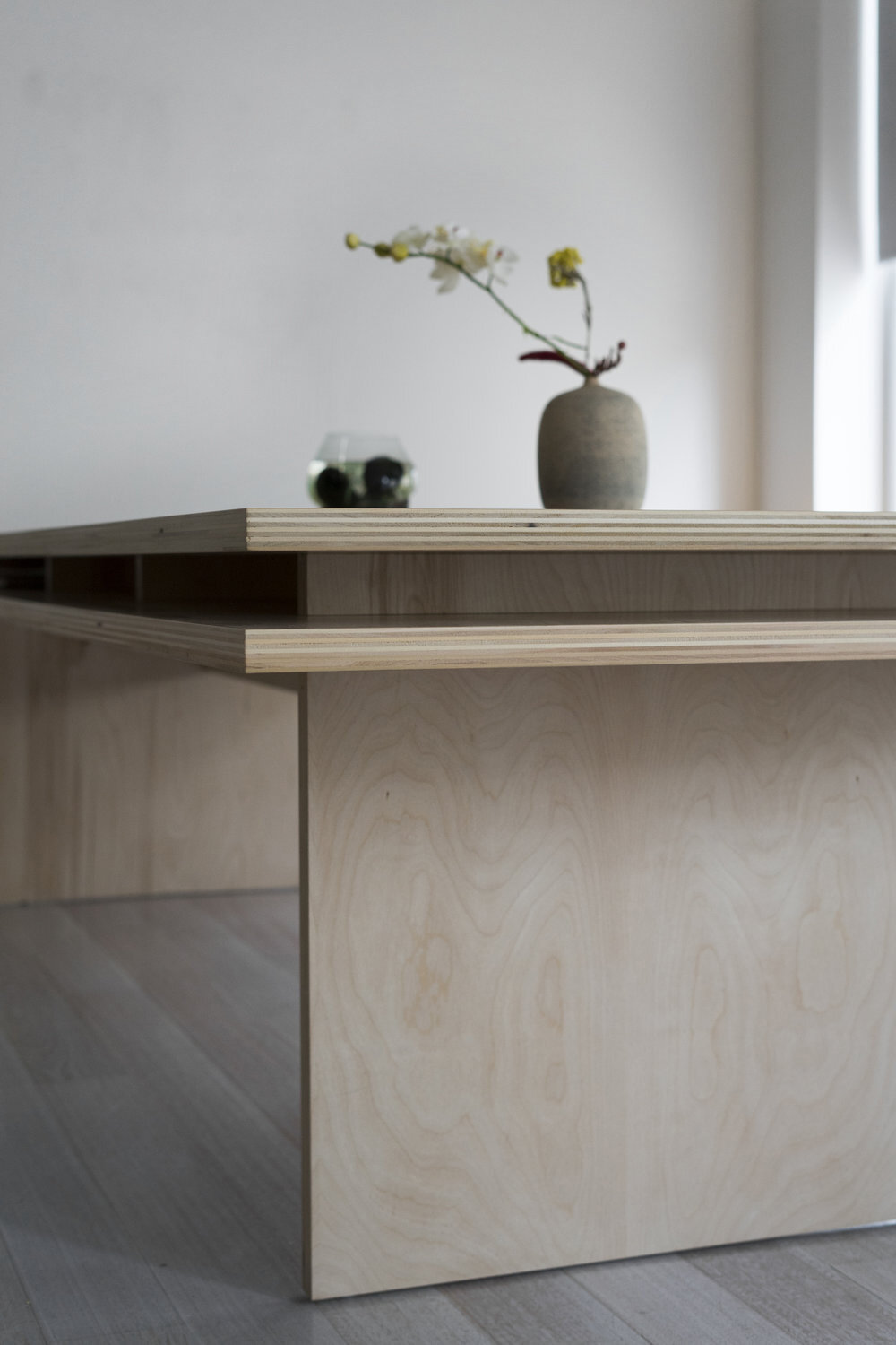
This elemental table is designed for flexible use in everyday life.
A slim shelf allows quick storage of laptops and books and an unobtrusive transition from work to dining. The design combines contemporary aesthetics and subtlety of detail, while honoring the quiet strength of simple forms.
The table is slender and grand at the same time.
It accommodates eight to ten people and the 4’ depth comfortably allows a formal dining setting. It is constructed of formaldehyde-free plywood, 1 1/4” thick. The 10’ length is monumental - yet well-proportioned to the scale of the space around it.

Furniture Design
A collaboration with
Ian Cheng
Fabrication
Takeshi Miyakawa
Material
Formaldehyde-free plywood
Status
completed
Location
New York City · USA
Year
2019

A hidden gap at the end of the shelf prevents objects from being forgotten in the depths, and offers - to a child hiding under the table - an unexpected space where things can be hidden and secret worlds imagined.





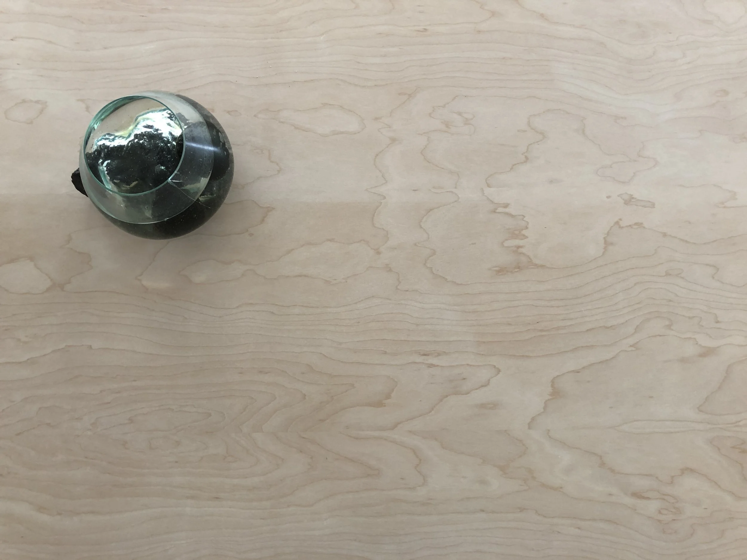

PureBond® Hardwood Plywood
LEED® & CARB compliant.
Winner, EPA’s Greener Synthetic Pathways Challenge
PureBond® is Columbia Forest Products’ formaldehyde-free innovation for hardwood plywood manufacturing.
Replacing traditional urea formaldehyde (UF) hardwood plywood construction with soy-based PureBond enables Columbia to eliminate any added formaldehyde from standard veneer-core and pMDI composite hardwood plywood core panels.
Excerpt from Columbia Forest Products

Interior renovation of an open, light-filled apartment on the 10th floor of a landmarked building.
The apartment occupies what were originally spaces dedicated to manufacturing. The 11' high ceilings and the large windows in the rear of the building allowed for working light and air circulation - while the front, with smaller double windows, was most likely occupied by offices.
The renovation engenders a space with contemporary elegance and subtlety of detail, while honoring the qualities of the original structure. The owners, rather than proceeding with a complete renovation, considered careful, strategic interventions to adjust to new needs.
Apartment interior renovation
Status
completed
Location
New York City · USA
Year
2018

Among other small interventions, one of the bedrooms has been turned into a new private office space.
By integrating two new glass doors, the space acquires natural light and views toward the rear of the building, where a landscape of more than 10 water towers opens to the sky.


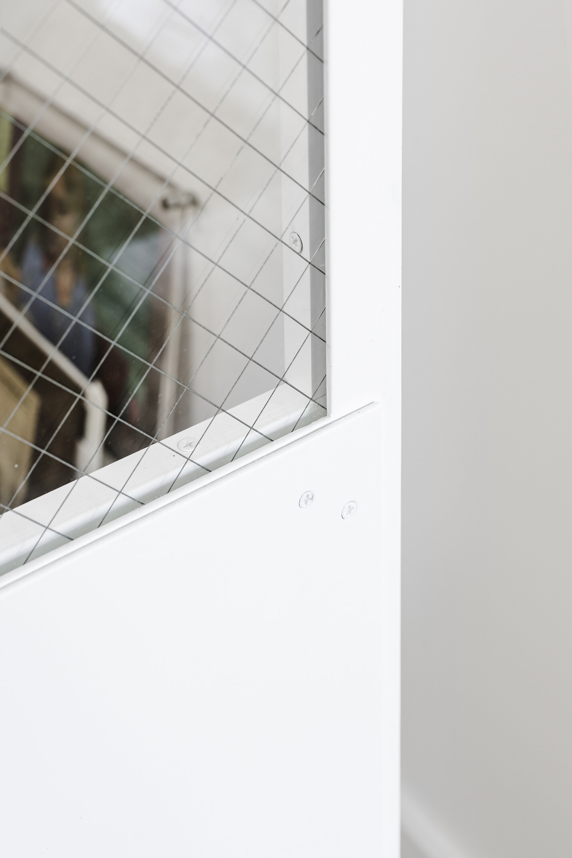


The new office is imagined as a greenhouse.
Two thin, white steel sliding doors connect the office and main living room, integrating the overall space and bringing in soft and diffuse natural light. The combination of layered translucent partitions - old windows and new doors - shelters the space in calm and tranquillity, within a neighborhood that is energetic and dynamic.

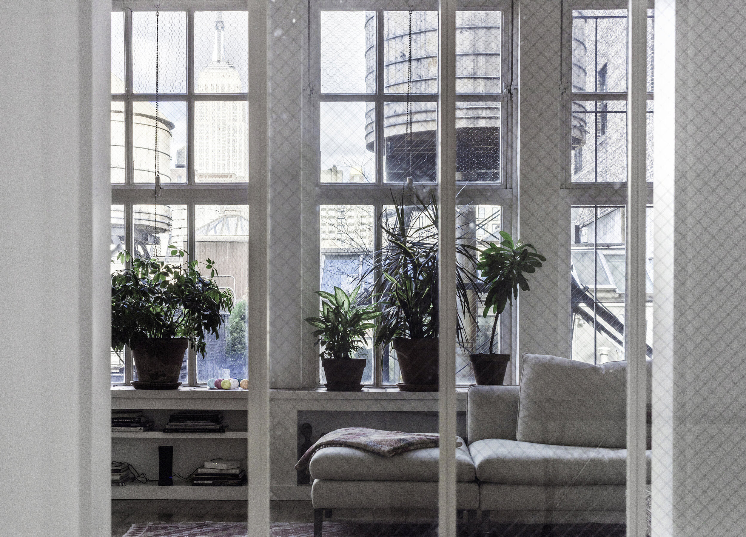
The door echoes the proportions of the existing large tilt windows with simpler, contemporary details.


The renovation maintains the existing features and oddities of the original construction. The concrete ceiling beams are visible and the original windows, with a pull chain opening mechanism, are retained.


This small home occupies the top floor of a 1901 building on a lively, tree-lined Manhattan street. Although only 420 square feet, the original layout of the apartment has four distinct main spaces: living room, office, kitchen, and bedroom - in a two-by-two grid in which each room connects to two others. The compact, century-old layout feels inexplicably contemporary.
During the interior renovation, this remarkably efficient layout was only minimally modified. And yet, by slightly shifting the position of two passages, the entire usable space was efficiently optimized. A loft bed doubles the available floor space in the bedroom; the kitchen gains room for a table; the small office is expanded vertically, with supplies and documents stacked in a custom vertical shelf system.
In such an intimate space, small details become crucial: the undulating outline of plywood panels along the uneven profile of the walls, hand-cut silhouettes that frame heating pipes, cabinetry that follows the slope of the floor.
These details accumulate in the space, but through their careful arrangement, they somehow disappear, into a narrowness that is calm, open, and serene.

Interior renovation of a 420 Sf apartment
Location
New York City
Year
2018
Carpentry work
Takeshi Miyakawa

"And there is almost no space here; and you feel almost calm at the thought that it is impossible for anything very large to hold in this narrowness."
Rainer Maria Rilke
as quoted in Gaston Bachelard, The Poetics of Space


A new light grey color – inspired by the original grey floor of the office - unifies all of the new built-in elements: the bedroom loft unit, kitchen storage, bathroom cabinet, library shelves. Small hints of grey also spread to other minor details, such as the steps of the bedroom ladders. The daylight coming from three directions varies the gray hues subtly throughout the day and across the seasons.


Despite this rather neutral palette, retained original features give the home a strong sense of materiality. The existing plastered walls, with their rough surface and finish, were restored and painted in a matte light grey tint. The existing floorboards, although rough and unleveled (the slope is nine inches from end to end), were kept in their original condition.


A careful selection of fixtures and furniture also optimizes the use and flow of the space.
Custom cabinets, together with ADA-compliant kitchen appliances, allow the kitchen countertop to maintain a limited height - especially given the significant slope of the floor. The bathroom sink is large, yet thin metal walls keep it unobtrusive.
Two egg-shaped tables, curved back chairs, and a small rounded sofa allow movement to flow from space to space, unhindered by strong corners and volumes. The custom kitchen sink is large in width but subtly narrow in depth, with the faucet set on the side to minimize the volume; and a removable draining shelf adding functional flexibility.

Storage areas are hidden in plain sight, behind bare, light grey plywood panels, with no visible handles or hardware. Accessible from the side, these shelves contribute to the feeling of lightness and openness throughout.
Like hidden secrets, the plywood panels conceal storage where it is most needed: at the entrance, where keys and letters are left, behind the bathroom sink, as a reinvented medicine cabinet, and by the kitchen sink, to store cutlery and everyday implements.


The distinction between functions - eating, sleeping, working, bathing - is regulated by the careful design of thresholds and boundaries, sometimes permeable and transient, sometimes more definitive. It is remarkable to find in this limited space six windows, seven doorways and a different declination for each threshold.

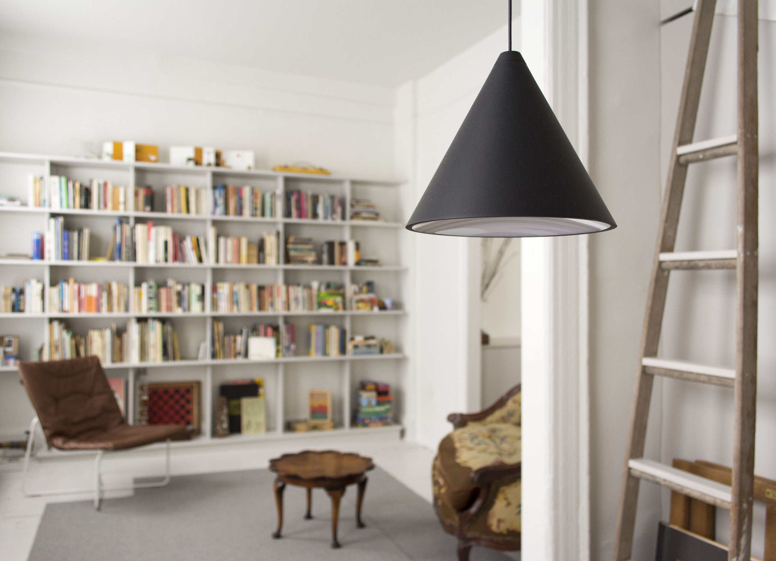


The doorway between the living room and office is wide and open, and yet the floors change in color, keeping the identity of the two spaces separate but still permeable and symbiotic. The passage between the bedroom and the kitchen is low, deep and narrow, acting as a kind of “gate” that separates the spaces, while providing visual privacy to the upper bed loft. A doorway and an interior window, both original to the apartment, connect the kitchen with the living room. The window lets light flow through from the kitchen, without exposing the more formal living area to the cooking and dining spaces.
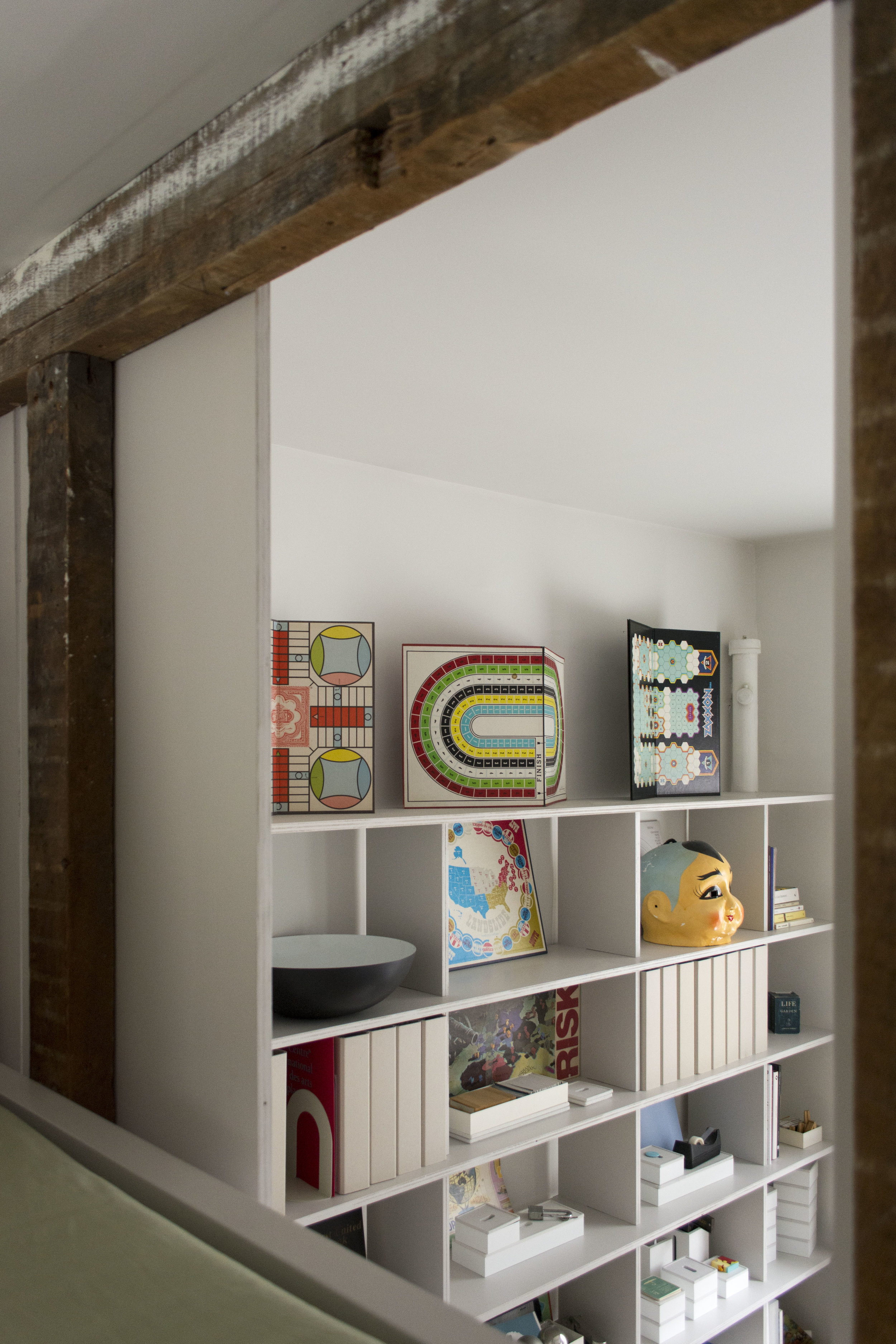


Within these rather small spaces, a complex narrative emerges through the alternation of low and tall ceilings, wide and narrow doorways, dark and light floors, dense and empty wall surfaces. The overall composition of space is also enhanced by the unfolding of multiple options to move from room to room, resulting in layered views and flowing circulation.


Exposed brick walls and a red tin bathroom ceiling remain untouched. Considering that the apartment is located on the 6th floor without an elevator, reducing transportation of materials was also a consideration.
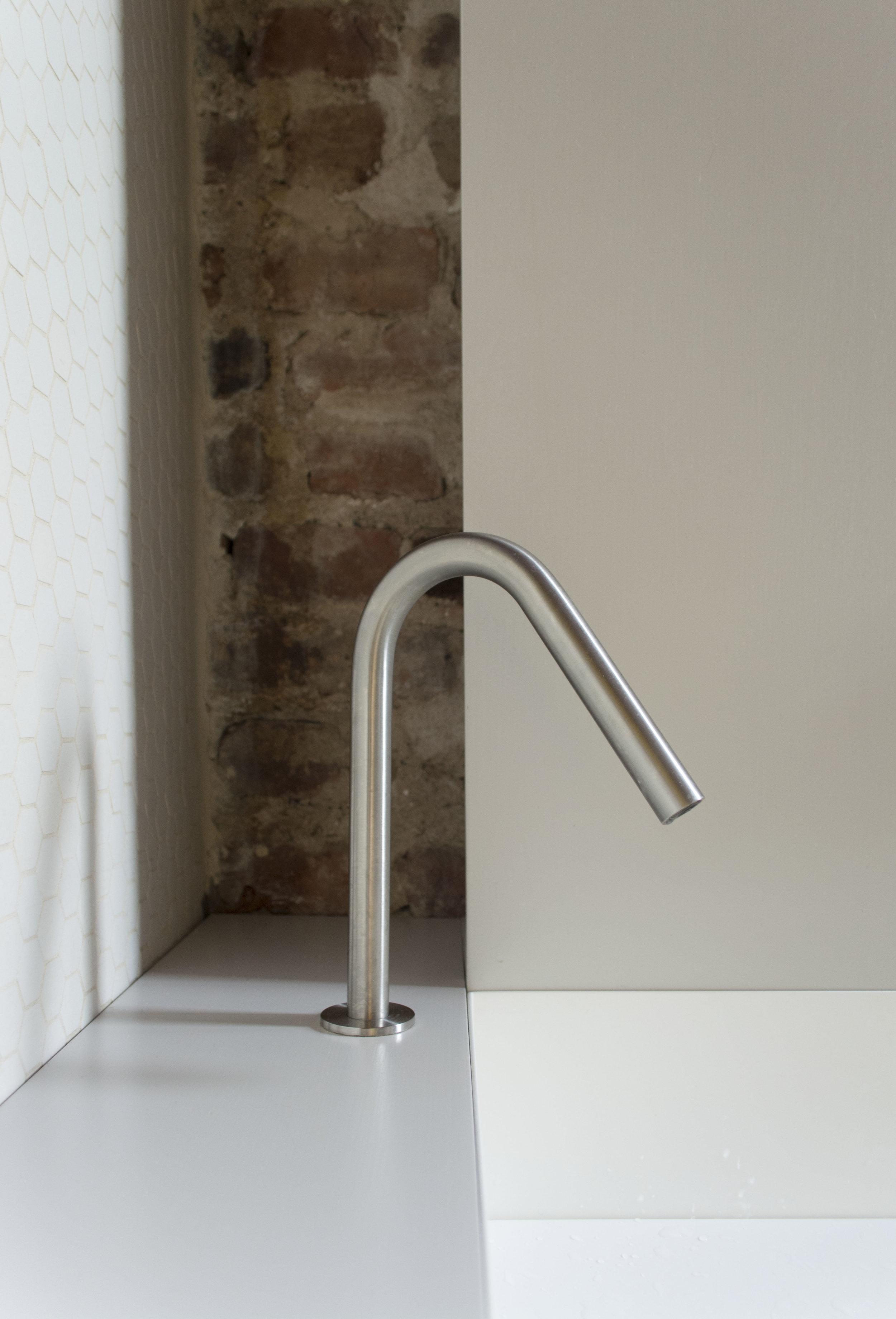
… is bigger inside than out.
Michael Ende, The Neverending Story (1979)


Surface
420 SF
Rooms
Living Room
Kitchen
Office
Bedroom
Bathroom
Materials
3/4” Plywood
Stainless Steel
Fabric

A thoughtful, prosocial company in Midtown Manhattan needed to reconfigure their offices. The resulting design offered a flexible use of space, taking into consideration existing elements such as lighting, flooring, desks, chairs.
The proposal focuses on a few selected areas of intervention and is designed for modular, gradual implementation.

Interior renovation of office space
Client
Digital Pulp
A collaboration with interior designer
Paolo Agostinelli
Status
Completed
Location
New York City
Year
2018
The design is meant to integrate seamlessly with existing spaces while also bringing order and organization.
The design works to:
• leverage a more balanced verticality to instill an airy experience
• be sensitive to acoustic comfort for those working in the space
• bring warmth through surfaces and materials
• provide a nuanced visual language that can eventually be extended to other spaces
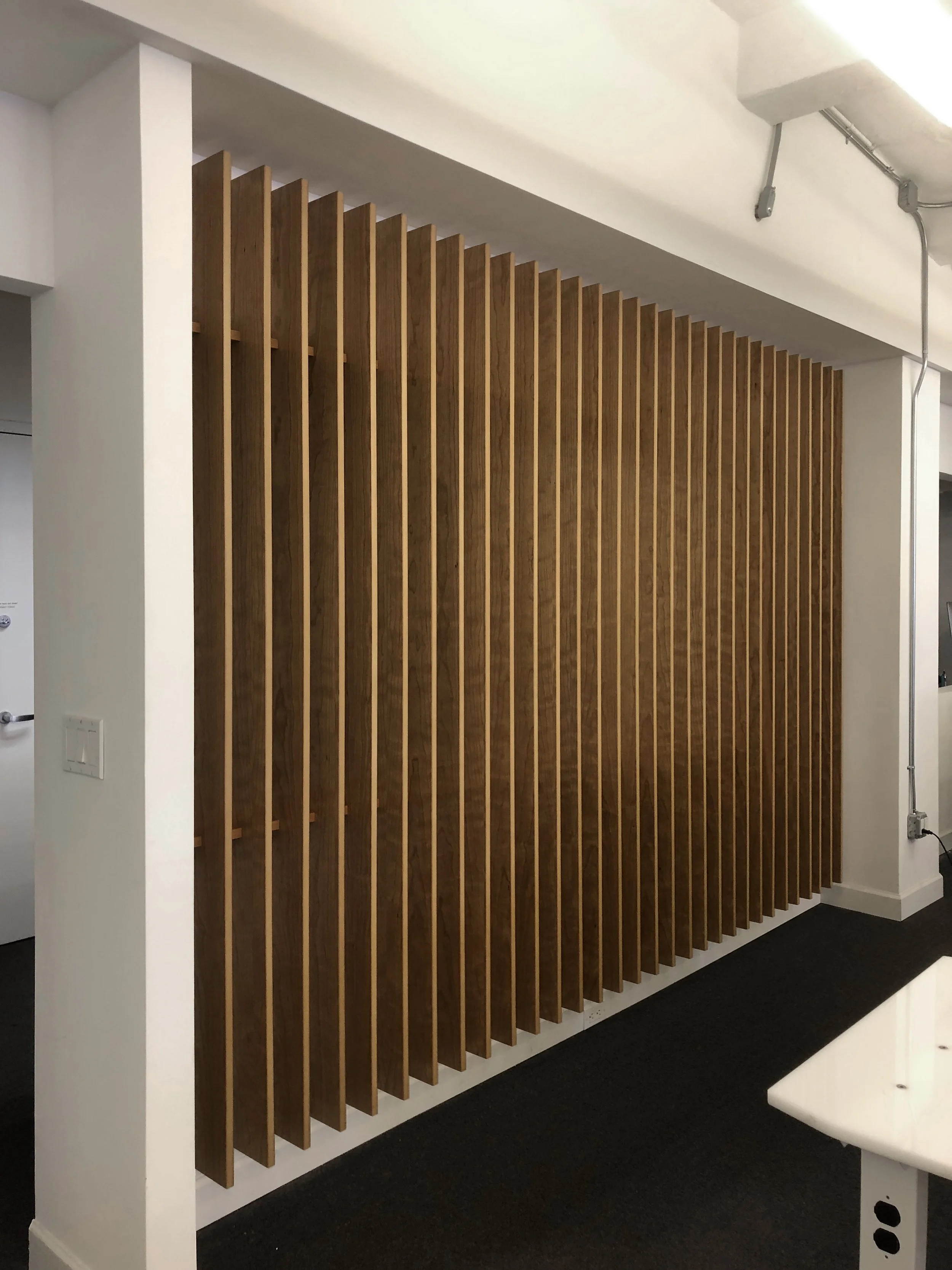
Slender Verticality
Plywood paneling and vertical louvers highlights verticality and facilitate noise attenuation. The vertical paneling has a monochrome natural finish and conceals existing service areas for printing and storage.
Subtle Patterns
The introduction of wooden materials (such as cherry plywood) lends the workspace experience a soft calmness. The existing color palette integrates with these warm material surfaces, resulting in subtle variations that unify the space.

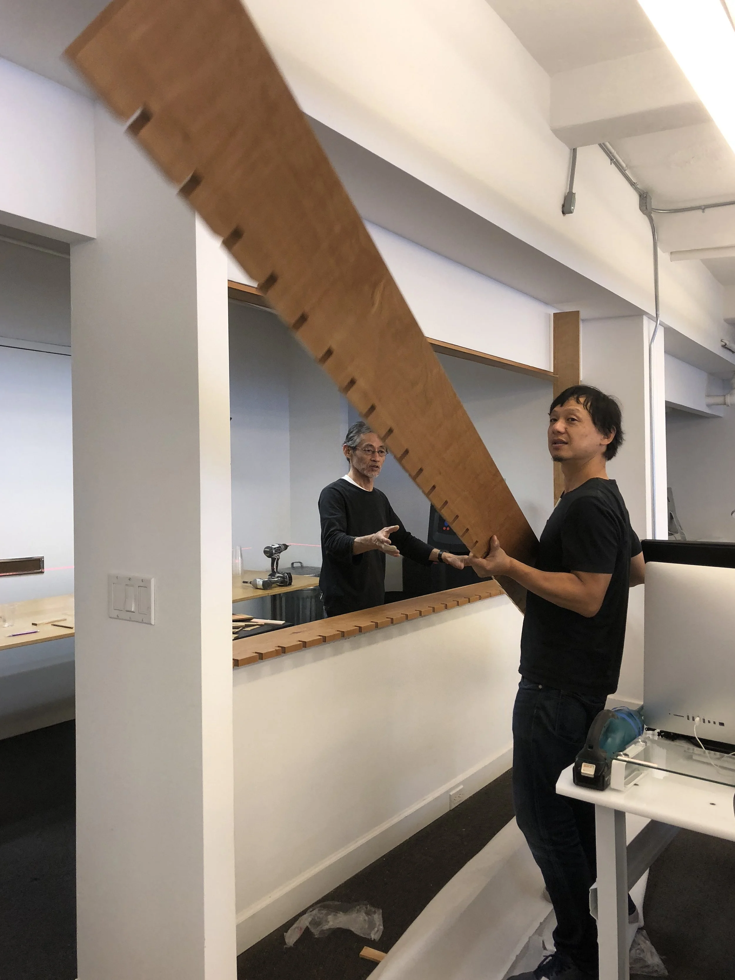


Natural Light
The design maximizes multiple connections between the larger space and the windows, allowing natural light to enter more workspaces. Focusing on sight lines to the windows brings structured order and rich complexity throughout the space.
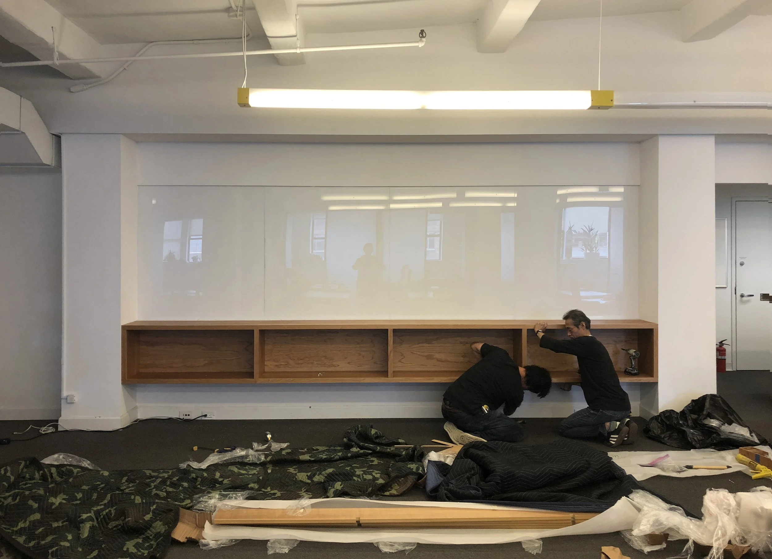
PURE BOND ® PLYWOOD • COLUMBIA FOREST
Formaldehyde-free
Environmentally safe
Soy based
Made in North America
Material Sustainability
The wood paneling and other elements focus on material sustainability. They also consider the potential involvement of small local fabricators, with design solutions that consider the life cycle of the material within the larger perspective of a circular economy.
The goal of the game you discover through play.
- Eric Zimmerman
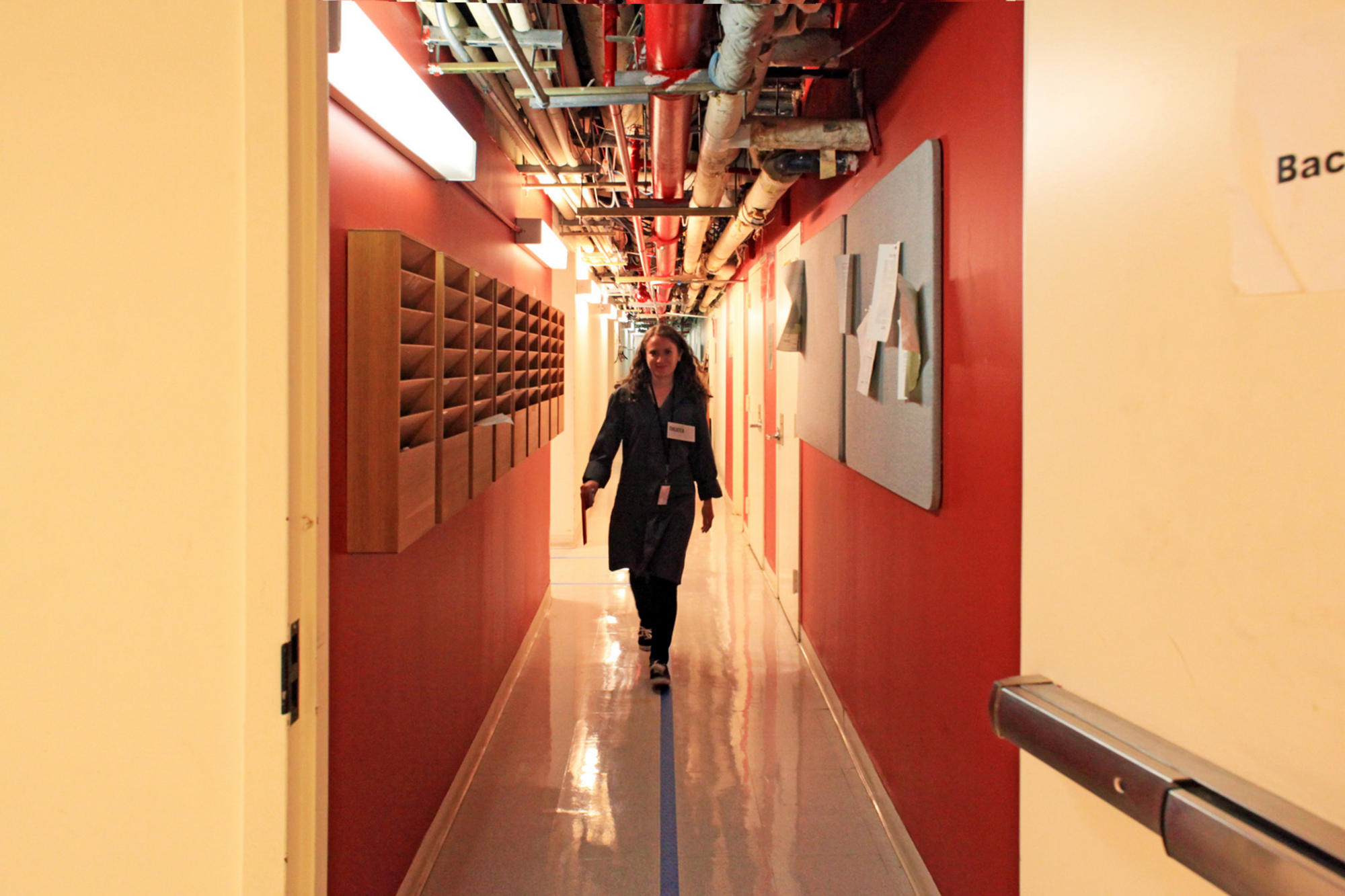
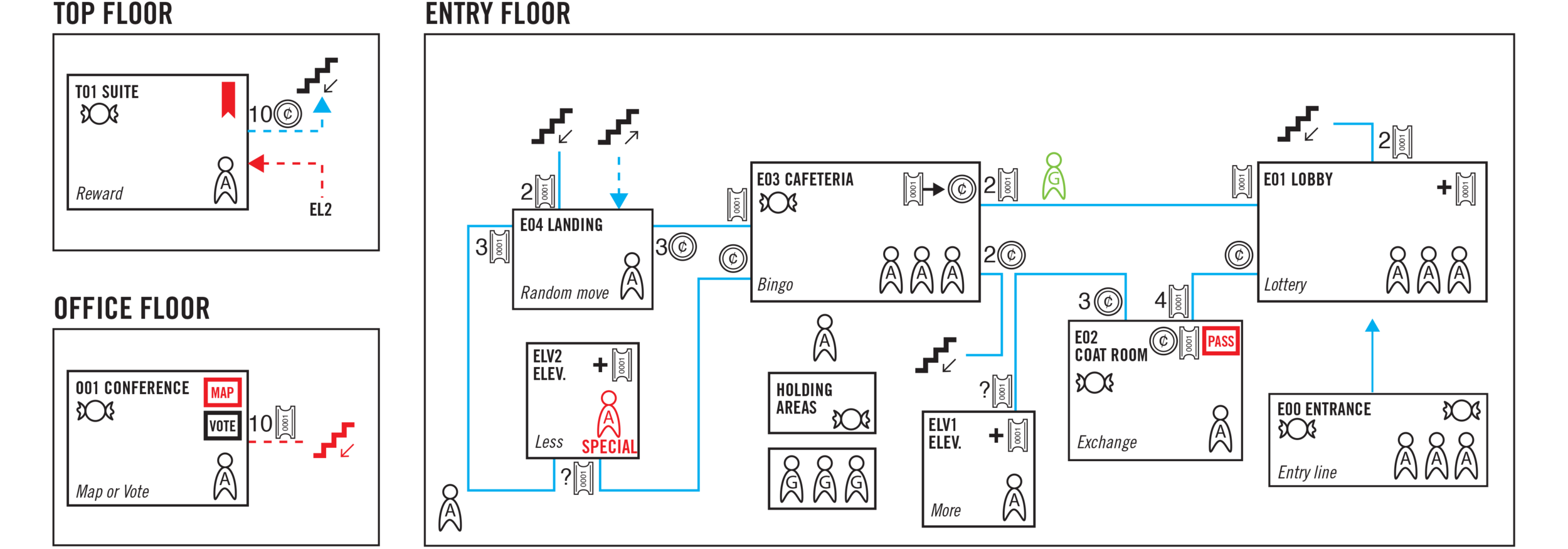
Waiting Rooms is a large-scale installation developed with game designer Eric Zimmerman.
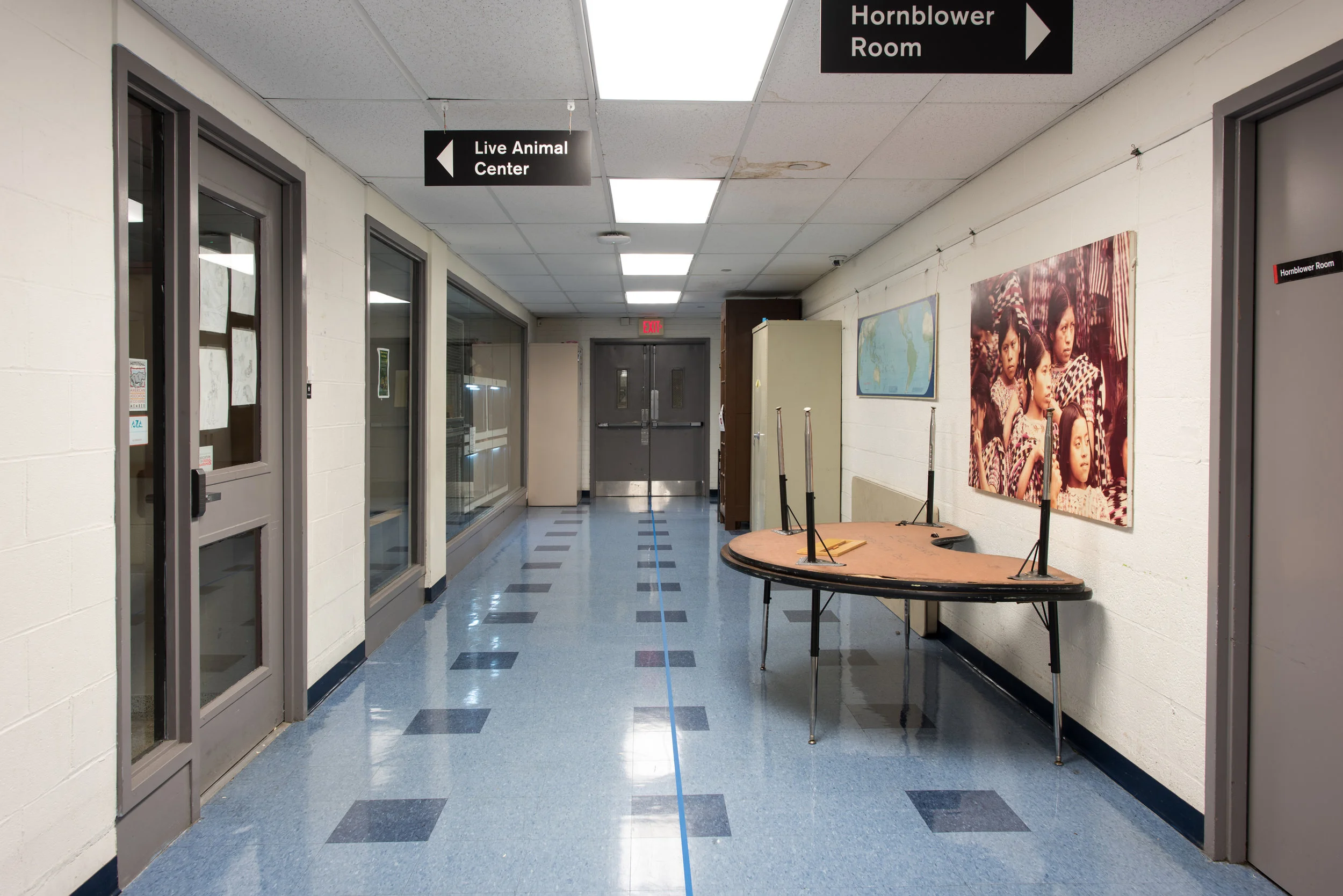
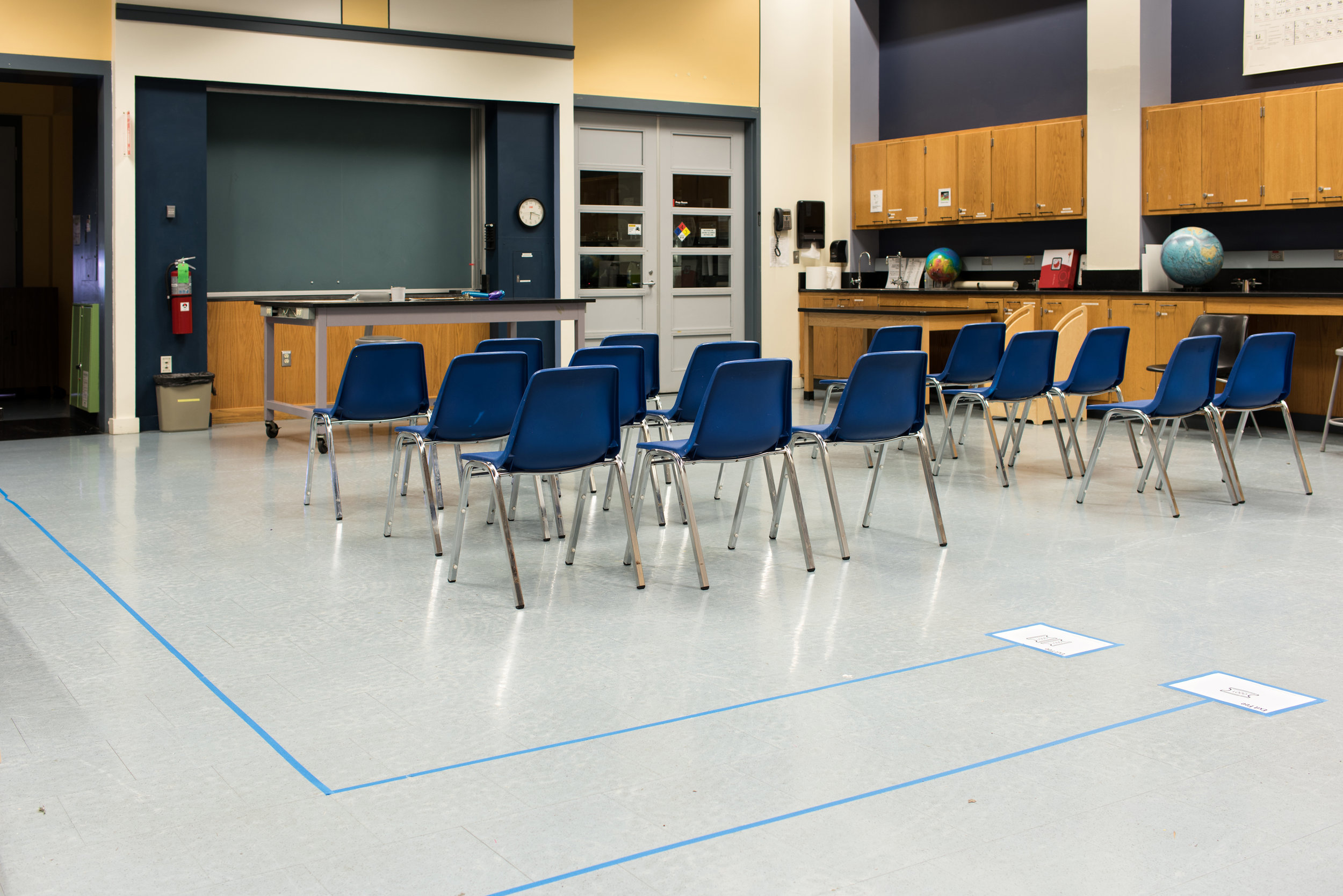
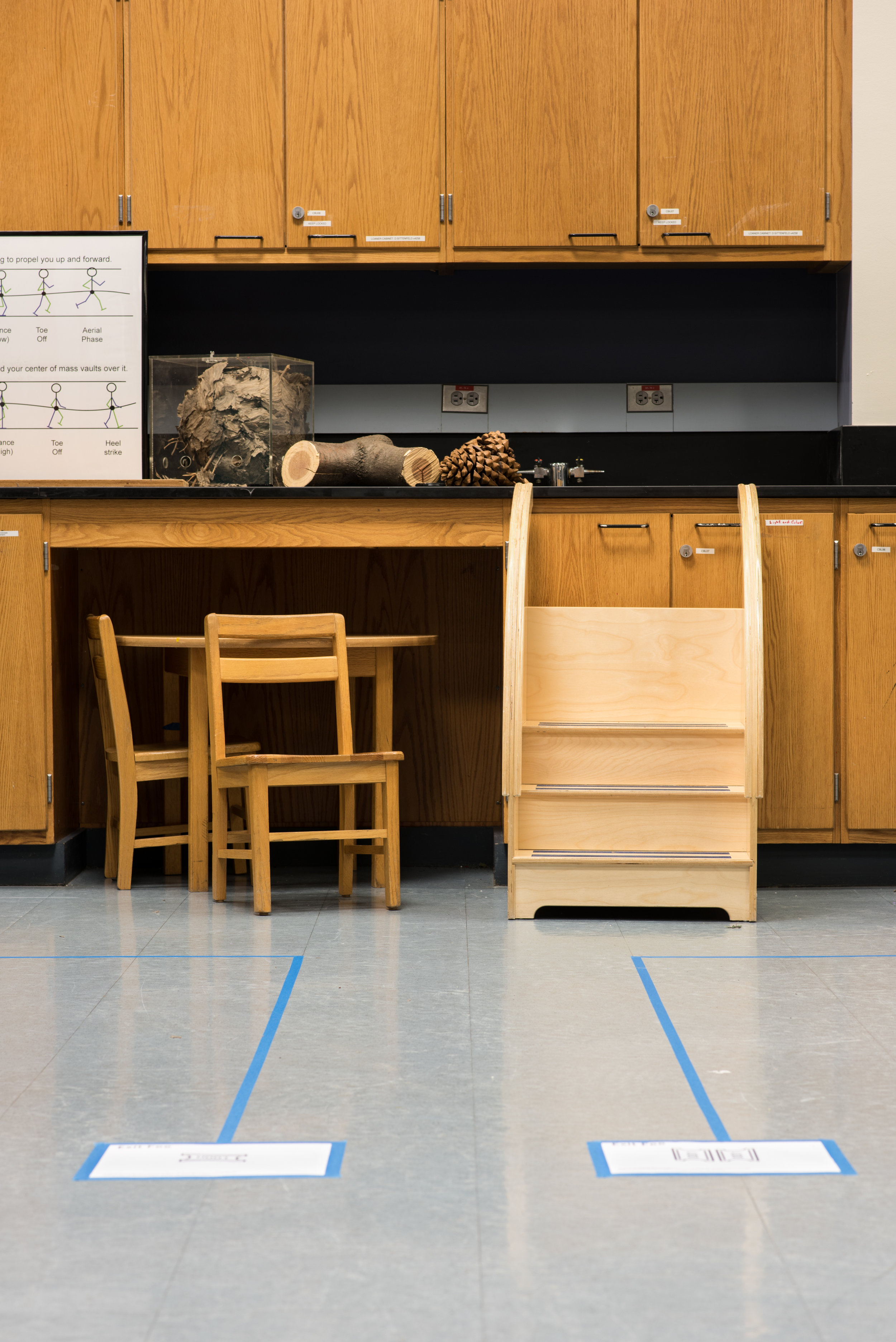
This work-in-progress explores the themes of bureaucracy, immigration, economic inequality, and the systematization of contemporary life. The Museum of Science was transformed into a series of absurdist waiting rooms governed by a topsy-turvy social economy through which players progress in sometimes collaborative and sometimes competitive ways.
Over four evenings, eight hundred Visitors stood in line, sat in confusion and frustration, and let time pass in the spaces of Waiting Rooms.
Large-scale physical installation
by
Nathalie Pozzi • Nakworks
Eric Zimmerman • Game Designer
Location
Museum of Science · Boston
Dates
26-27 September 2017
4-5 October 2017
Visitors
200+200+200+200
Production Coordinator
Ember Rose
Photography
Cris Moor
Attendant Note:
Storage Room
One man stayed in the room for probably 40 minutes. He didn’t want to go back to where he came. I could tell he thought that something else was going to happen, but it never did. Eventually, he stole a ton of stuff and went on his way.



Attendant Note:
Forms Room
There was an unusual interaction when one guest pulled out his own blue tape! I’m not sure where he got it from and he tried to create his own lines. Perhaps he did something similar in other rooms.

Attendant Note:
Bingo Room
A Visitor was stuck in the bingo room for over an hour. He noted that the counters didn’t work well, that the rapidly speaking, erratically inconsistent bingo caller was frustrating and, smiling, said it was a "special hell.”


Attendant Note:
Map Room
One person had only 9 blue tickets, not 10, and offered a chuck e. cheese ticket for the 10th. LOL


Thanks to
Lisa Monrose
James Wetzel
All the Attendants from the Museum of Science
More about the previous installation of Waiting Rooms
26 April 2016
Kill Screen · Waiting Rooms
by MICHELLE EHRHARDT
@ChelleEhrhardt
This elemental table is designed for optimal use in tight spaces. Rather than a true oval, its shape is organic and asymmetrical, with curves optimized for flow and surface, more efficient than a circle or rectangle.
Two versions are available: one for dining, one as a desk. Different heights allow the tables to nest together. Adjustable feet accommodate sloped floors.
Furniture Design
Fabrication
Takeshi Miyakawa
Material
Formaldehyde-free plywood
Status
completed
Location
New York City · USA
Year
2017

The plywood edge pattern remains visible through a black finish, revealing the layered structure of the material.
PureBond® Hardwood Plywood
LEED® & CARB compliant.
Winner, EPA’s Greener Synthetic Pathways Challenge
PureBond® is Columbia Forest Products’ formaldehyde-free innovation for hardwood plywood manufacturing.
Replacing traditional urea formaldehyde (UF) hardwood plywood construction with soy-based PureBond enables Columbia to eliminate any added formaldehyde from standard veneer-core and pMDI composite hardwood plywood core panels.
Excerpt from Columbia Forest Products
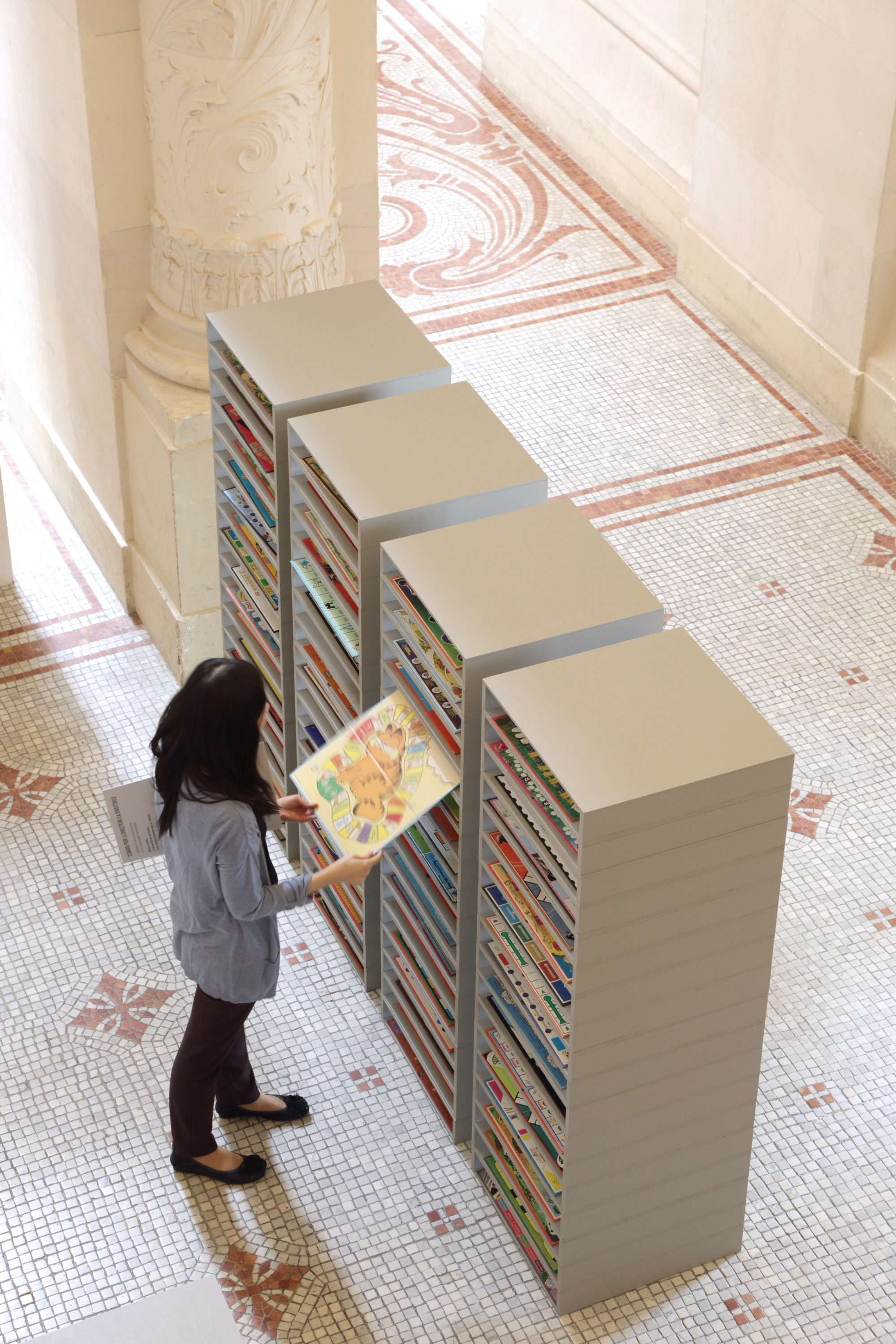
Flatlands is fictional archive for nearly 200 game boards. Within this theatrical space, two players compete to find the perfect board to please a judge and win the game.
Each round, players play cards from their hand that create changing criteria for the comparison. There are adjective cards and noun cards, which combine to make statements like colorless geometries or nostalgic characters. (Of course, colorless characters or nostalgic geometries are just as possible.) The players argue their case before the judge, who picks the winner.
In Flatlands, the field of play is a cultural space, as players argue over visual aesthetics and social meanings of the colorful game boards. It is also a narrative space with a fable-like quality – two archivists search through a randomly organized collection of objects and then present their case to a judge, whose word is law.
Large-scale physical installation
by
Nathalie Pozzi • Nakworks
Eric Zimmerman • Game Designer
Exhibition
D-DAYS
Gallery
Musée des Arts décoratifs · Paris
Dates
2nd May · 14th May 2017
Photography
Baptiste Heller
Project acquired by the Centre national des arts plastiques, the French institution under the Ministry of Culture and Communication that manages the collection of the Fonds national d'art contemporain (National Foundation for Contemporary Art).
Originally commissioned by
Babycastles
Venue
New York City · 2010


army
blood
brains
circle
civilization
colonizers
comfort
conflict
conquest
cries
decisions
destiny
determination
egoism
enemies
fate
force
friends
earth
hearts
heroes
history
hour
ignorance
illusions
impulses
injustices
justice
manifestation
men
moments
mountains
nations
peace
people
poets
power
promises
revolution
rhythm
rights
saints
sanctions
seas
shadow
soldiers
souls
spectacle
spirit
squares
temples
victory
war
women
world



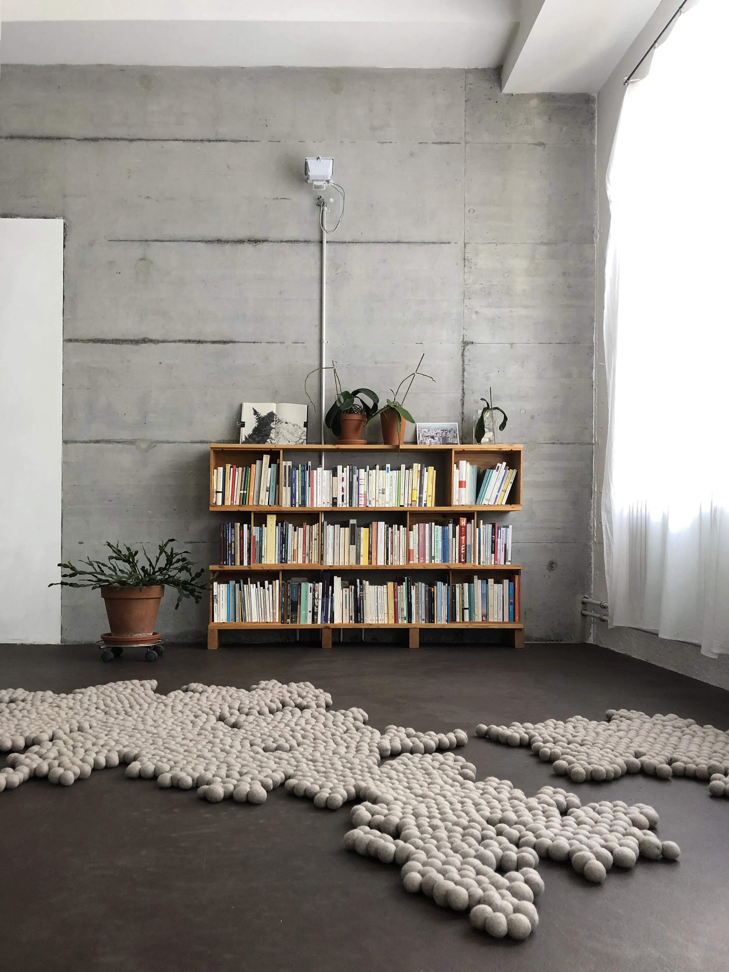
This minimalist shelving unit is an example of approachable strategies to sustainable design. The modular system features three horizontal tiers of open-compartment storage, constructed from repurposed wooden boxes.
The upcycled wood boxes retain their original character, with visible grain patterns and natural color variations that celebrate the material's history. This approach to materiality aligns with circular economy principles, recognizing the value of existing discarded materials.
Thanks, Enzo Mari.
Modular Bookshelf System with Upcycled Wood Boxes
Material
Wood
Year
2016
Drawings
Carolina Andrade / Ciudad Análoga
Photo • Iteration #3
by CP
Location
Zürich
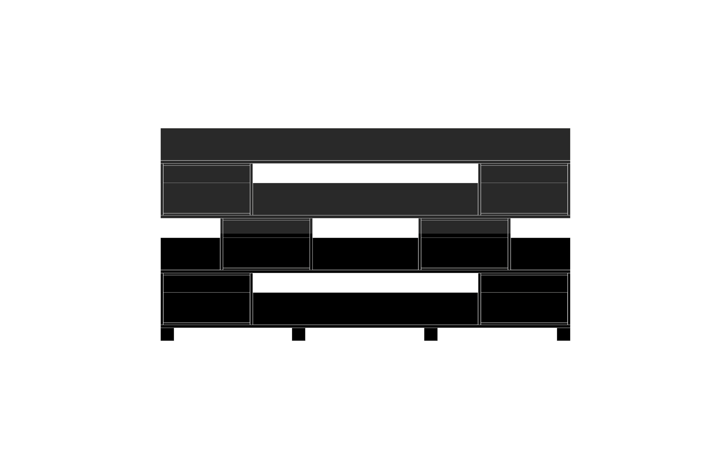
Components
6-9 wooden boxes/crates (upcycled)
depending on box dimensions
4 wood planks / shelves
4 legs / support
Additional cross bracing as needed for stability
Note: Exact quantities will vary based on specific box dimensions and desired overall shelf dimensions. This estimate is based on the visible configuration in the image.



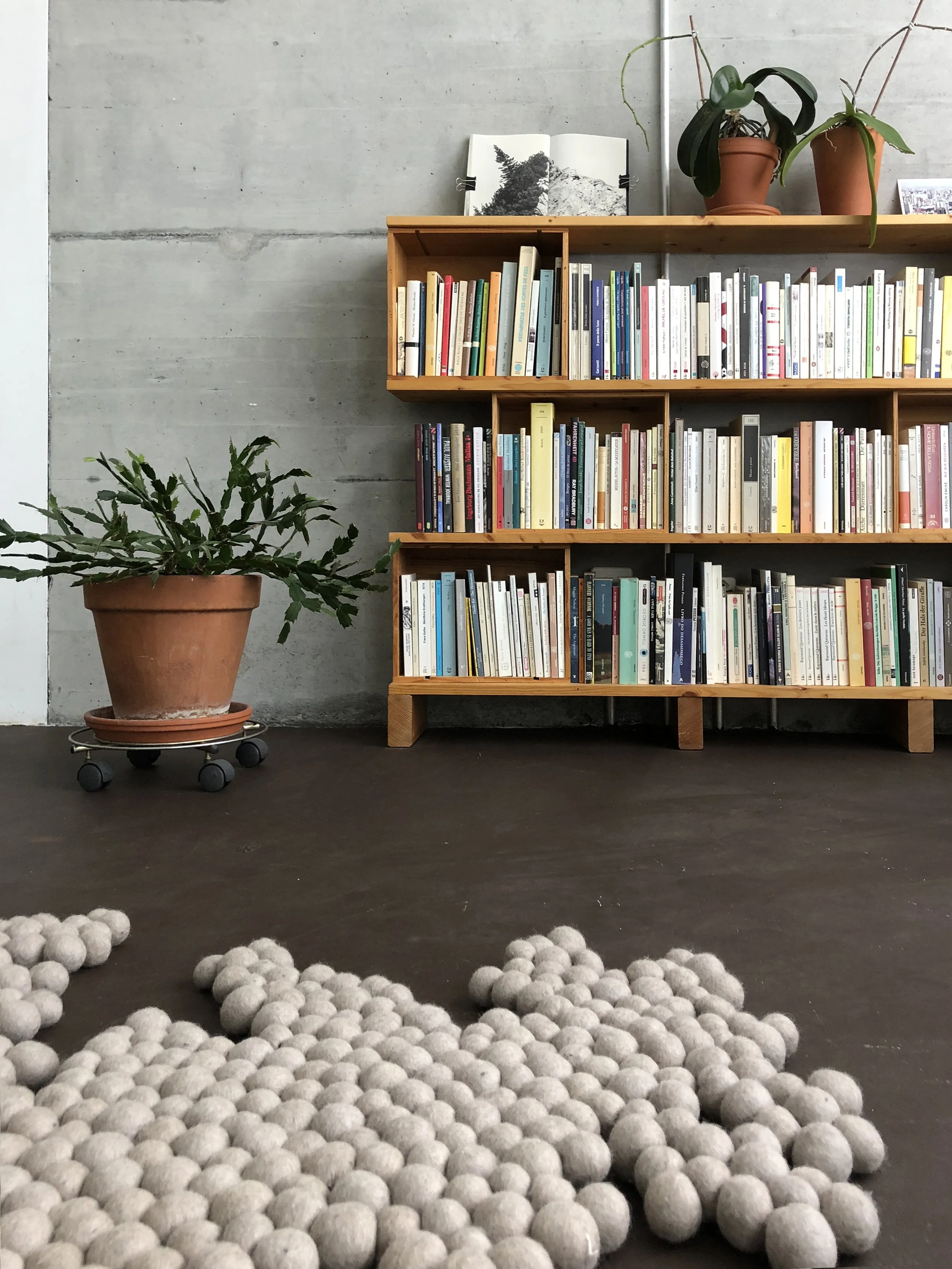

This modular shelving system is designed for easy assembly and disassembly, allowing for flexible reconfiguration, transportation, and storage.

The building sits in the old core of the village, adjacent to a dense forest. It was constructed in the 1950s, following a traditional Alpine “tower house” model, and was later renovated in the 1980s.
The renovation maintains the existing features and oddities of the original 1950s structure. The ceilings are low (barely 200 cm in places), and the rooms and windows are small. Yet everything is well-proportioned to the overall modest footprint of the house: 5.5 by 5.5 meters.
New elements introduced to the building include thin white steel stairs that connect the three upper levels and basement, integrating the overall space. Two added skylights bring in soft and diffuse interior light. The interior wood paneling and the original windows in dark reddish larch evoke a strong feeling of warmth, in this region of long, cold winters.
The renovation results in a home that combines contemporary elegance and subtlety of detail, while honoring the quiet strength of the original dwelling and the way it transitions from the social life of the village to its surrounding natural environment.
Renovation of an Alpine dwelling
Status
completed
Location
Cogne · Italy
Year
2013 design development
2016 first phase
2019 completed
Photo:
Paolo Rey




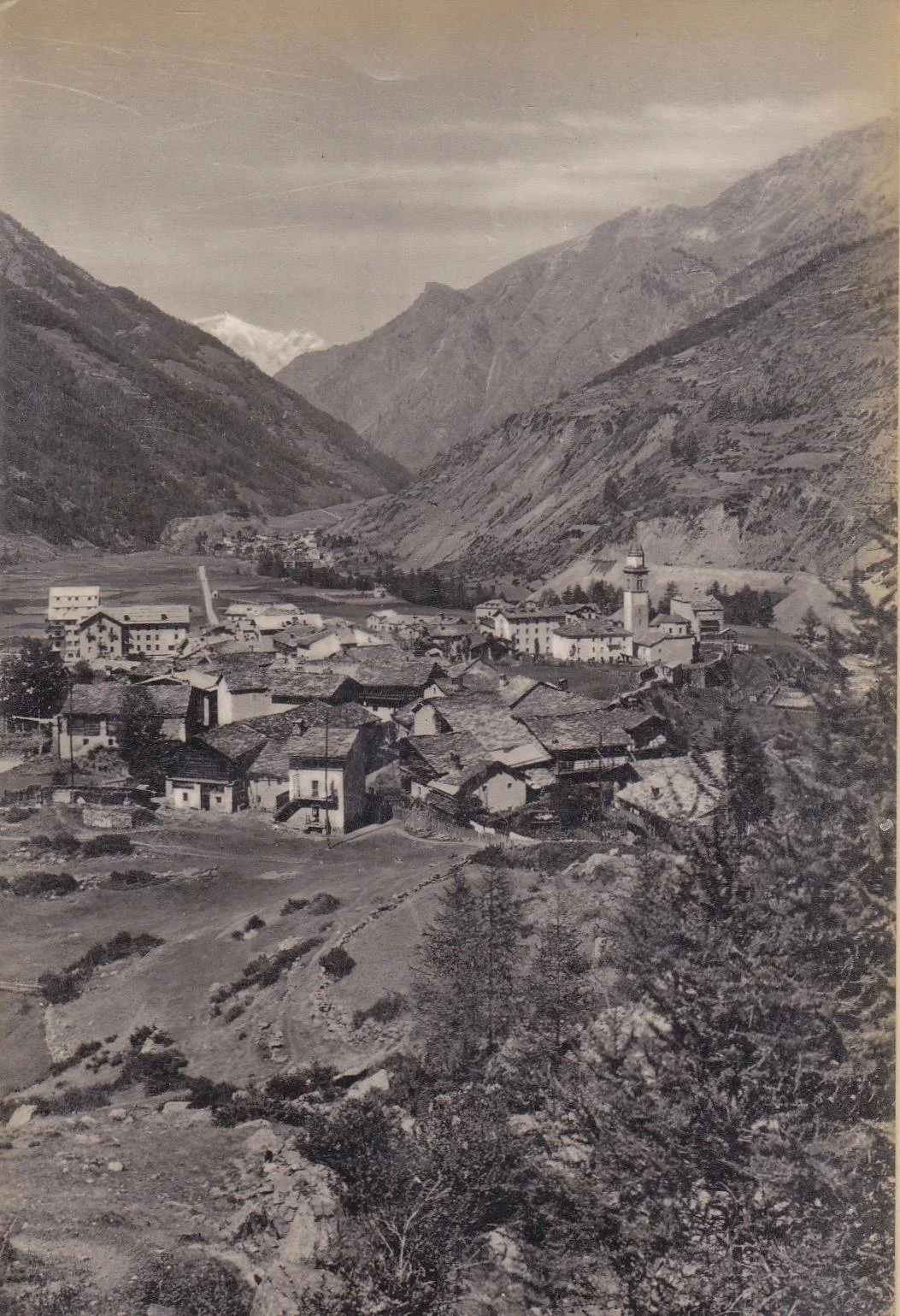
Cogne. Photo: Unknown. Courtesy of AMC (Associazione dei Musei di Cogne).
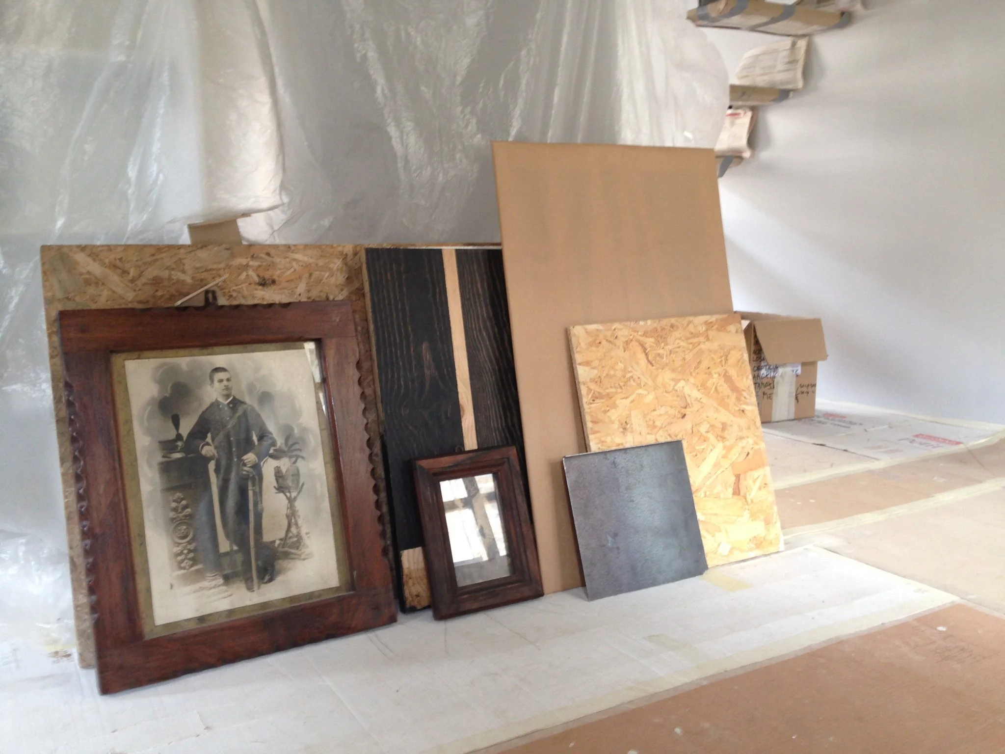
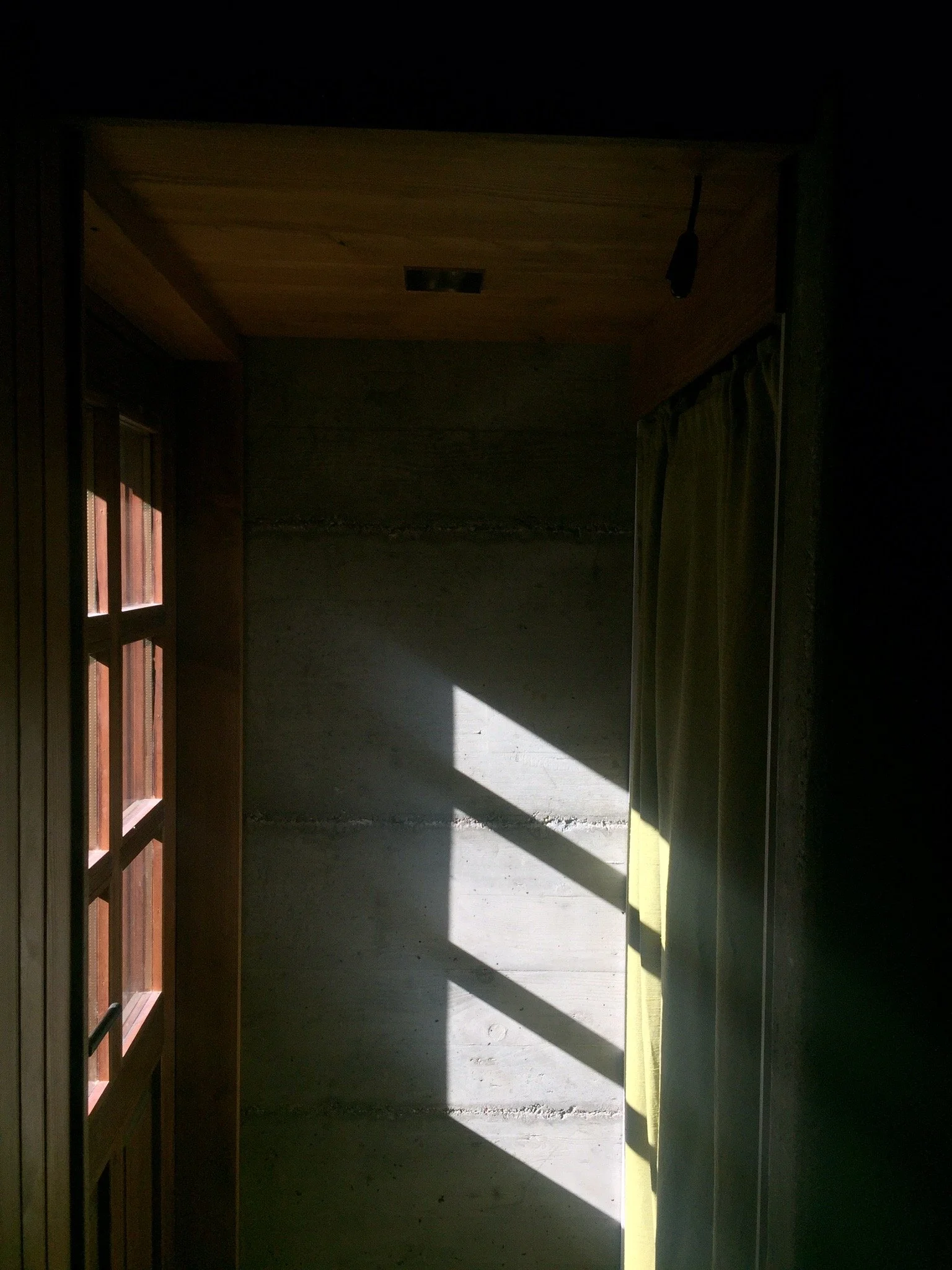



Cogne is a historic mining village, shaped by its iron ore extraction and the hydroelectric power plants built to support it, and the design draws on that industrial heritage in a direct way.
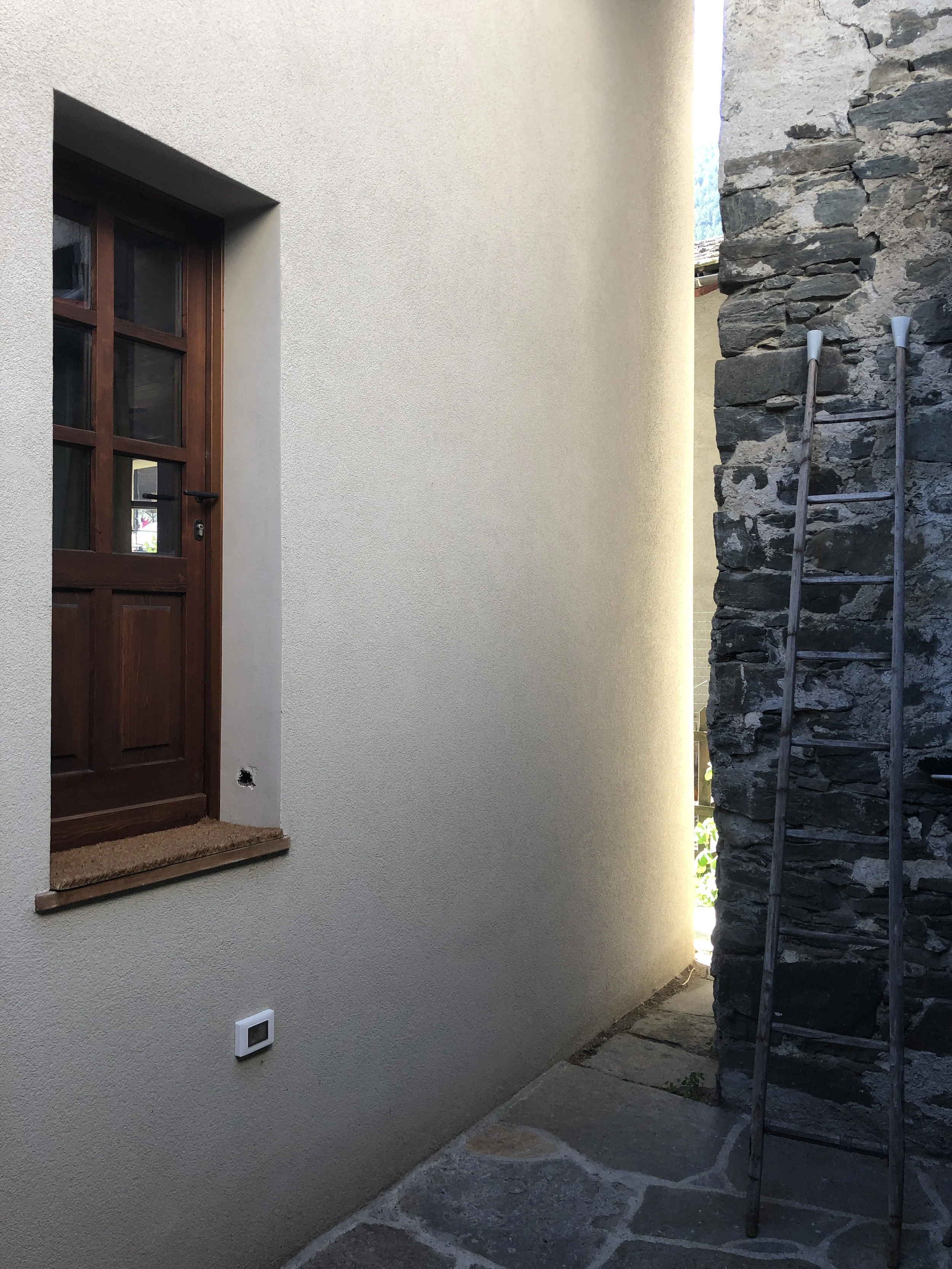
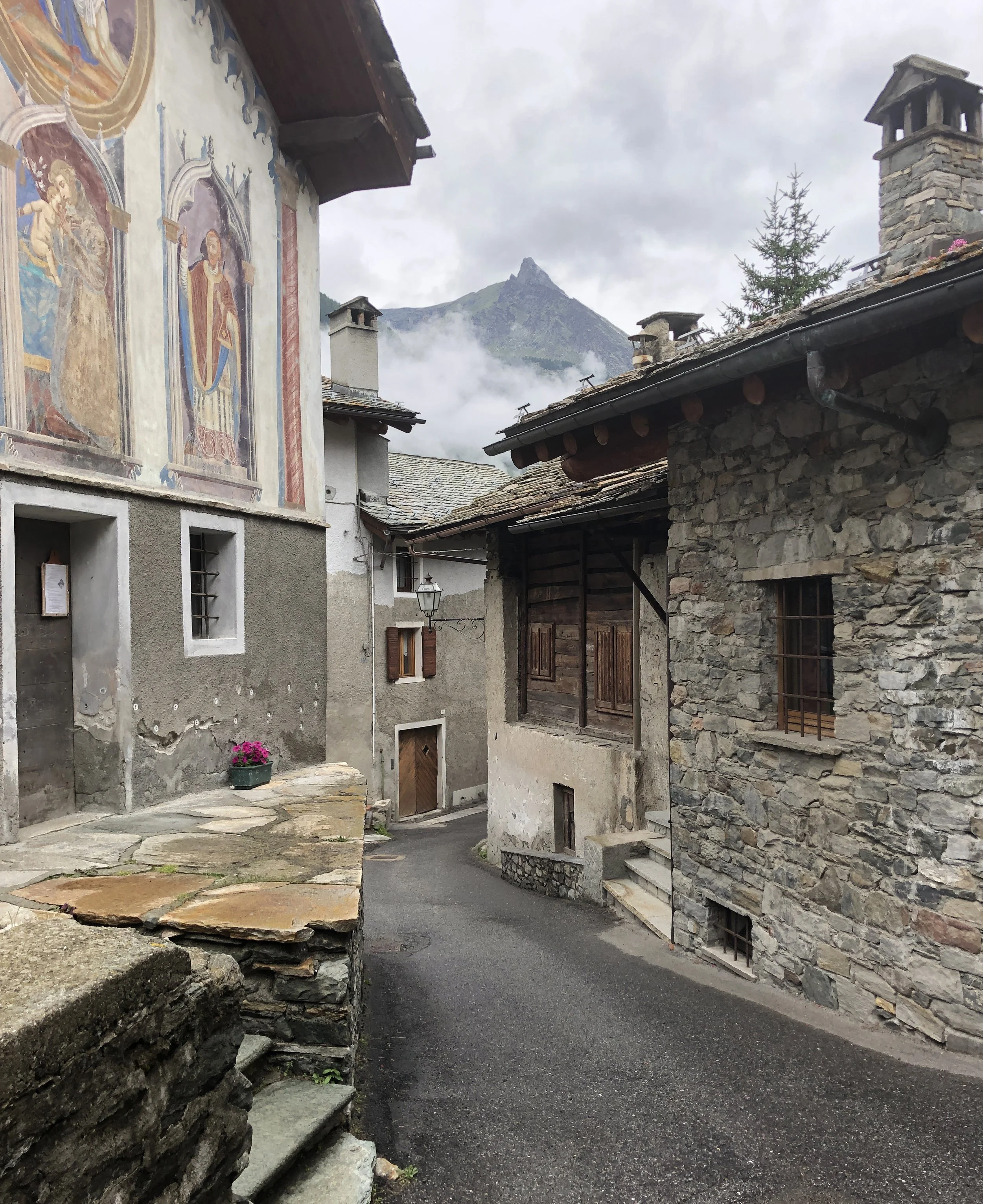
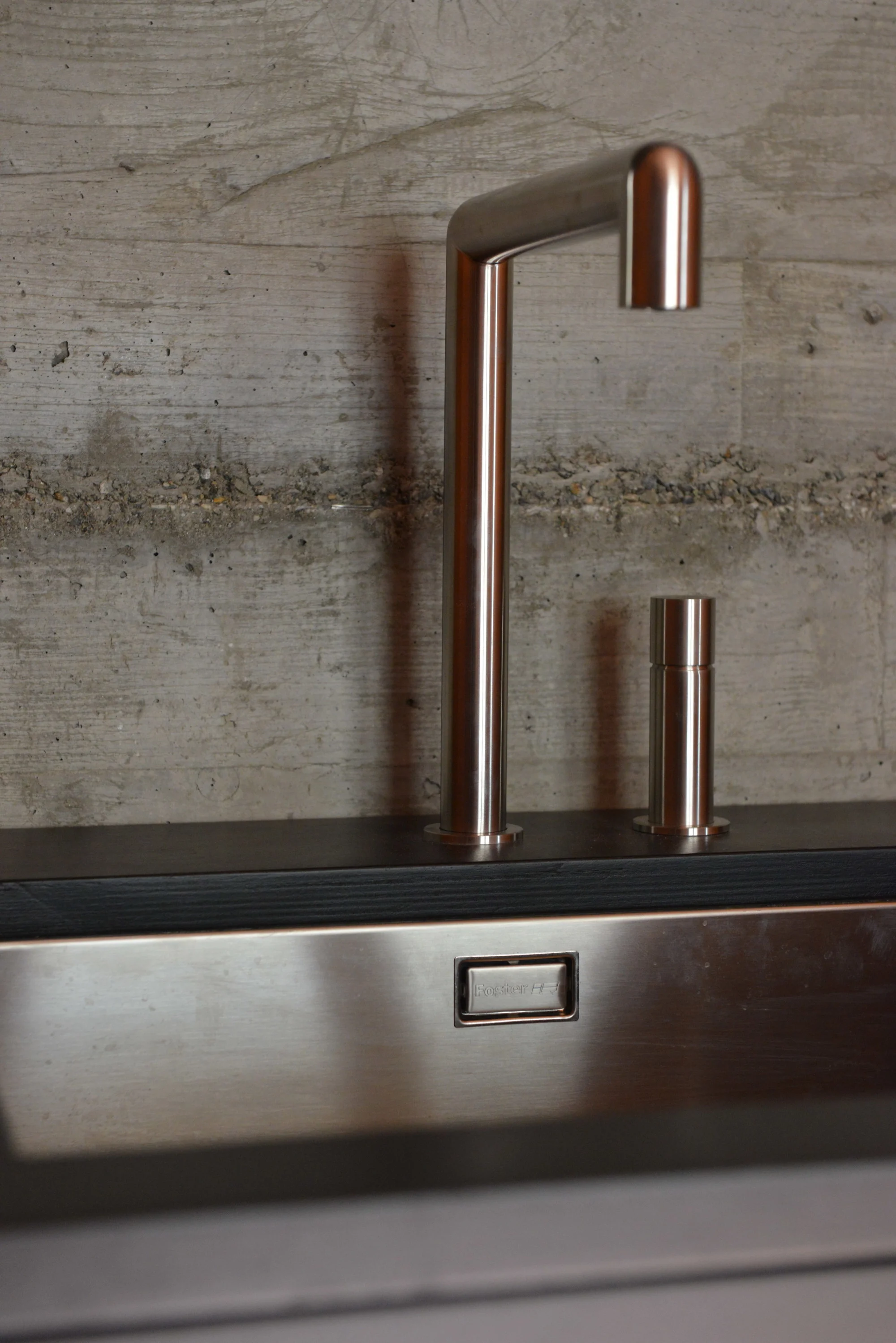
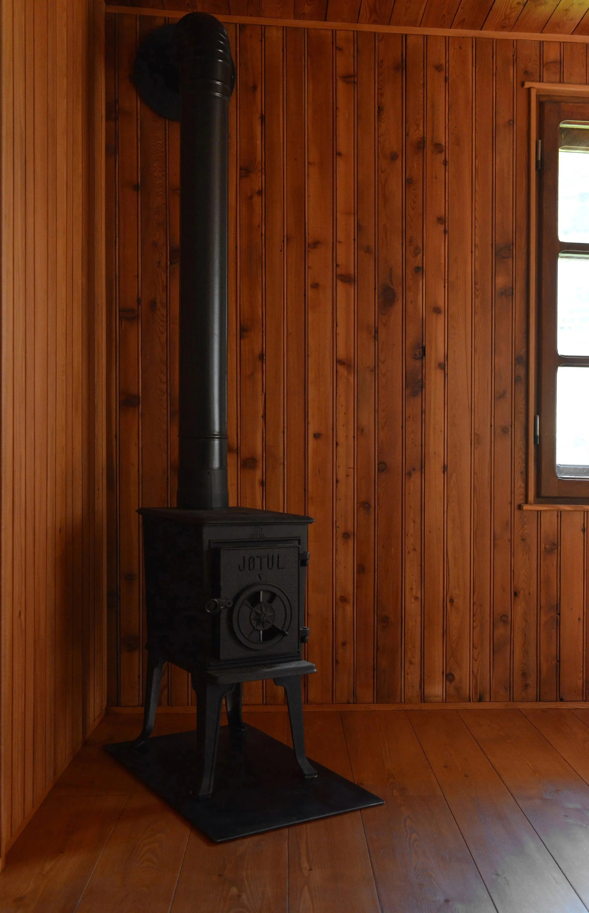
Driven by efficiency, the walls are insulated with calcium silicate panels, and electric floor heating keeps the house warm through the Alpine winters - powered by the same hydroelectric infrastructure that once ran the mines, and complemented by the warmth of traditional wood fire stoves.
This industrial logic also shapes the architecture itself. The thin white steel stairs and bookshelves that connect all levels of the house echo the character of the valley, where steel was both a raw material and a structural language.

A simple outdoor element extends the project's dialogue with the industrial history of the valley. The outdoor fountain is made from refurbished steel pipes, originally part of the hydroelectric power plants that served the mines. Recovered and reassembled, they bring a piece of the valley's industrial past into the domestic garden, connecting the house to the broader history of the landscape around it.
"La montagne est ma mère."
Jean Giono, Voyage en Italie
The goal of the game you discover through play.
- Eric Zimmerman
Waiting Rooms is a large-scale installation developed with game designer Eric Zimmerman.
This work-in-progress explores the themes of bureaucracy, immigration, economic inequality, and the systematization of contemporary life. The Rubin Museum was transformed into a series of absurdist waiting rooms governed by a topsy-turvy social economy through which players progress in sometimes collaborative and sometimes competitive ways.
Large-scale physical installation
by
Nathalie Pozzi • Nakworks
Eric Zimmerman • Game Designer
Location
The Rubin Museum of Arts · New York City
Event · Brainwave
Supported by public funds from the New York City Department of Cultural Affairs in partnership with the City Council.
Presented in collaboration with Psychology Today.
Year
2016
Photography
Ida C. Benedetto
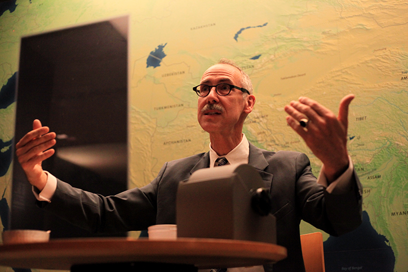


Thanks to:
Tim McHenry
Nicole Leist
Laura Lombard
Kaho Abe
Corrine Brenner
Mattie Brice
Ruth Charny
Naomi Clark
Stephen Clark
Ric Delgado
Kaitlyn Ellison
Justin Field
Gwynna Forgham-Thrift
Nick Fortugno
Aaron Freedman
Jesse Fuchs
Aaron Gaudette
Dalton Gray
Julian Hyde
Alexander King
Flourish Klink
Sydney Mainster
James Marion
Andrea Morales
Toni Pizza
Ben Rotko
Ben Sironko
Winnie Song
Jimi Stine
Geoff Suthers
Tim Szetela
Jonathan Zungre